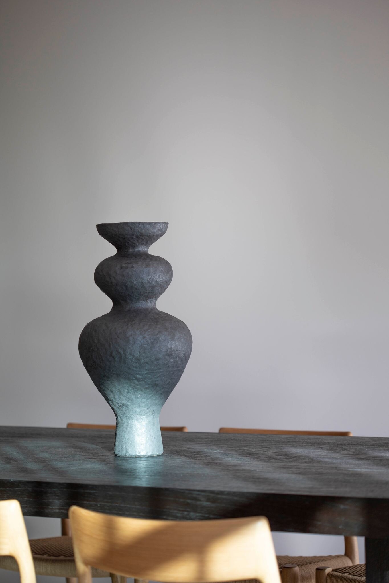
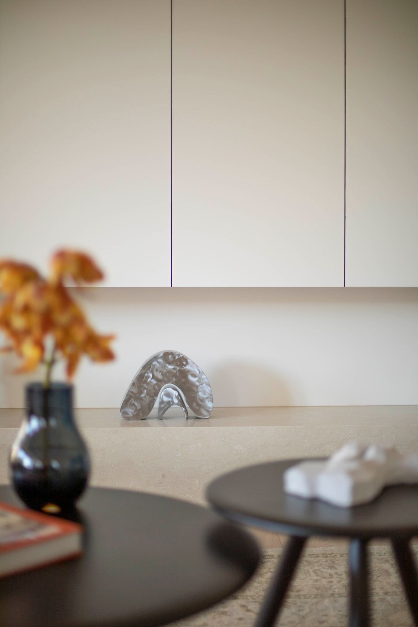
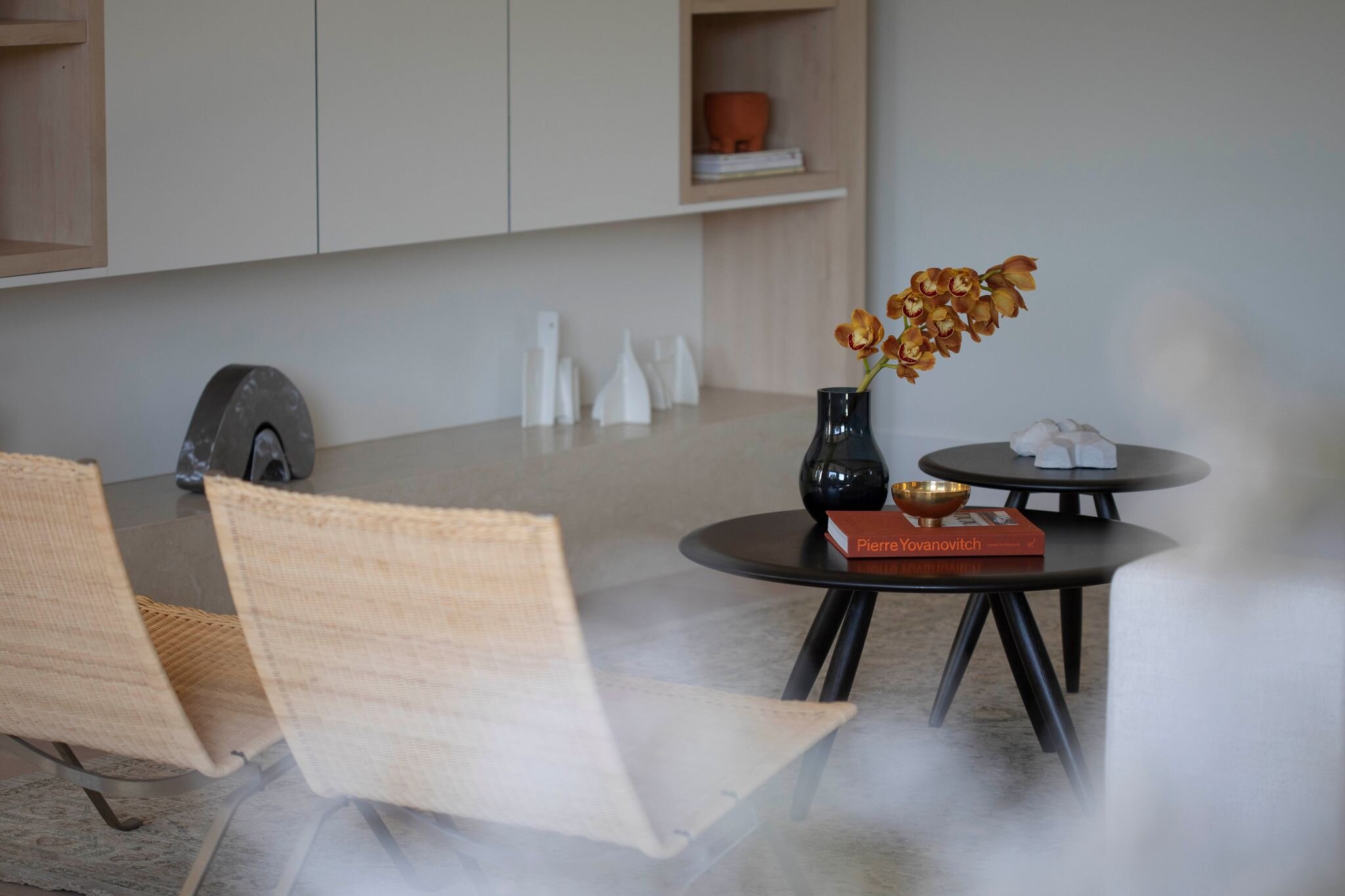
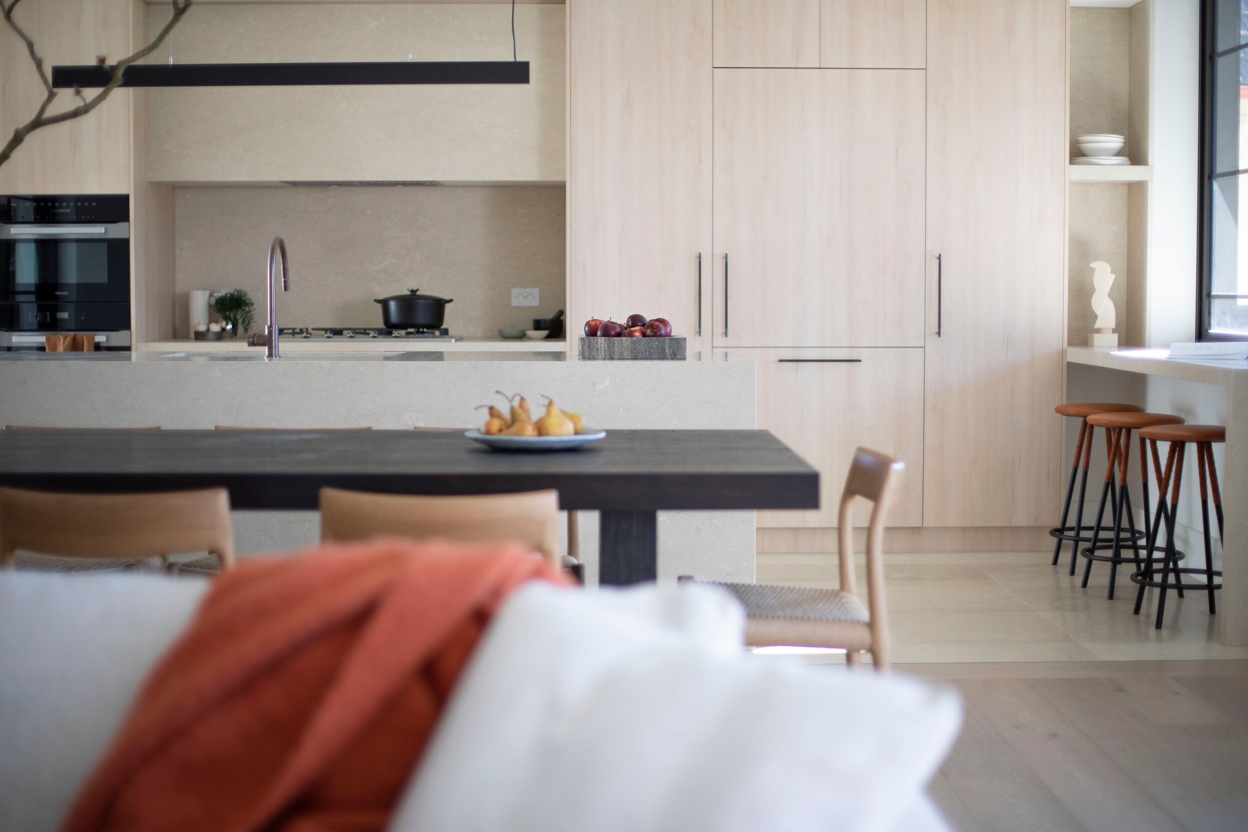
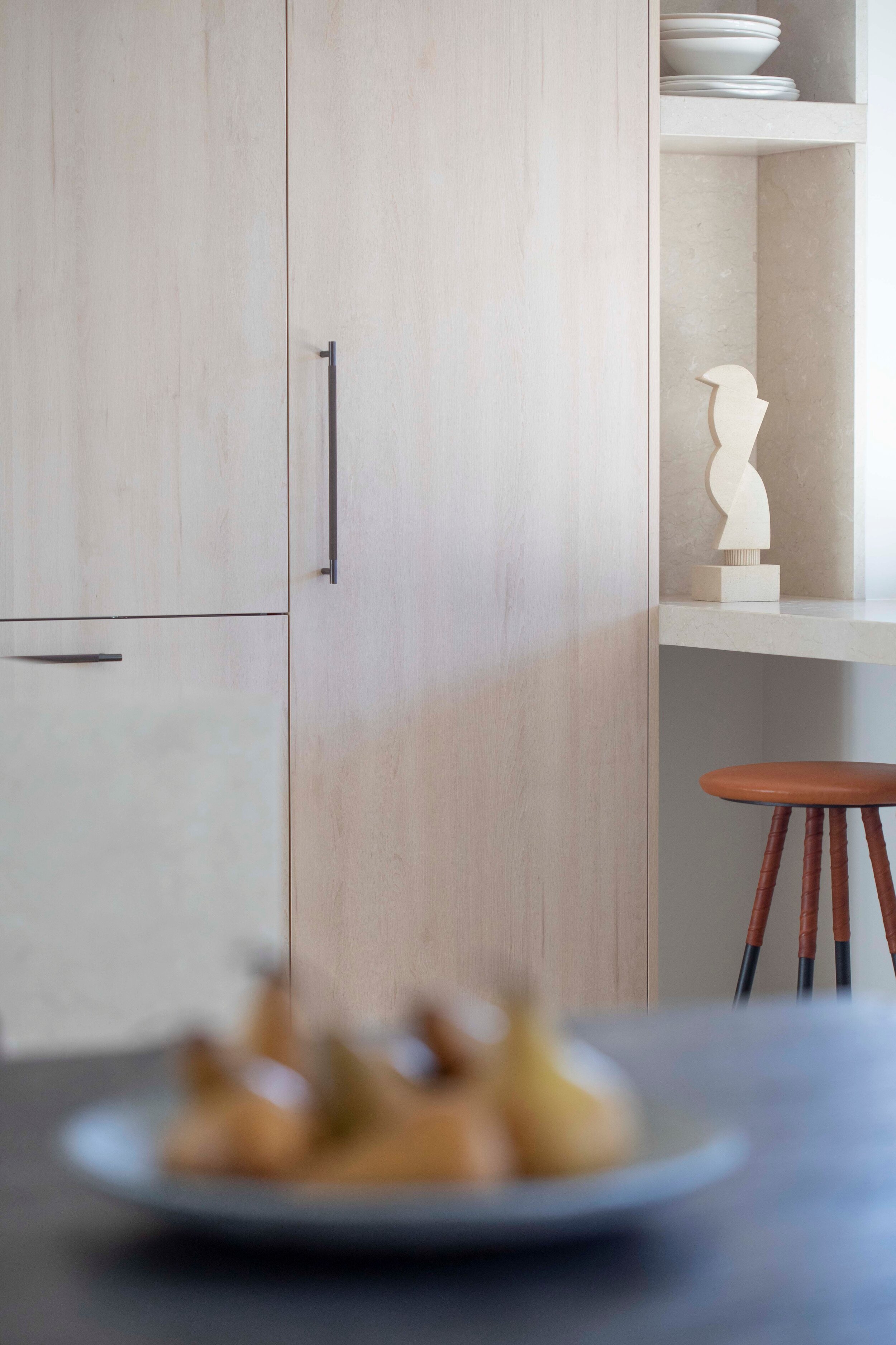
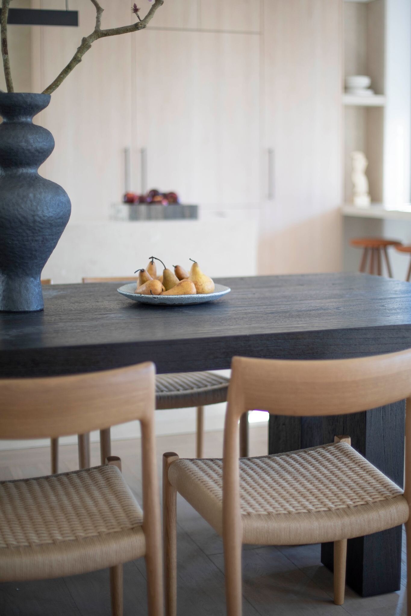
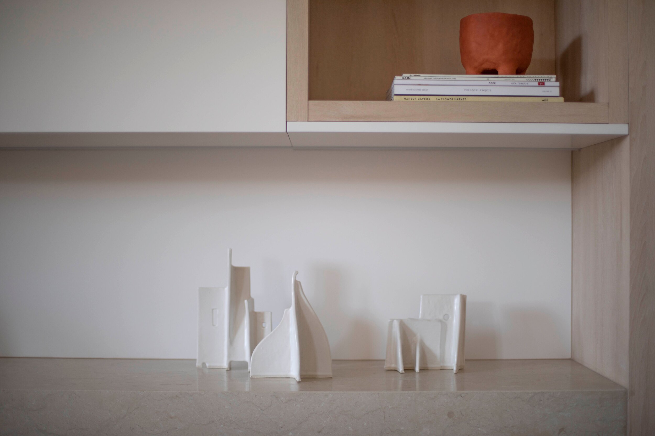
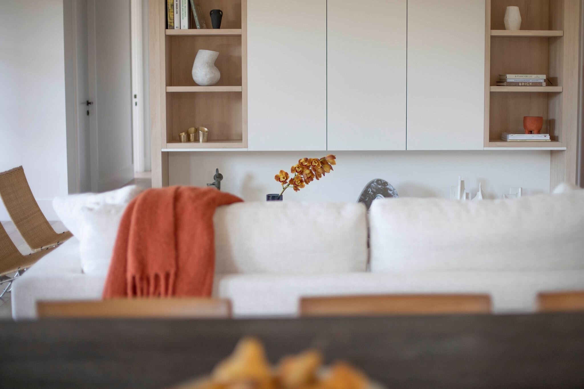
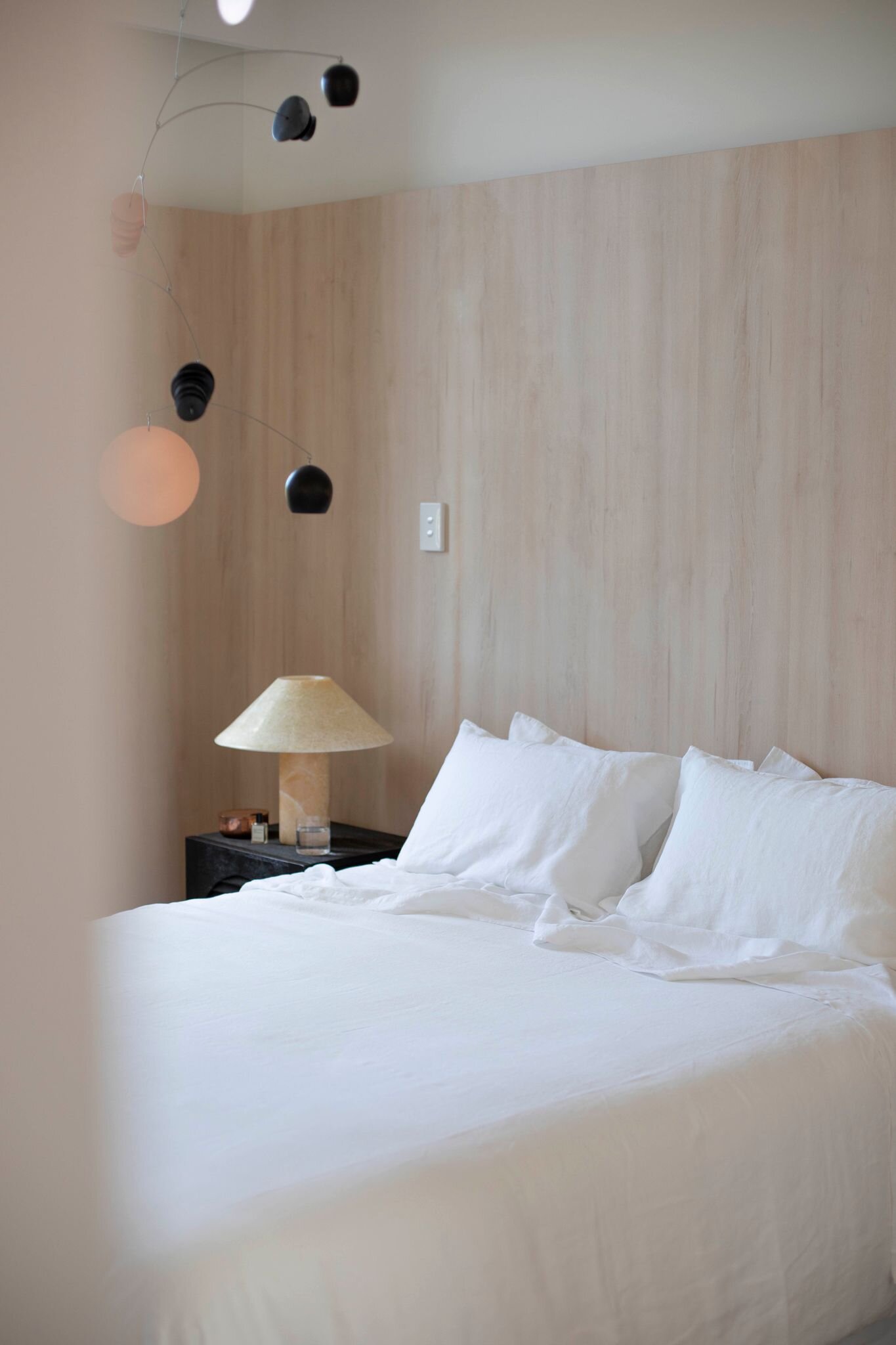
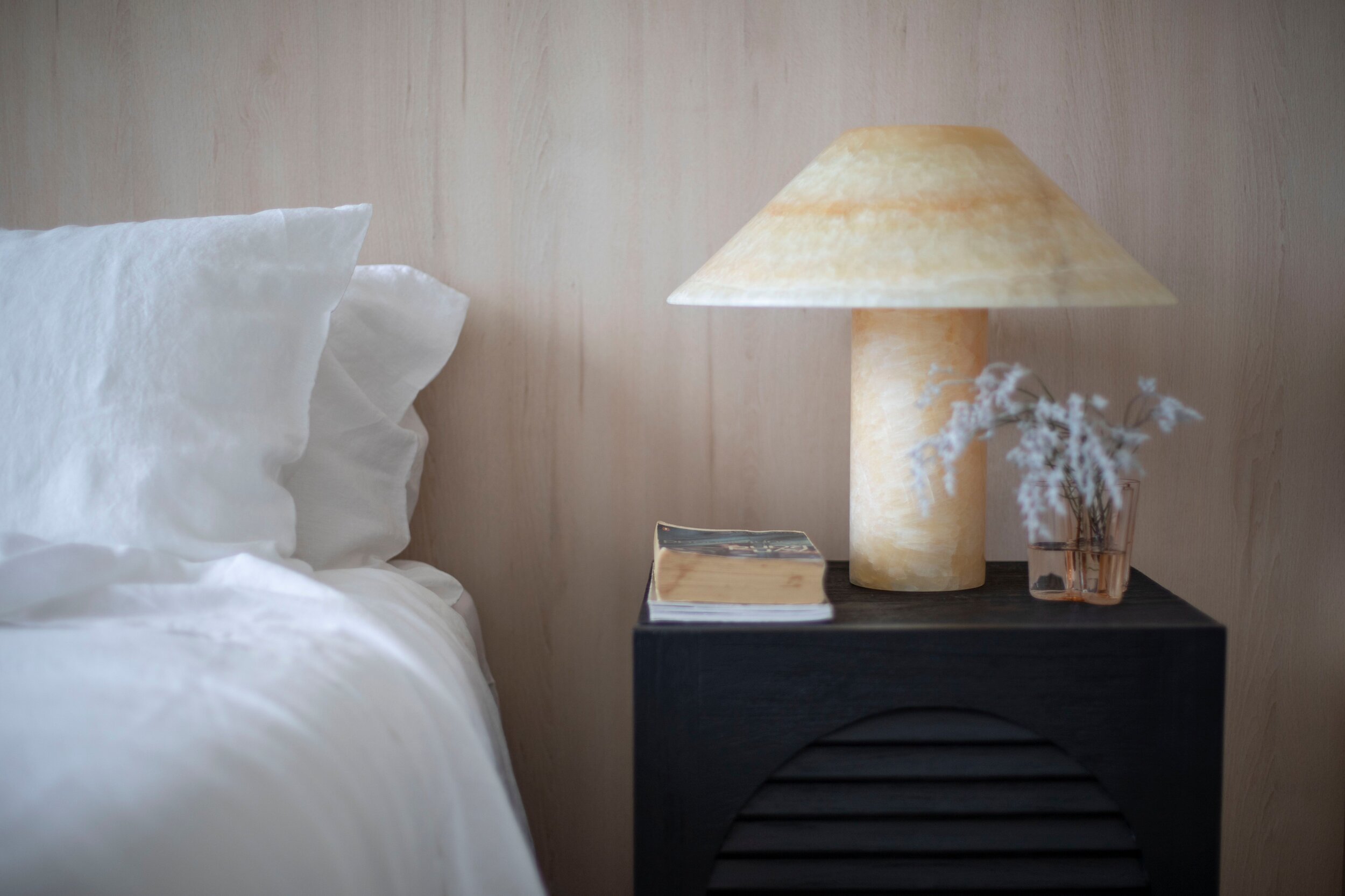
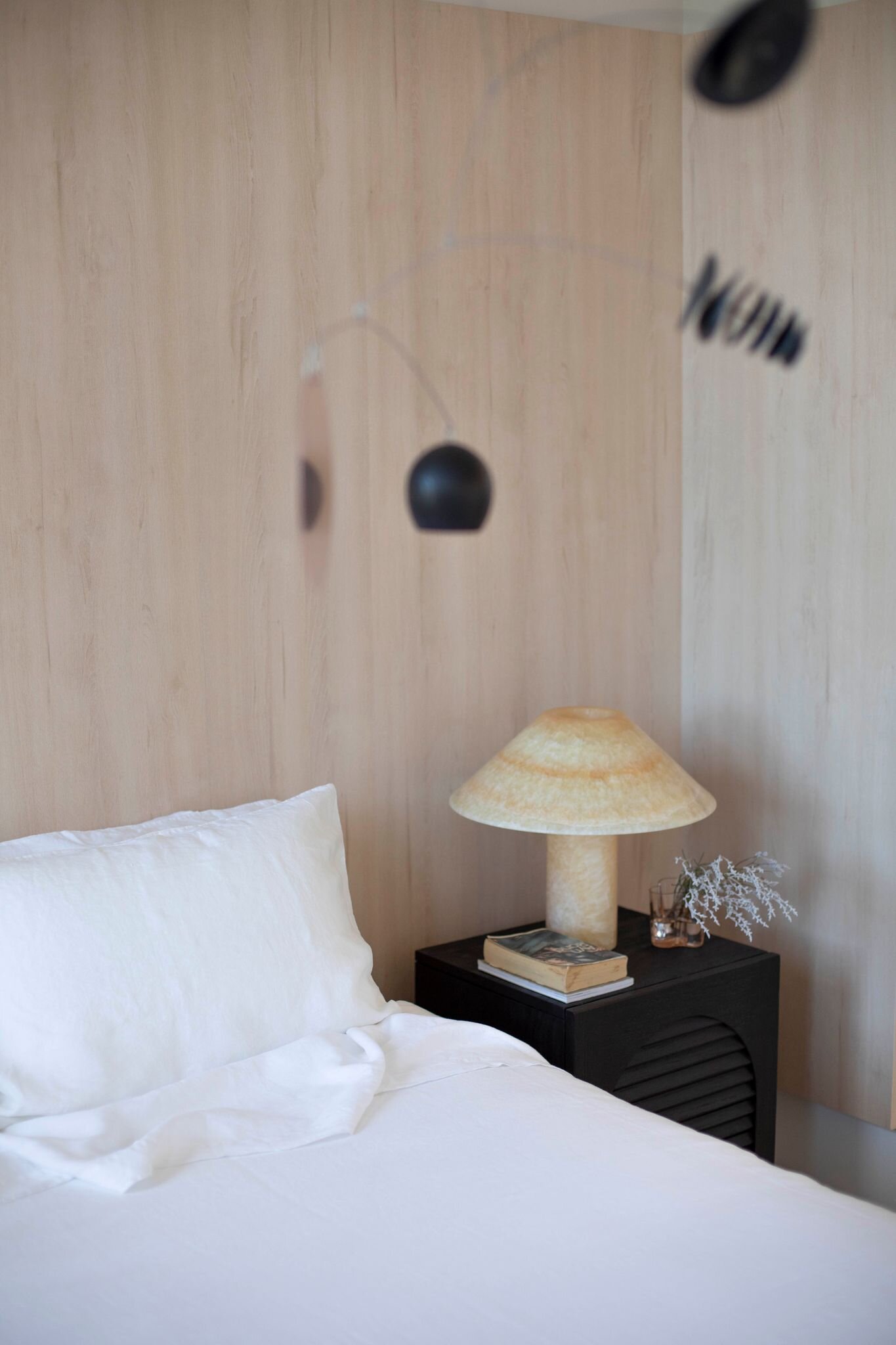
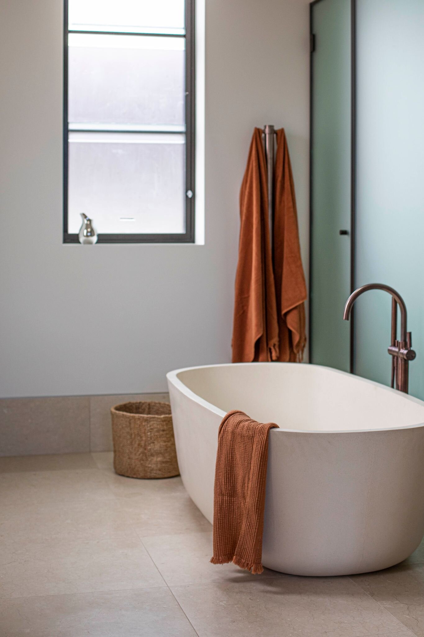
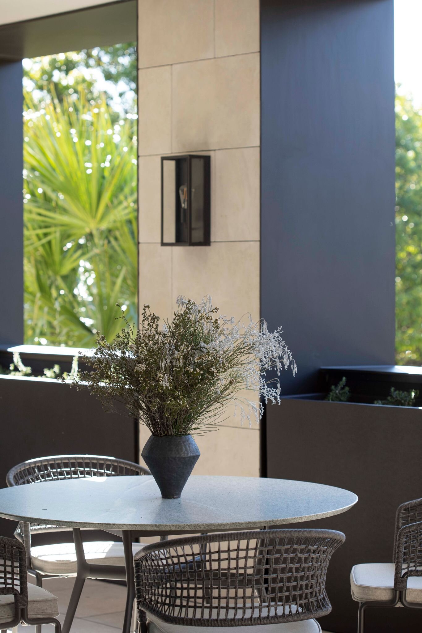
Meet Chloë McCarthy, Lord Howe Island local and Founder of Sydney-based design studio Room on Fire. Read the full interview here.
IN BED JOURNAL - At Home on Lord Howe Island with Interior Designer Chloë McCarthy
This week we visit interior designer Chloë McCarthy at the beautiful home she shares with her partner Jesse, son Max (4) and daughter Margaux (6-months) on Lord Howe Island. We spoke to Chloë about the nuances of island life, her creative process and unique perspective on Australian design. A special thank you to photographer Chelsea Holden who captured the lifestyle Chloë shares with her family and friends on Lord Howe so beautifully for this piece. Read the full interview here.
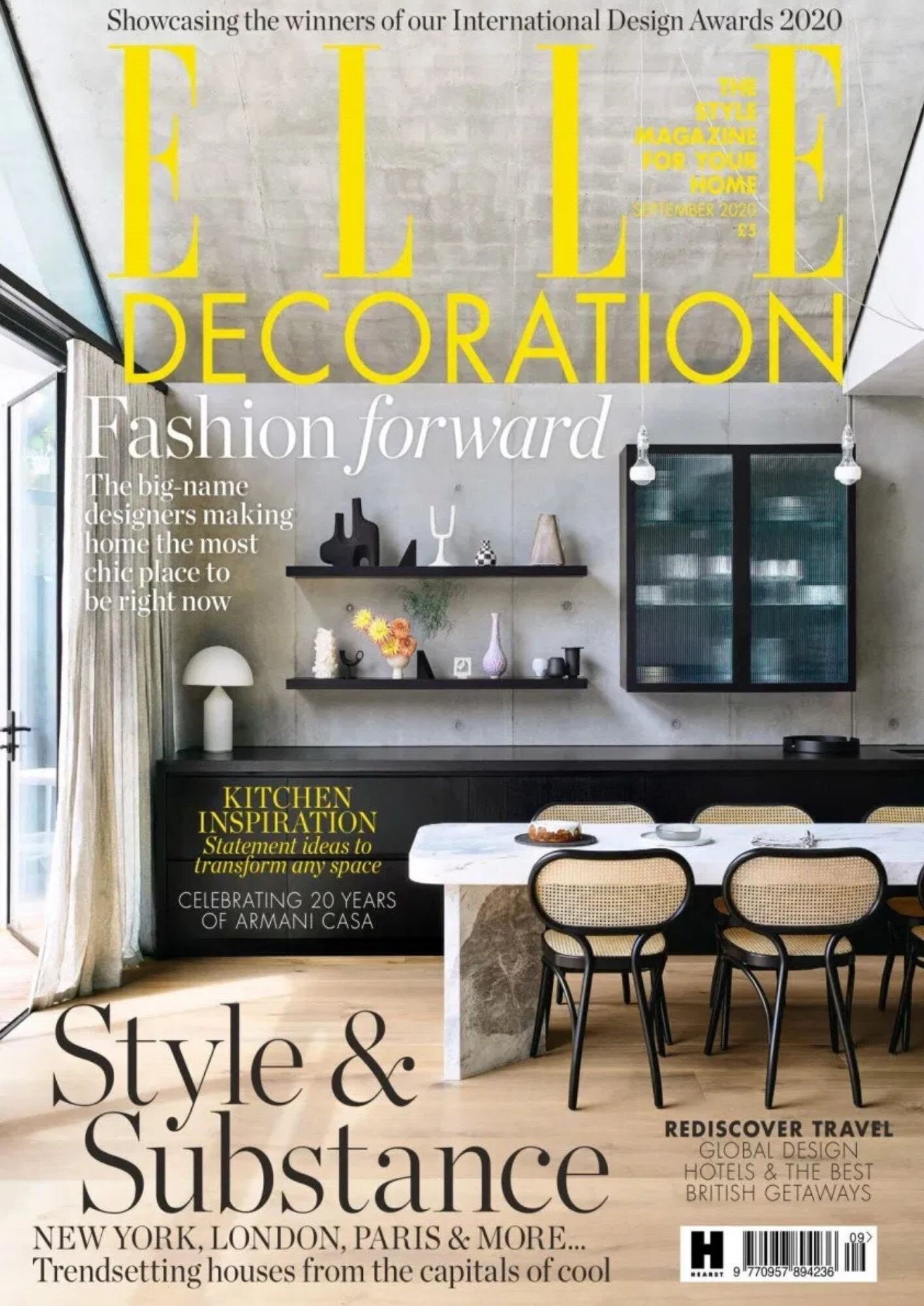
STYLING BY ROOM ON FIRE FOR KENNON+ FEATURED ON THE SEPTEMBER COVER OF ELLE DECORATION UK
The Scandizzo House in Melbourne’s Toorak designed by KENNON+ is featured on the September 2020 cover of Elle Decoration UK.
Editorial Styling: Room on Fire
Architecture & Interior Design: KENNON+
Photography: Derek Swalwell
Builder: Duo Built
BEHIND THE SCENES - STYLING BY ROOM ON FIRE FOR THE BENSON BY FORTIS
Some behind the scene shots taken by Liz Keene from last week’s shoot for The Benson, a boutique development in Sydney’s Rose Bay by Fortis. Select luxury residences were styled by Room on Fire. Interior design concepts were developed by Hecker Guthrie in collaboration with Fortis with architecture by MHNDUNION. Final images by Simon Whitbread coming soon.
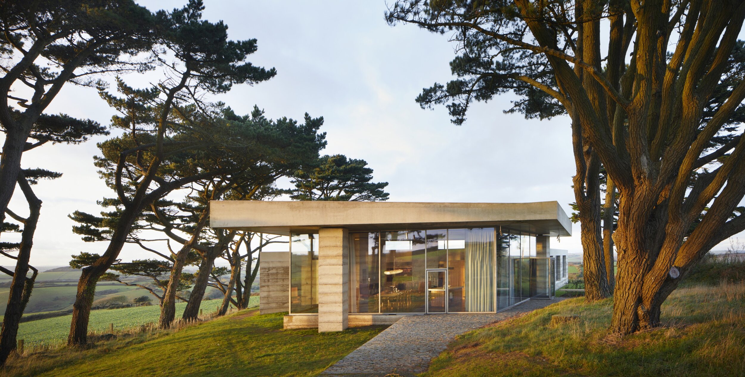
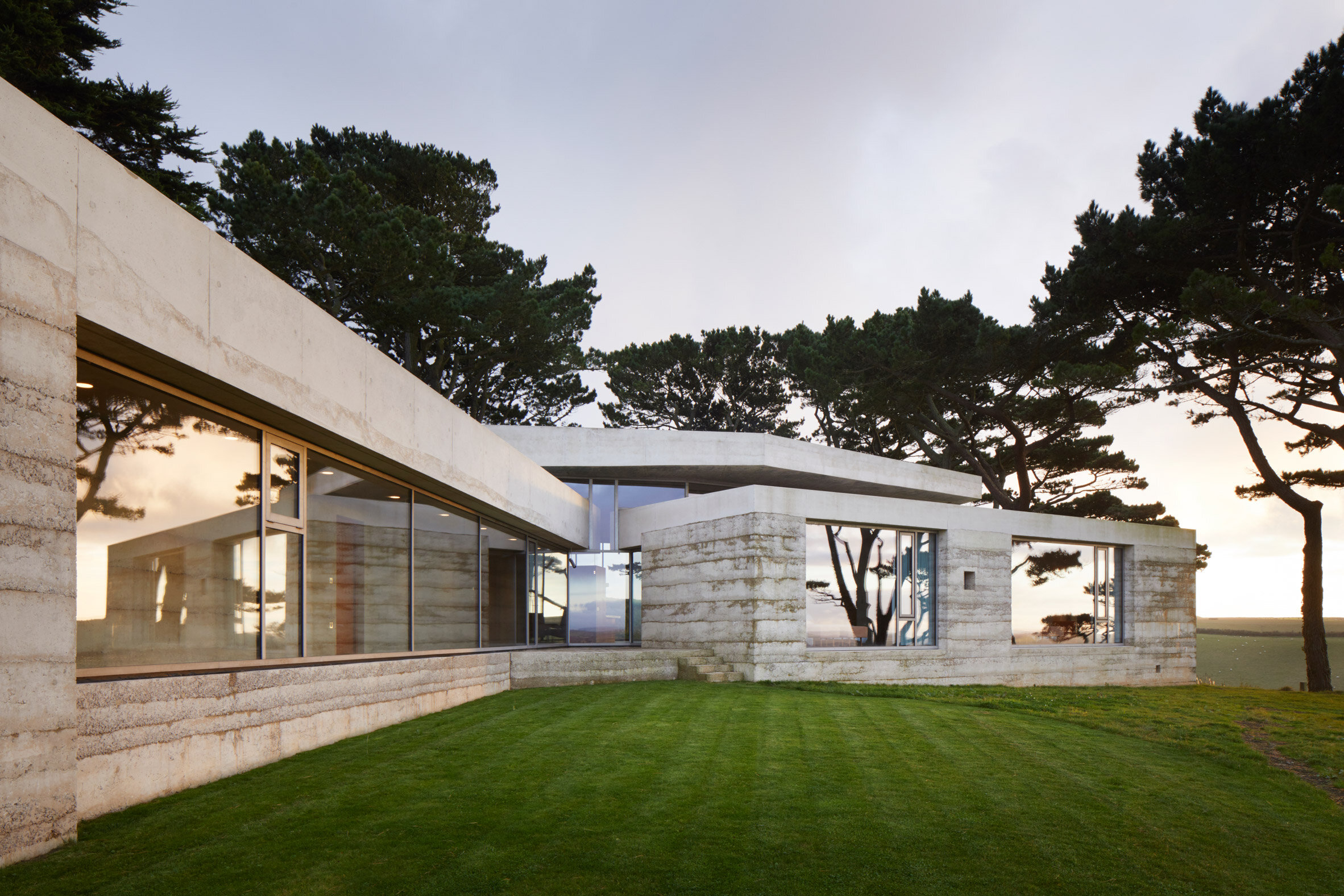
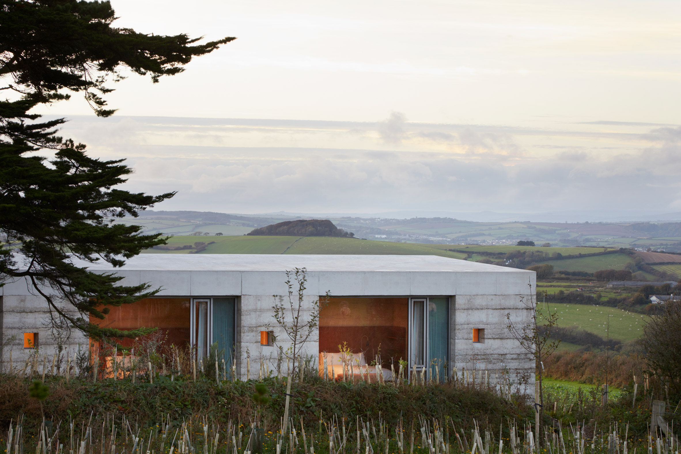
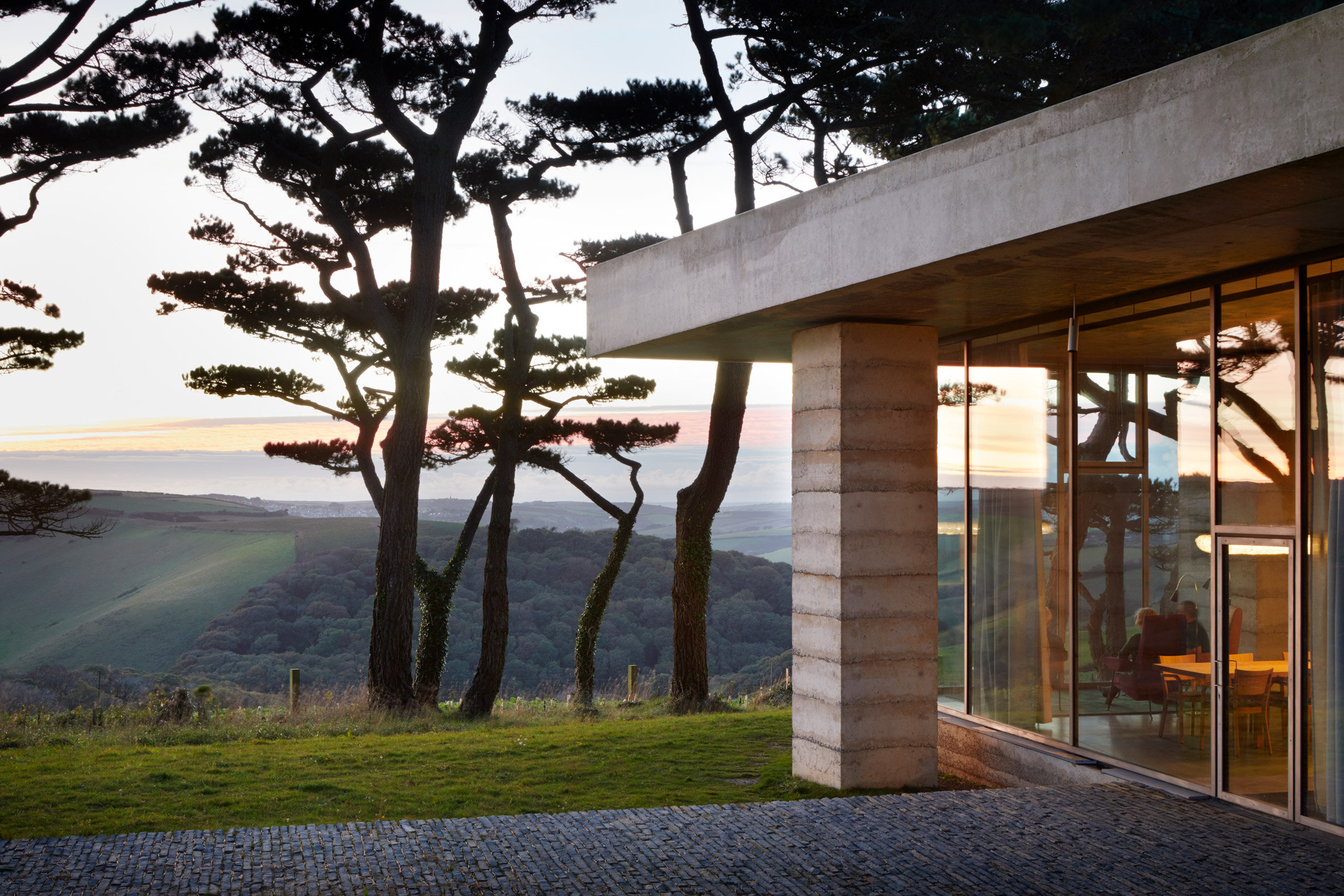
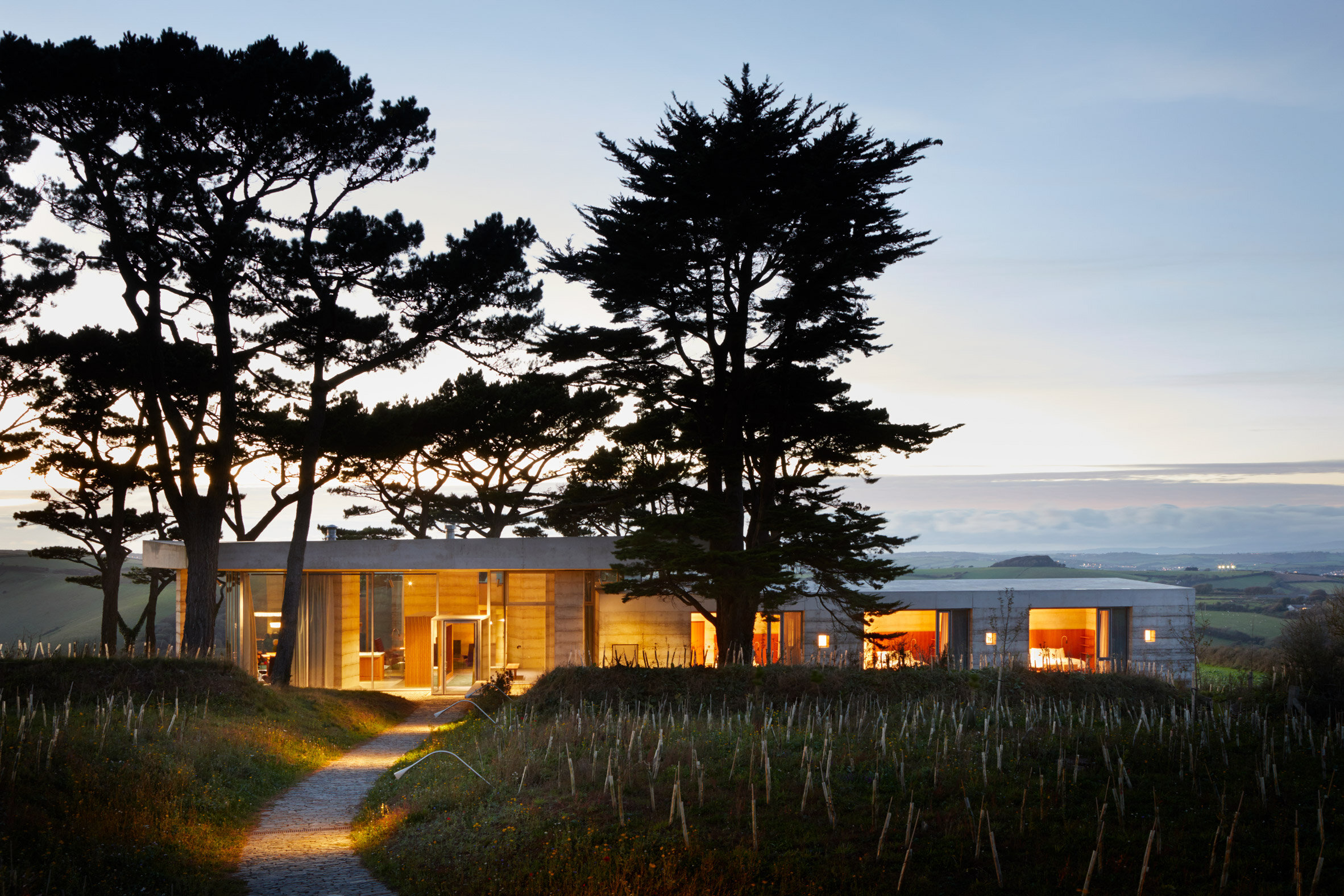
Secular Retreat in Devon by Peter Zumthor for Living Architecture
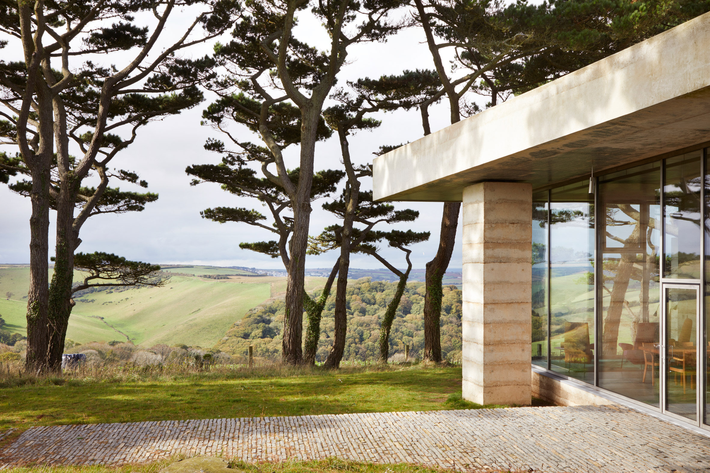
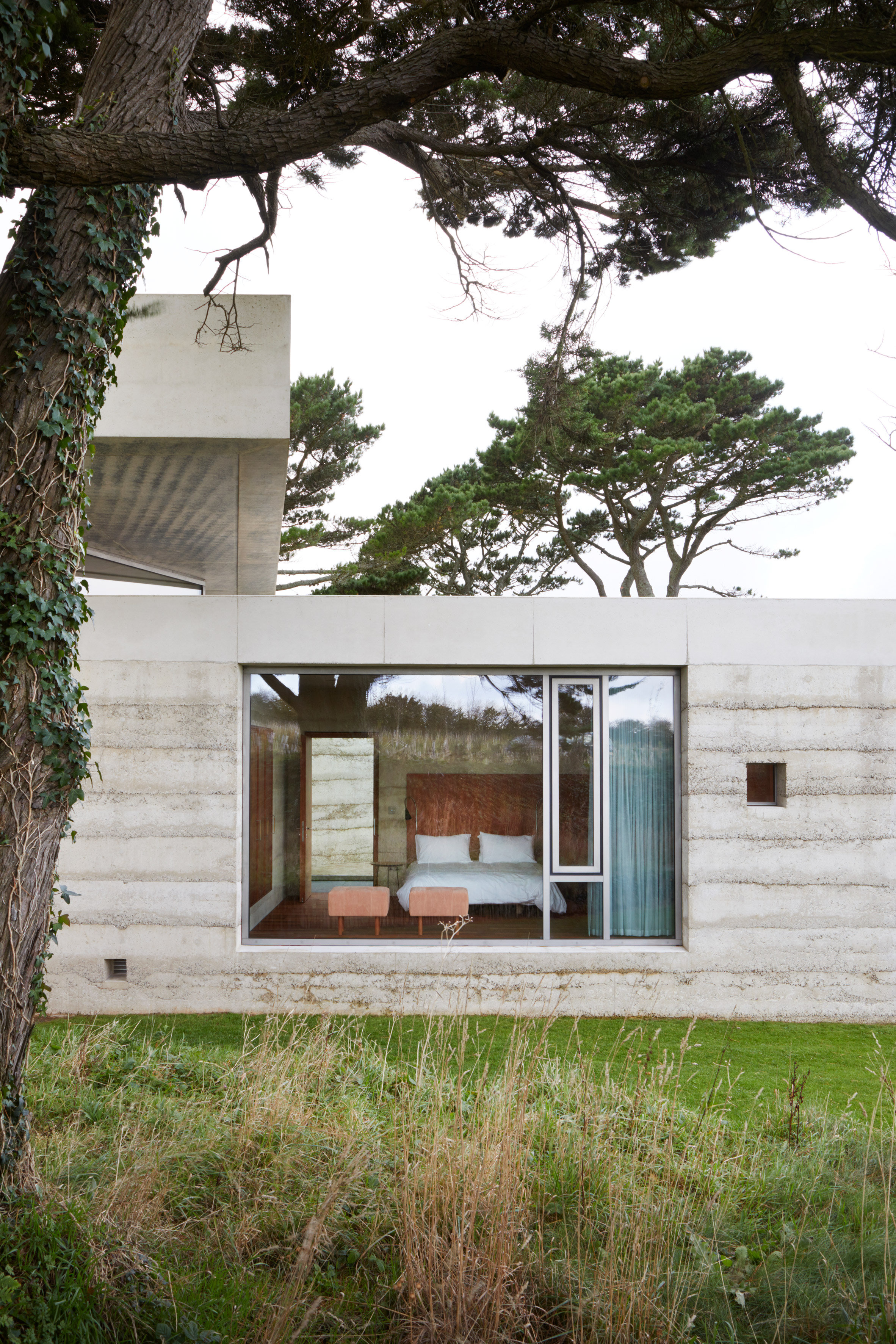
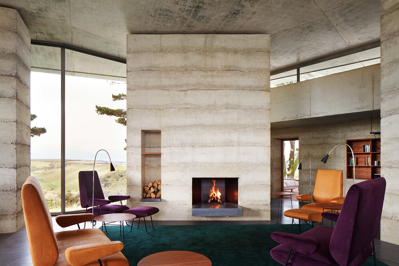
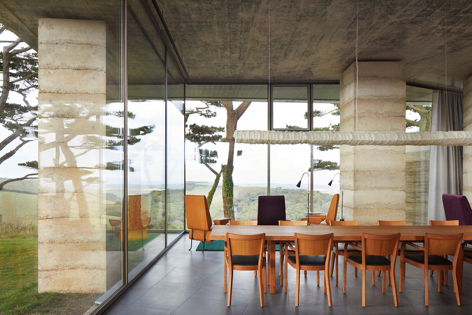
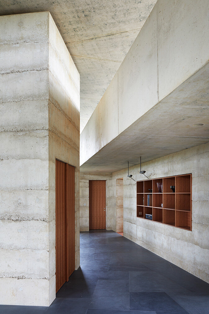
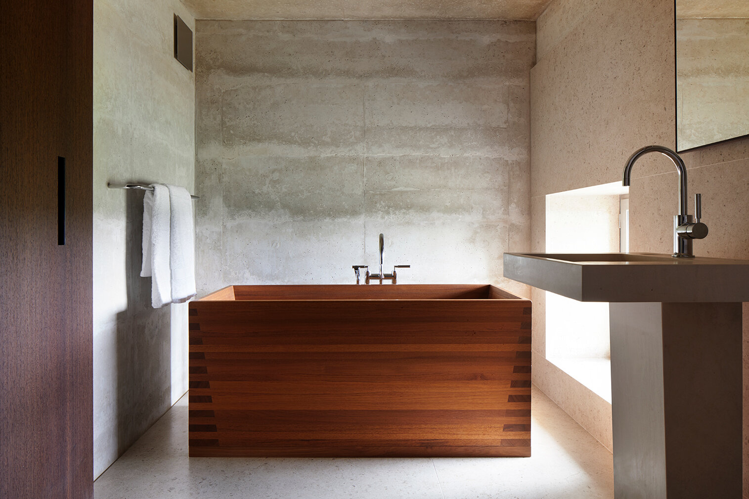
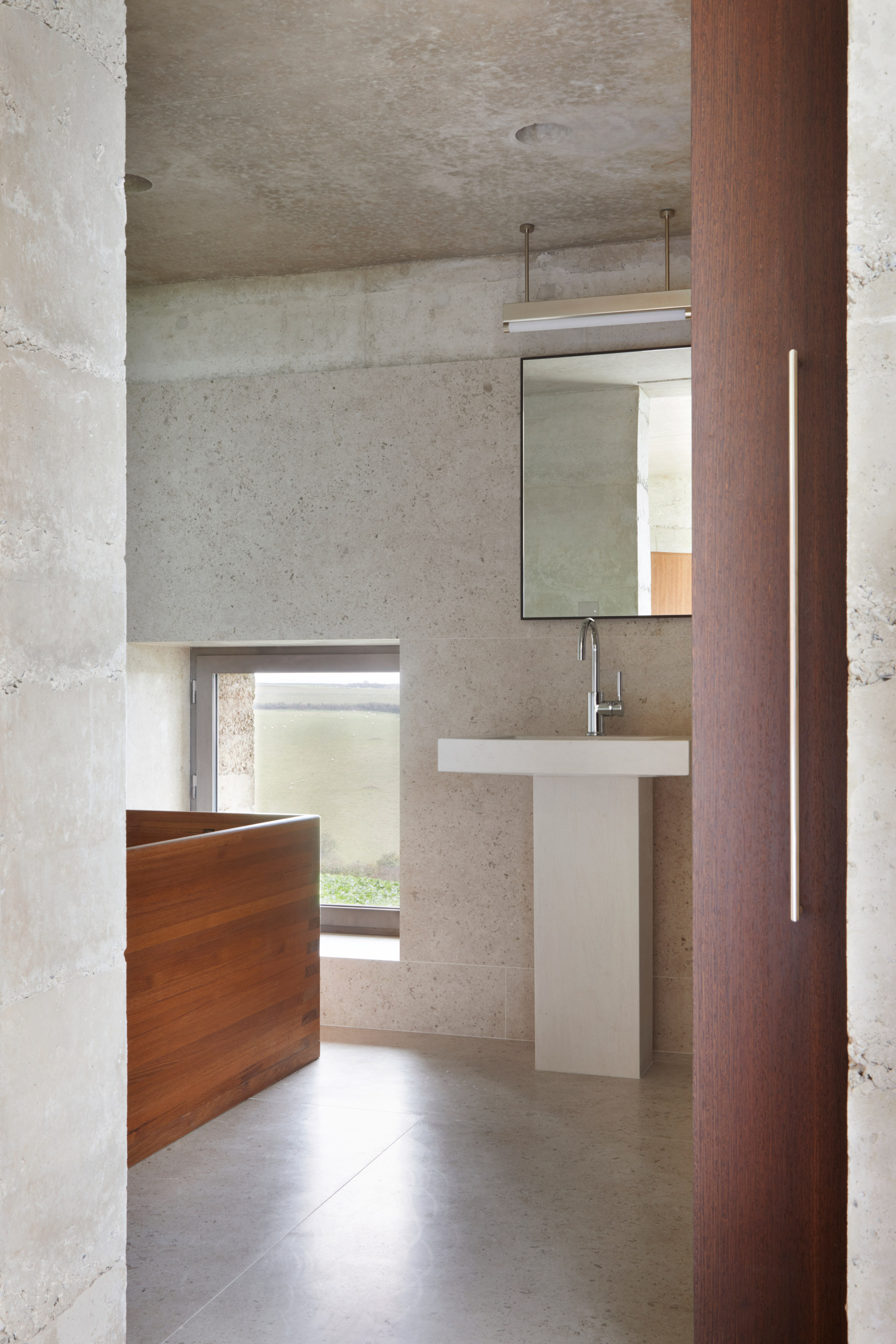
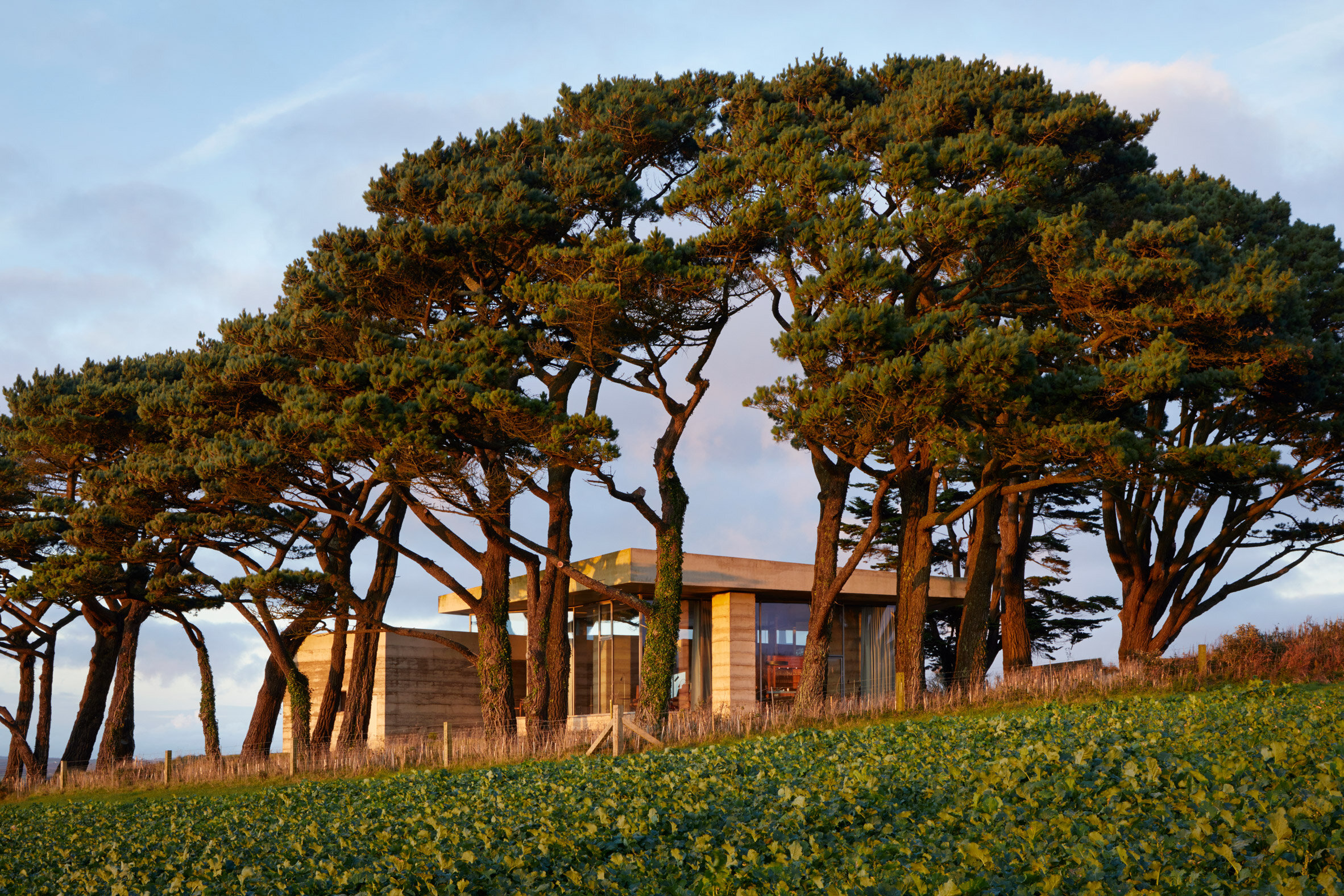
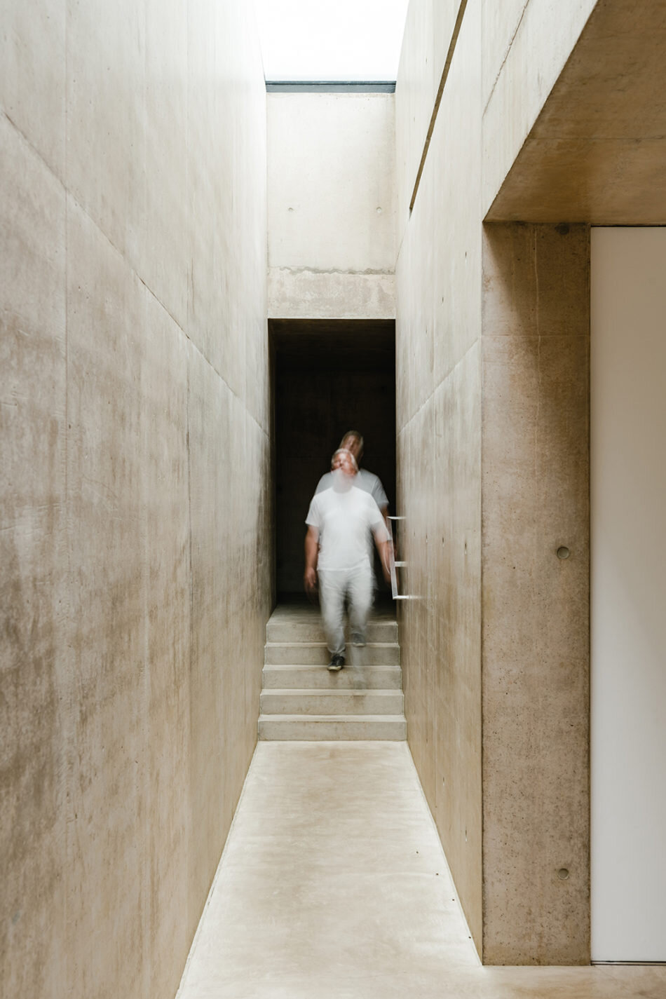
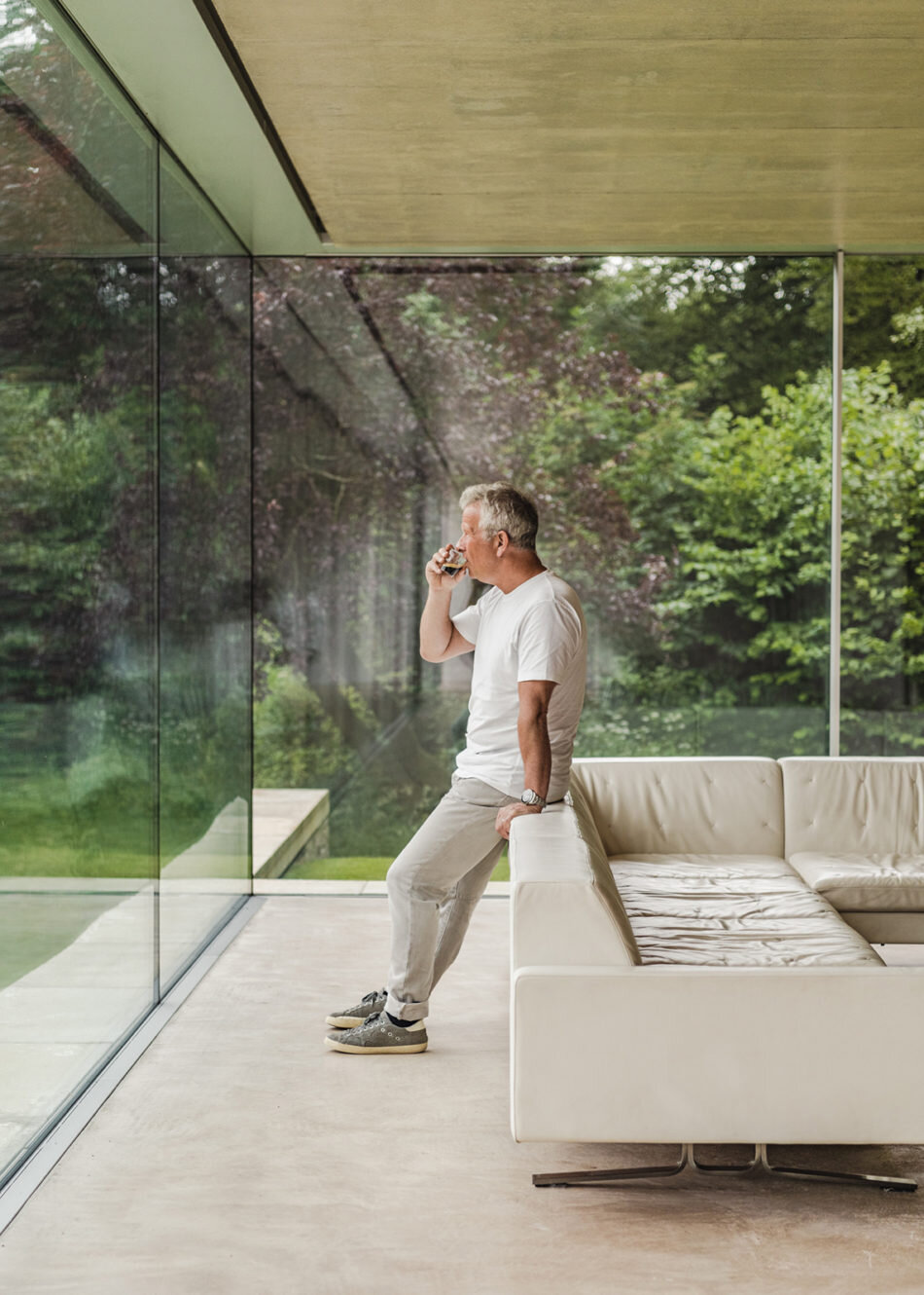
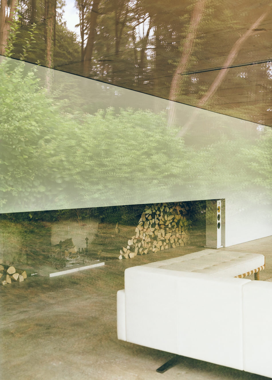
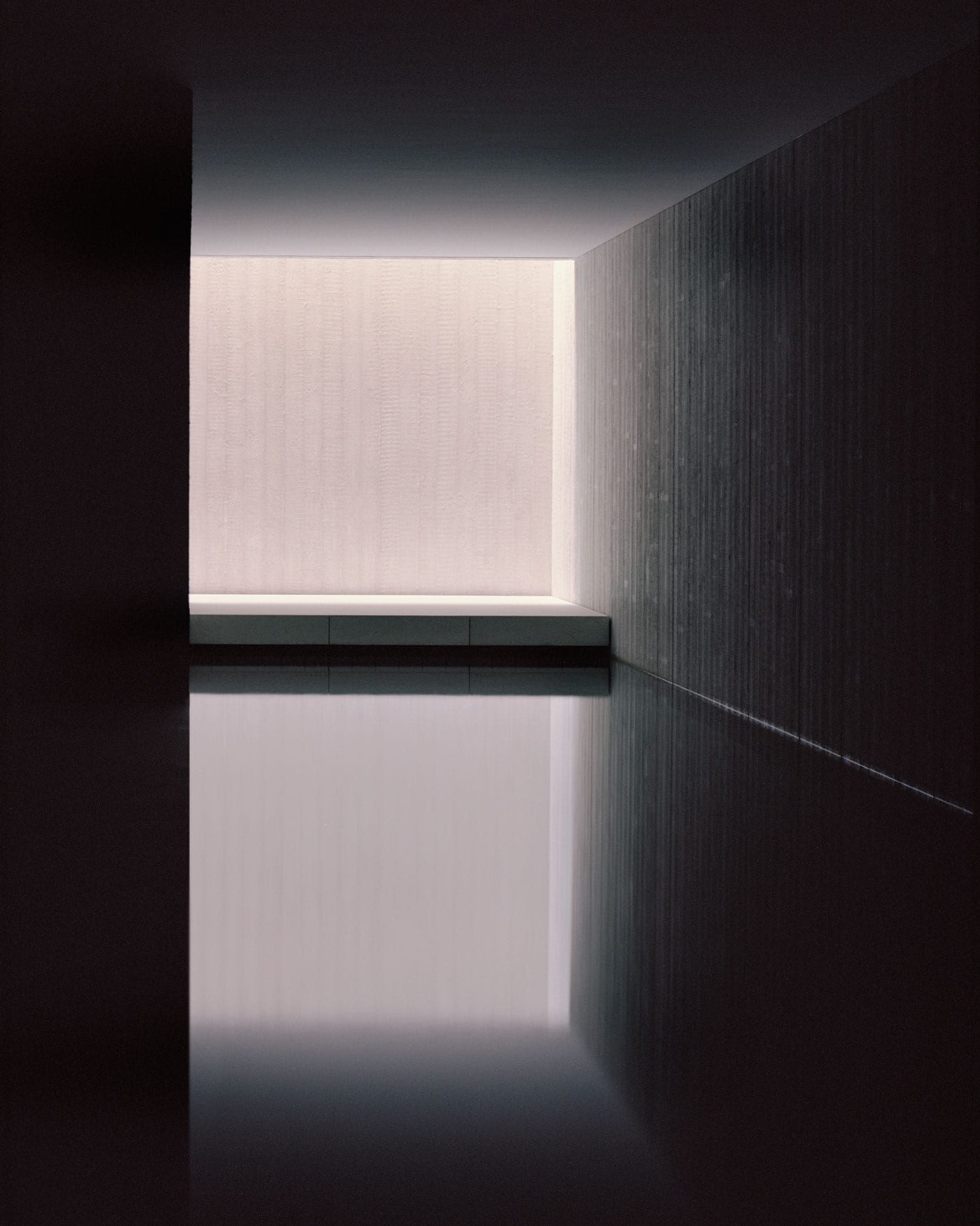
Words by Rowan Moore for The Guardian | In the Secular Retreat, the latest in the Living Architecture program of building beautiful modern holiday homes, a thick slab of concrete hovers over a long, glass-sided corridor. Future visitors may not pay it much attention – they’ll be distracted by the lovely Devonian hills revealed and reflected by the glass – but it takes a lot to stop it toppling over: a lot of steel reinforcement, of its engineers’ mathematics, of arduous processes of construction and ultimately of money. It is a feat of building whose achievement is to make you look somewhere else.”
If it would have been simpler and cheaper to insert a column or two, that would have undermined the “horizontality” essential to the house’s architect, Peter Zumthor. “Look at the landscape,” he says. “There’s horizontality all about,” and a column would indeed have jarred. Highly engineered nuance, effort in the service of the effortless, artful simplicity – all are essential to the effect of this work. It’s a gliding swan of a building, propelled unseen by furiously paddling feet.
This five-bedroom, single-storey house, 375 square metres in area, has been 10 years in the making (it has been under construction for four). Its site was acquired early in the life of Living Architecture, which the writer Alain de Botton set up in 2006 to enable people to enjoy the pleasures of contemporary architecture at relatively affordable prices. Zumthor (b1943), a famously meticulous son of a Swiss cabinet-maker, is not one to be rushed. He is demanding of his clients: “I don’t do buildings for a quick return,” he says, “that is not what I am offering in my shop.”
He goes beyond ordinary attention to detail. Zumthor interrogates construction methods, pummels them, stretches them, drives them like an exacting athletics coach to do what they didn’t know they could. And so the stone floor required a long-range discussion about the placing of every piece, between the quarry in Somerset and Zumthor’s office in Switzerland, which also required a two-year search to find a quarry with both the right kind of stone and a willingness to take part in the intricate design process. House-high panels of triple glazing had to be shipped to site from a preferred German manufacturer via narrow West Country lanes.
Such things can’t happen without individuals such as Living Architecture’s director, Mark Robinson, and the project’s building contractor Simon Cannon, who gave years of their lives to interpreting Zumthor’s wishes. “You need people like this,” he says, “people who are proud of it, who want to tell their grandchildren that they did it.” It’s a labour of love, by builders and client as well as architect. Living Architecture won’t divulge the cost, but it will be in the millions, and it is clearly their most expensive project.
Images by Jack Hobhouse for Living Architecture
Keralan house by Axel Vervoordt and studio mumbai
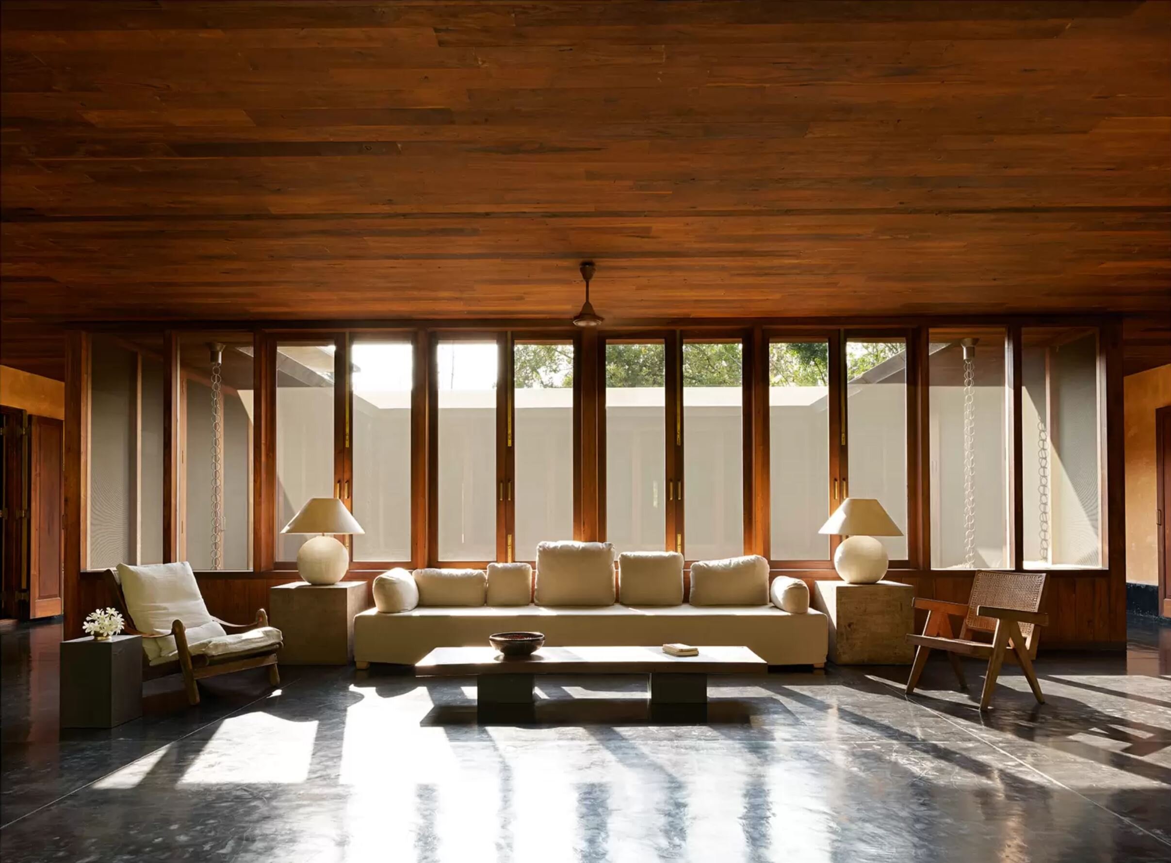
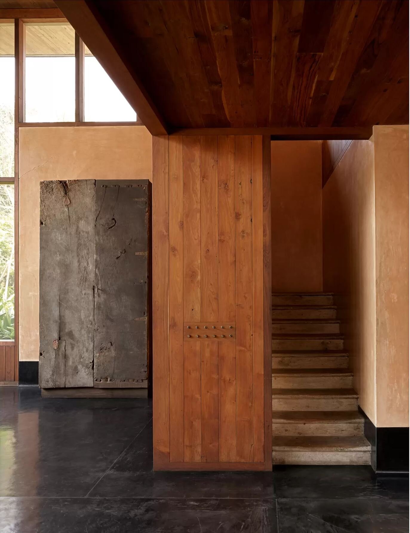
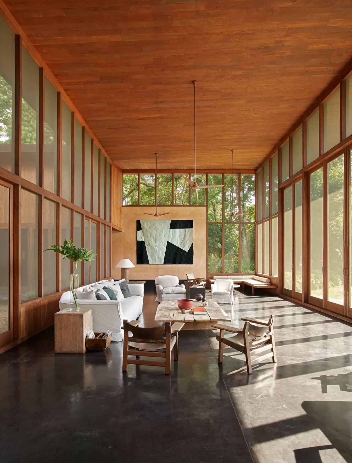
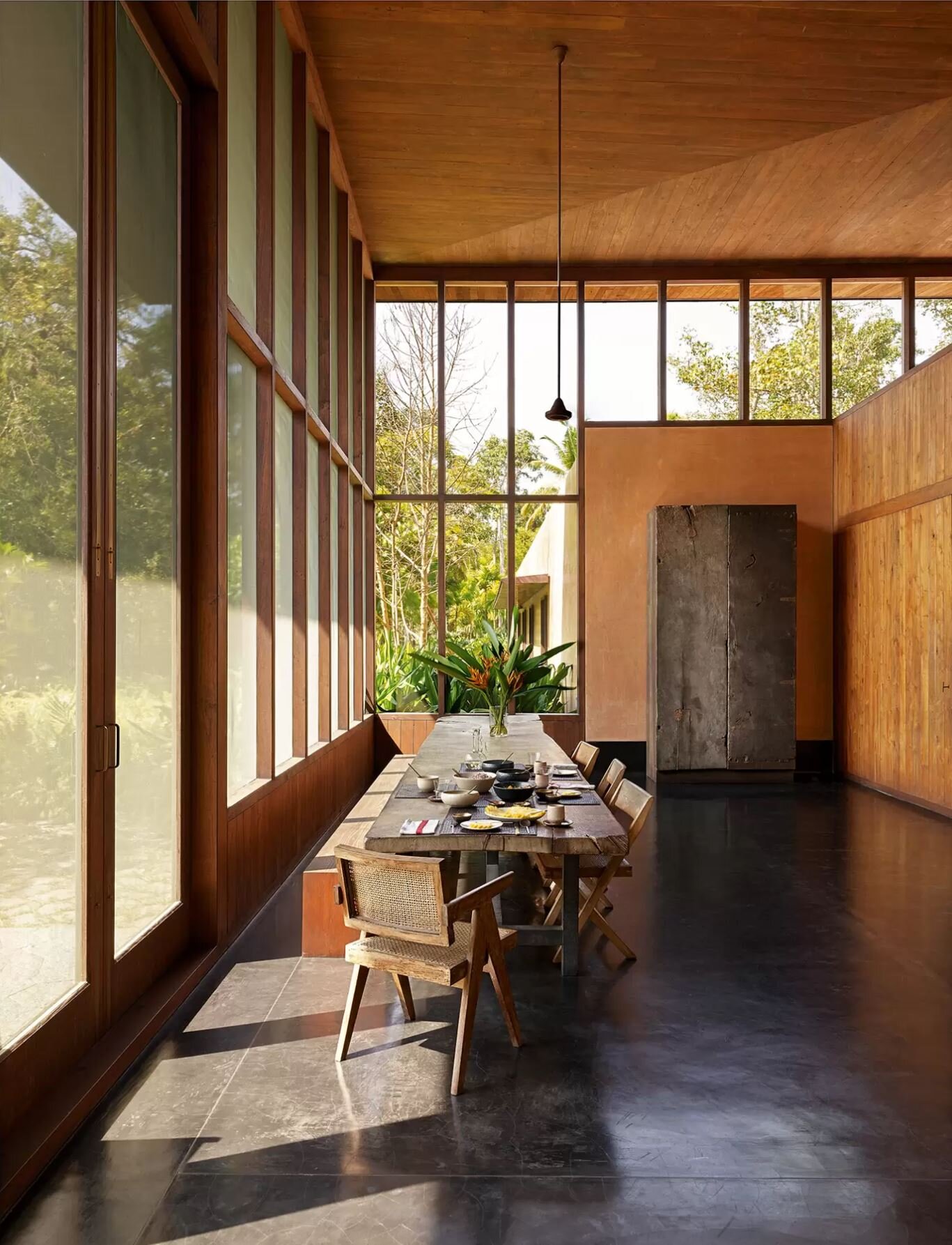
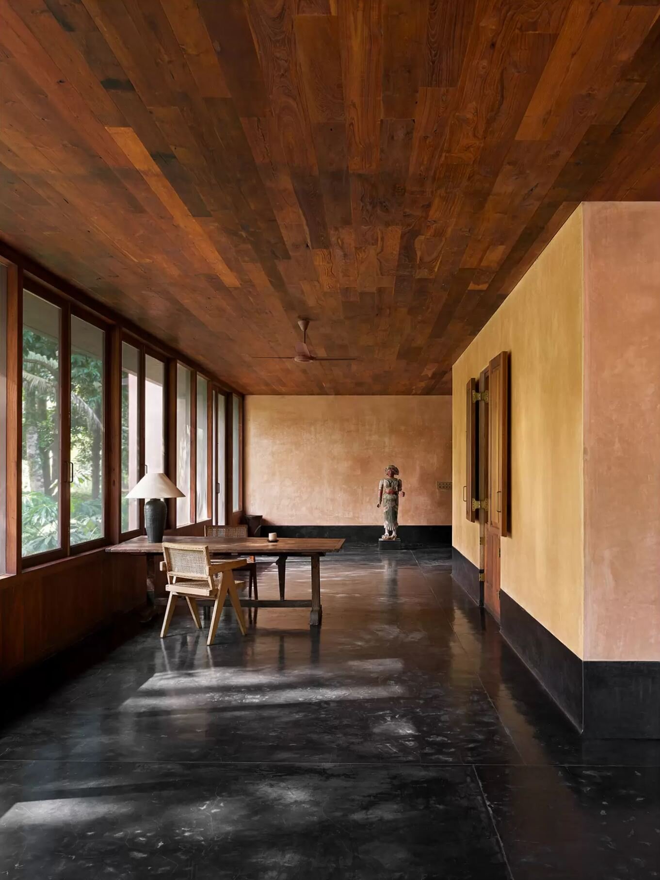
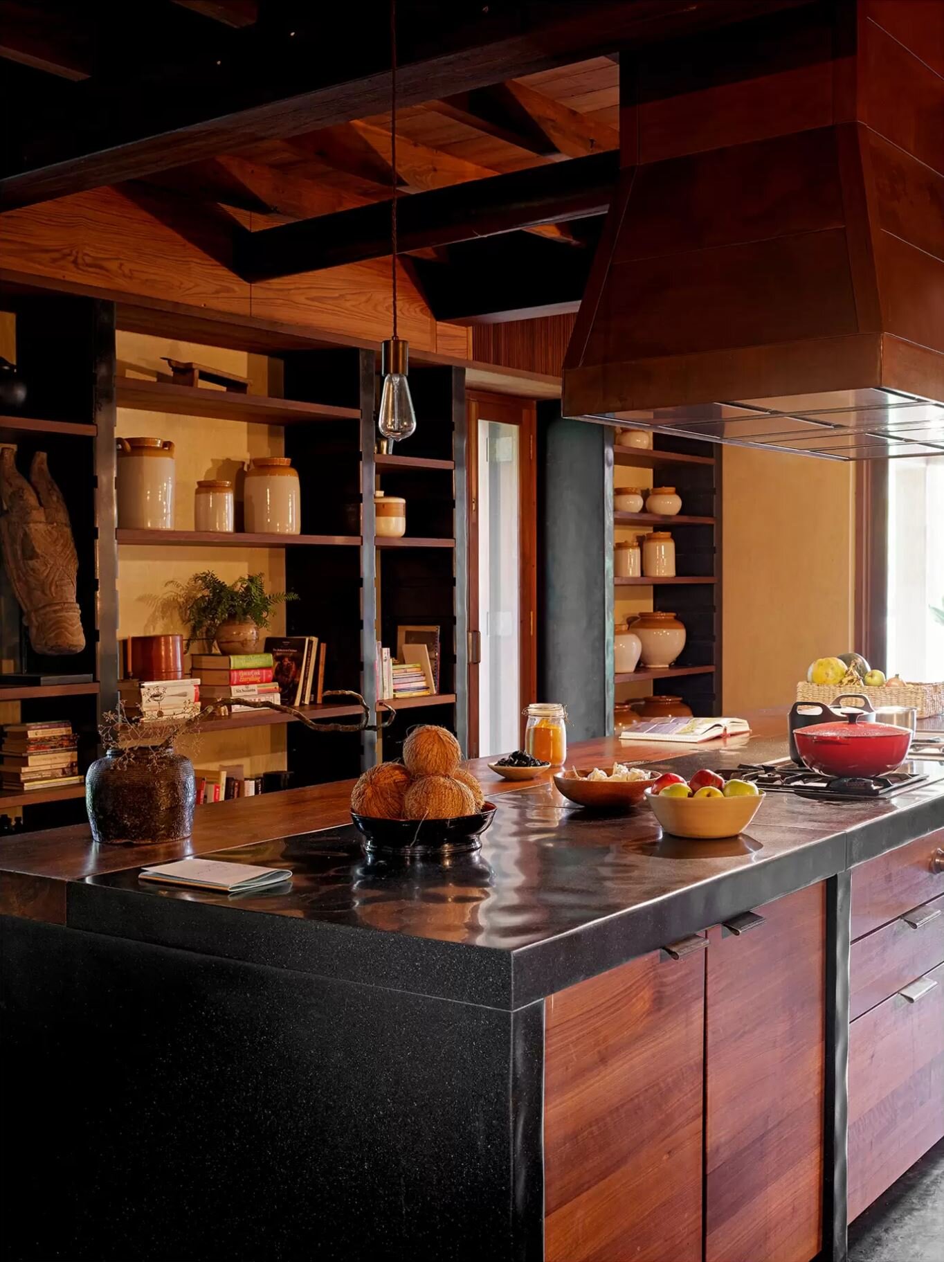
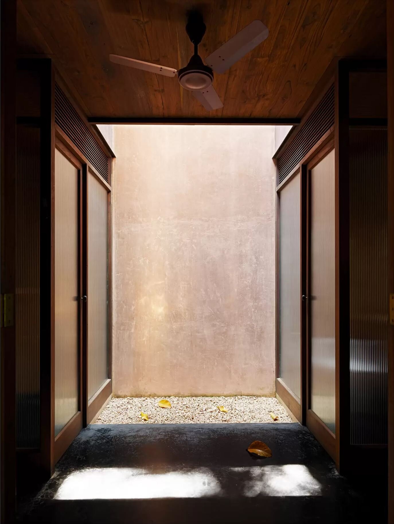
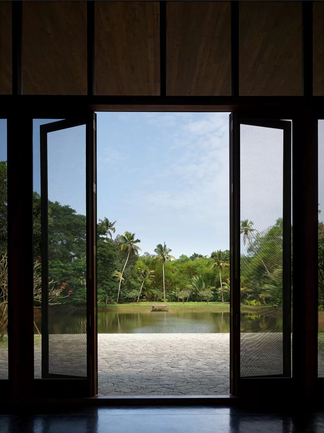
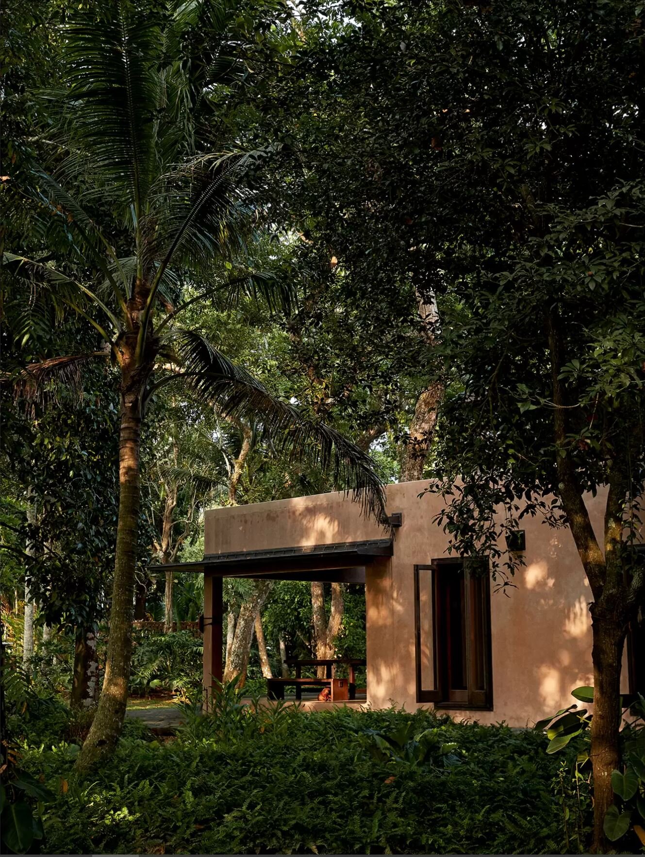
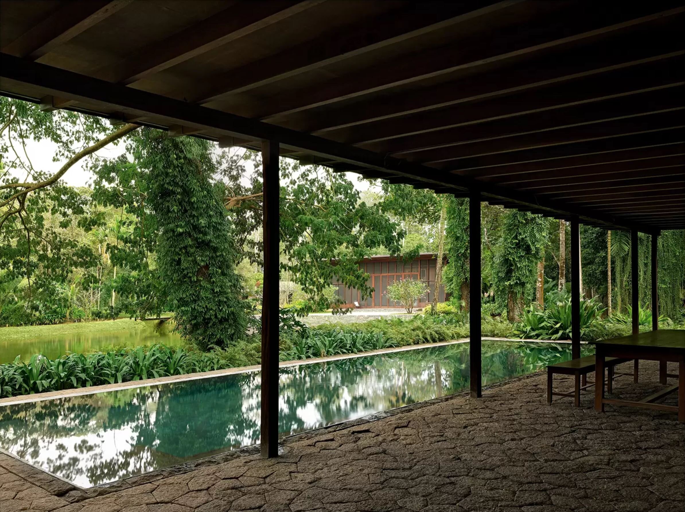
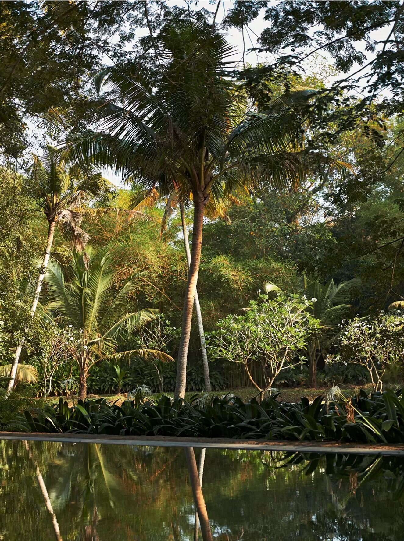
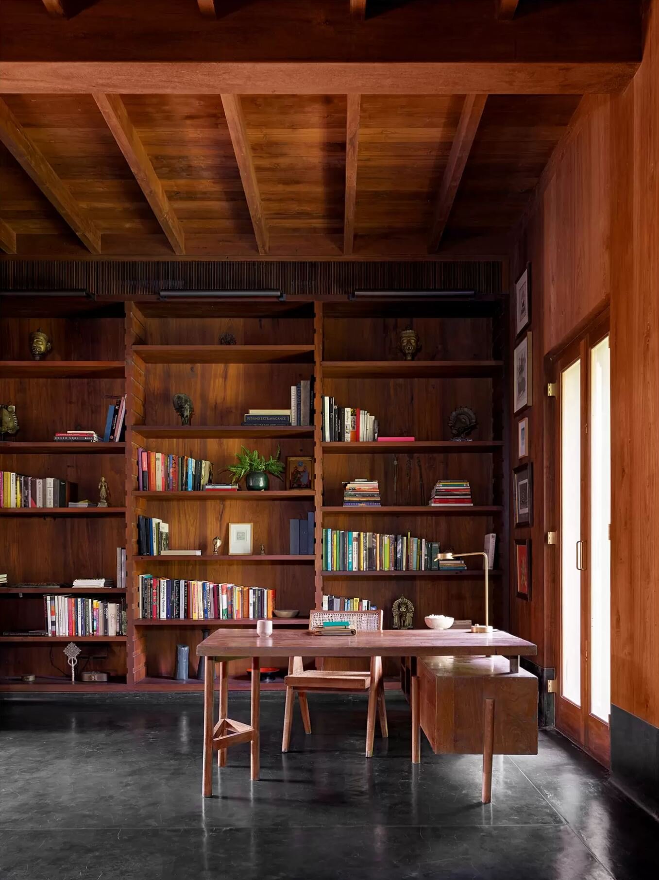
The owners of this wooden house in Kerala, India brought their favourite designers (Bijoy Jain, founder of Studio Mumbai, landscape architect Tom Stuart-Smith and interior designer Axel Vervoordt) together to create this family home that blends into the landscape.
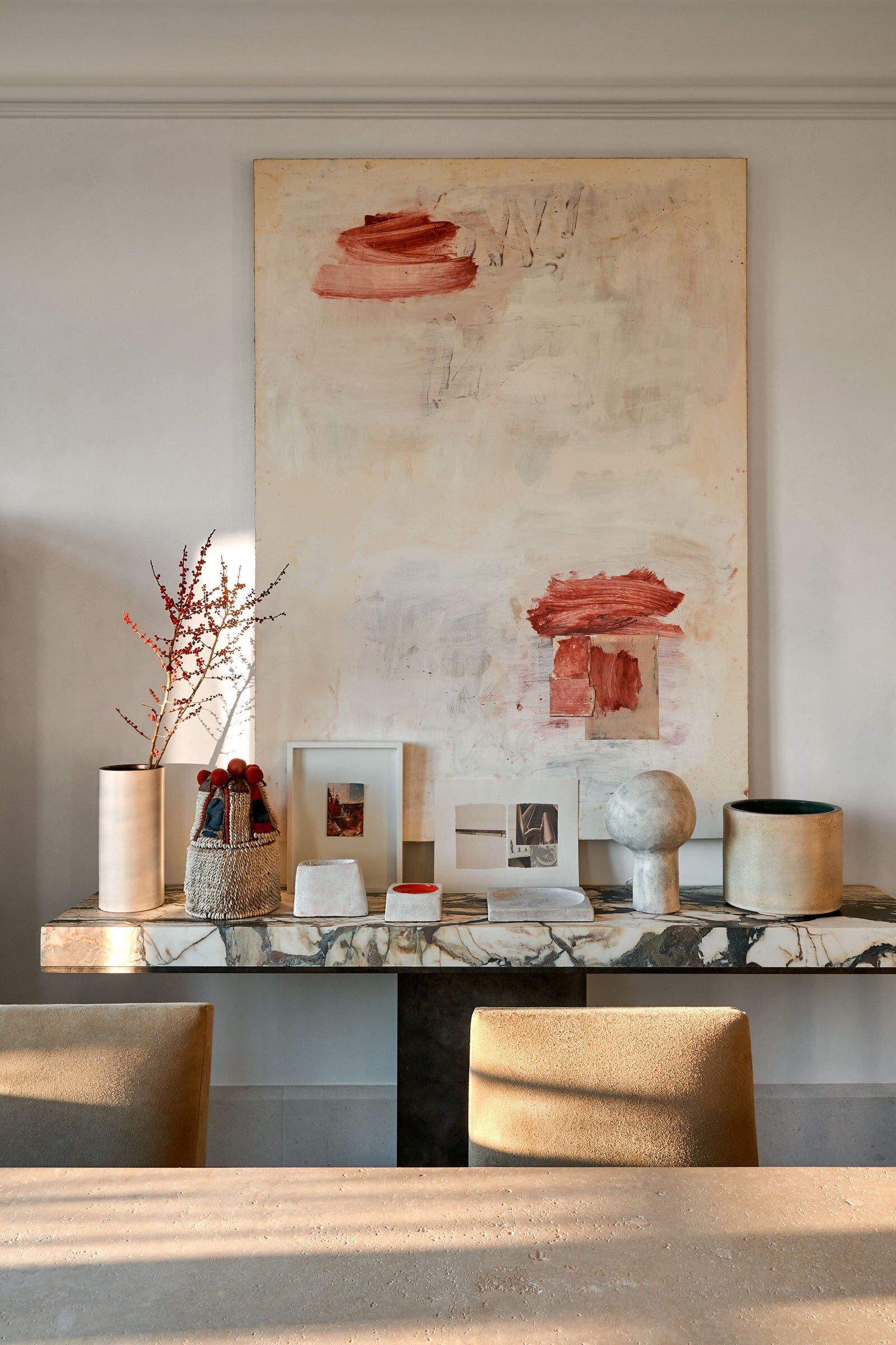
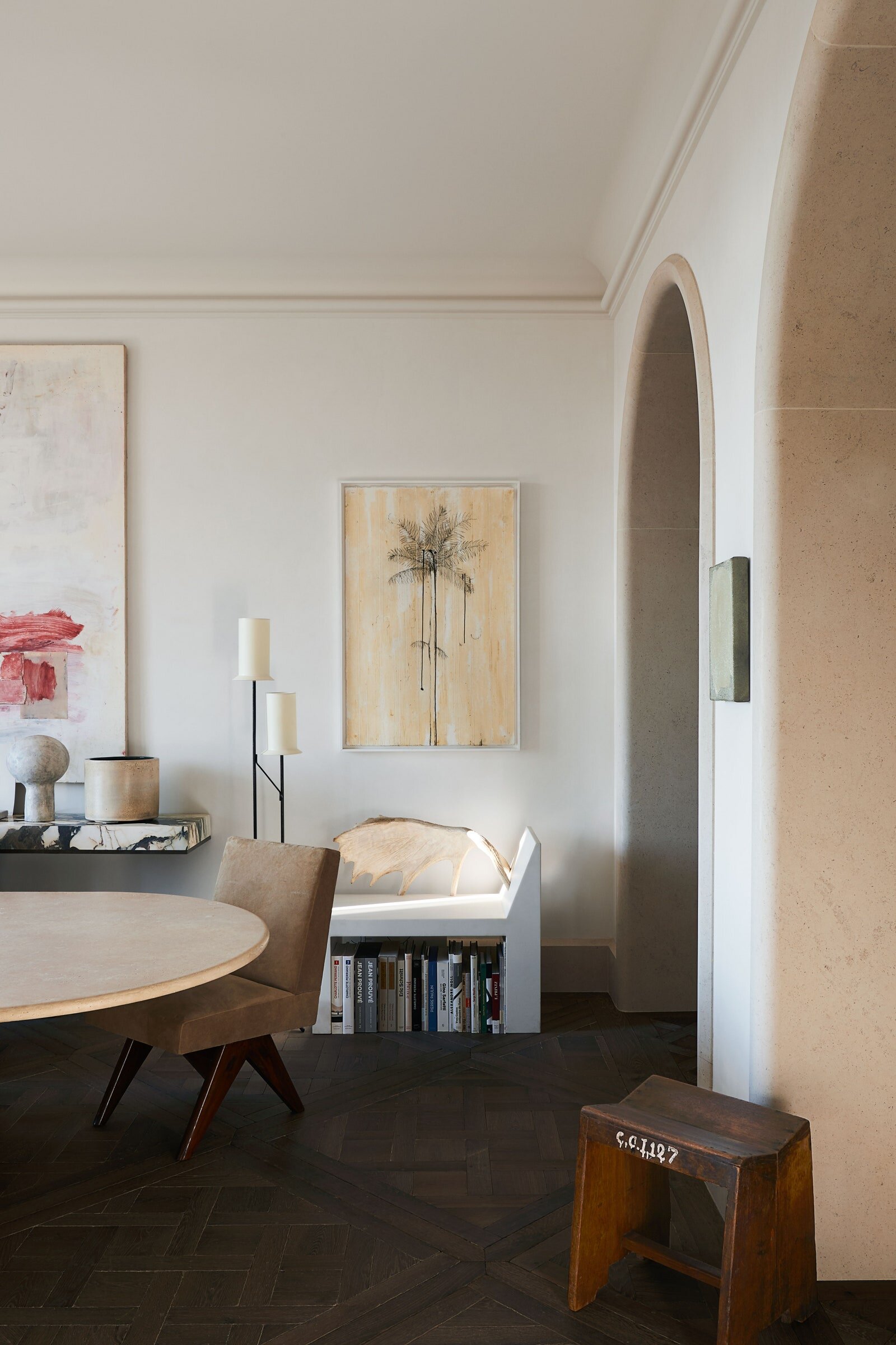
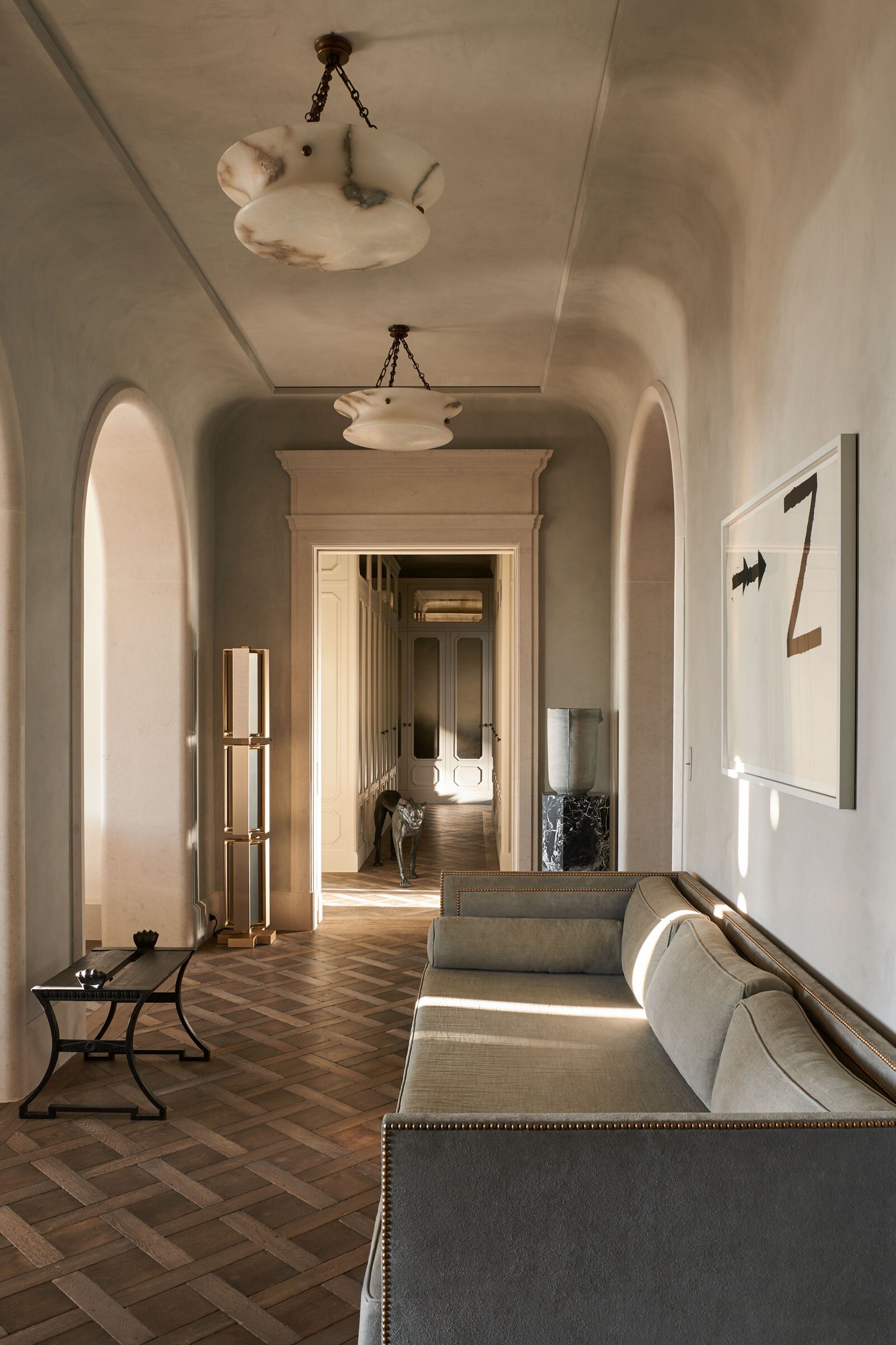
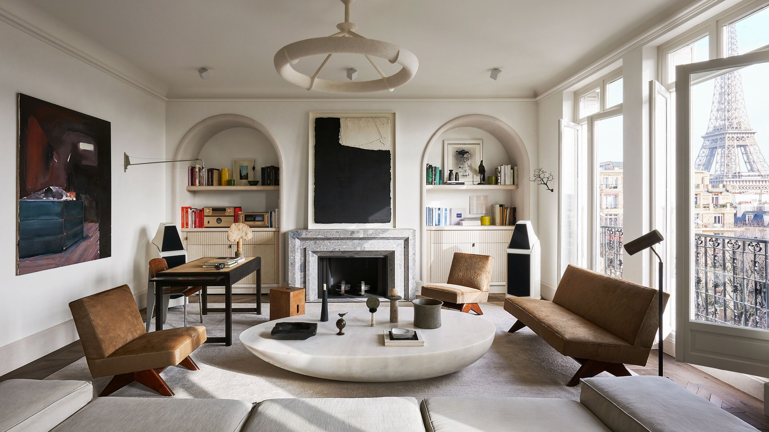
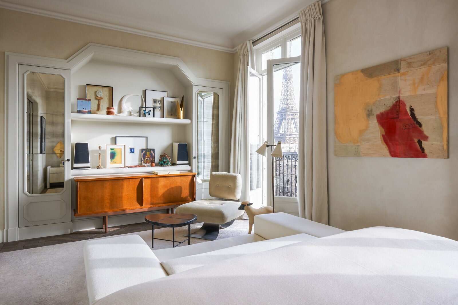
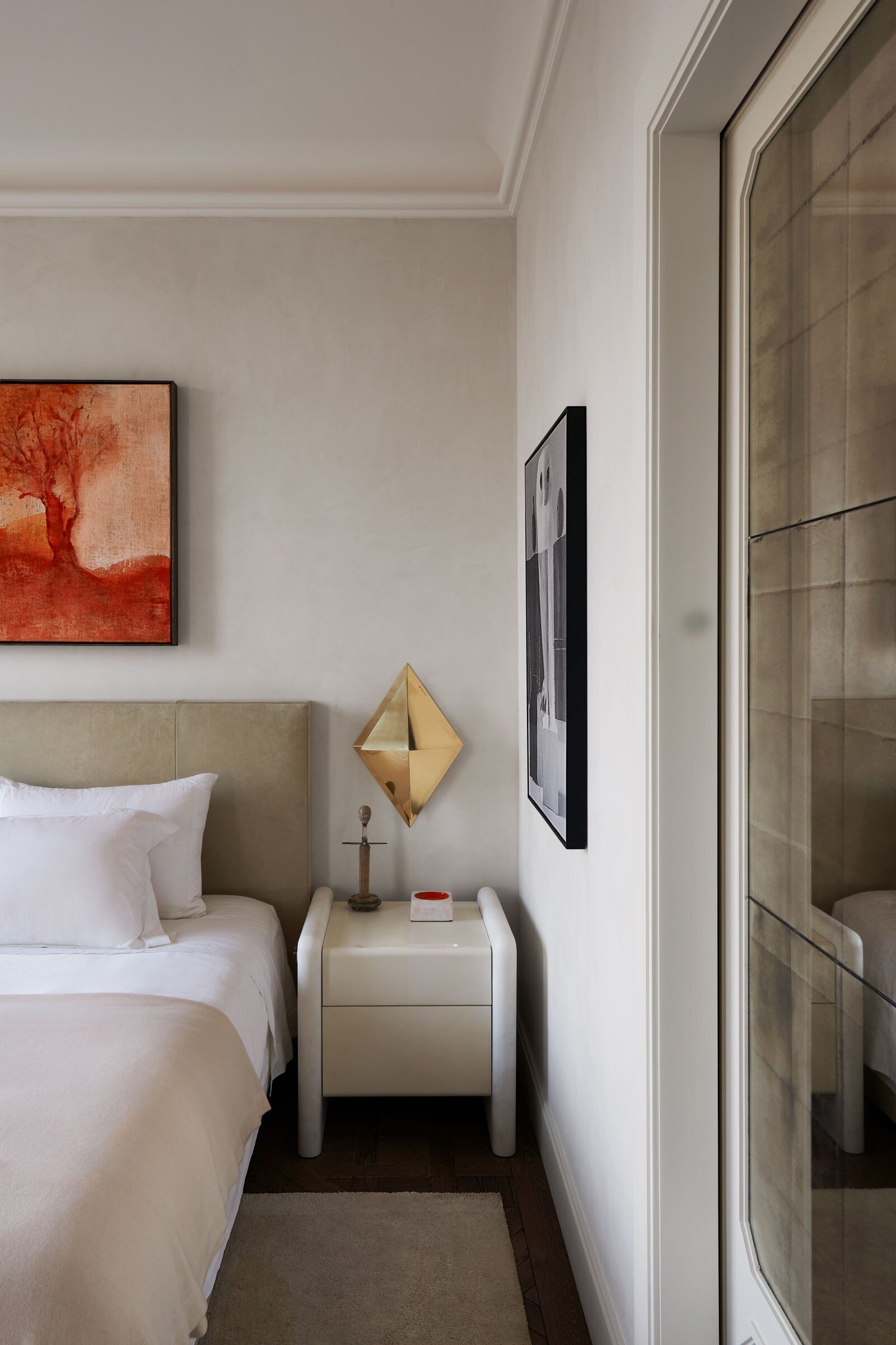
French Architect Joseph Dirand's New Apartment in Paris
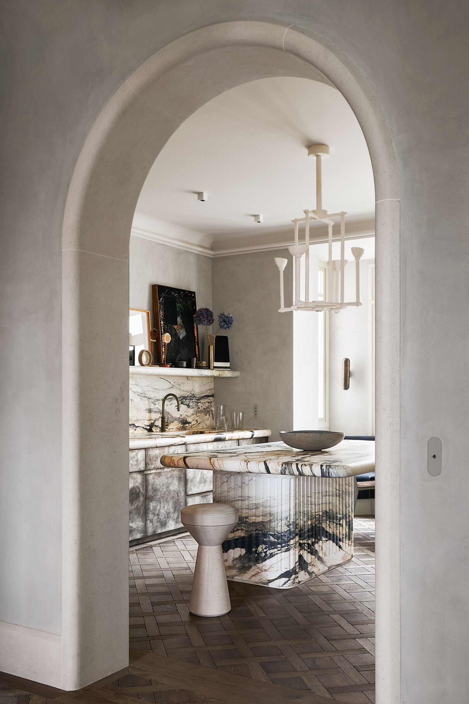
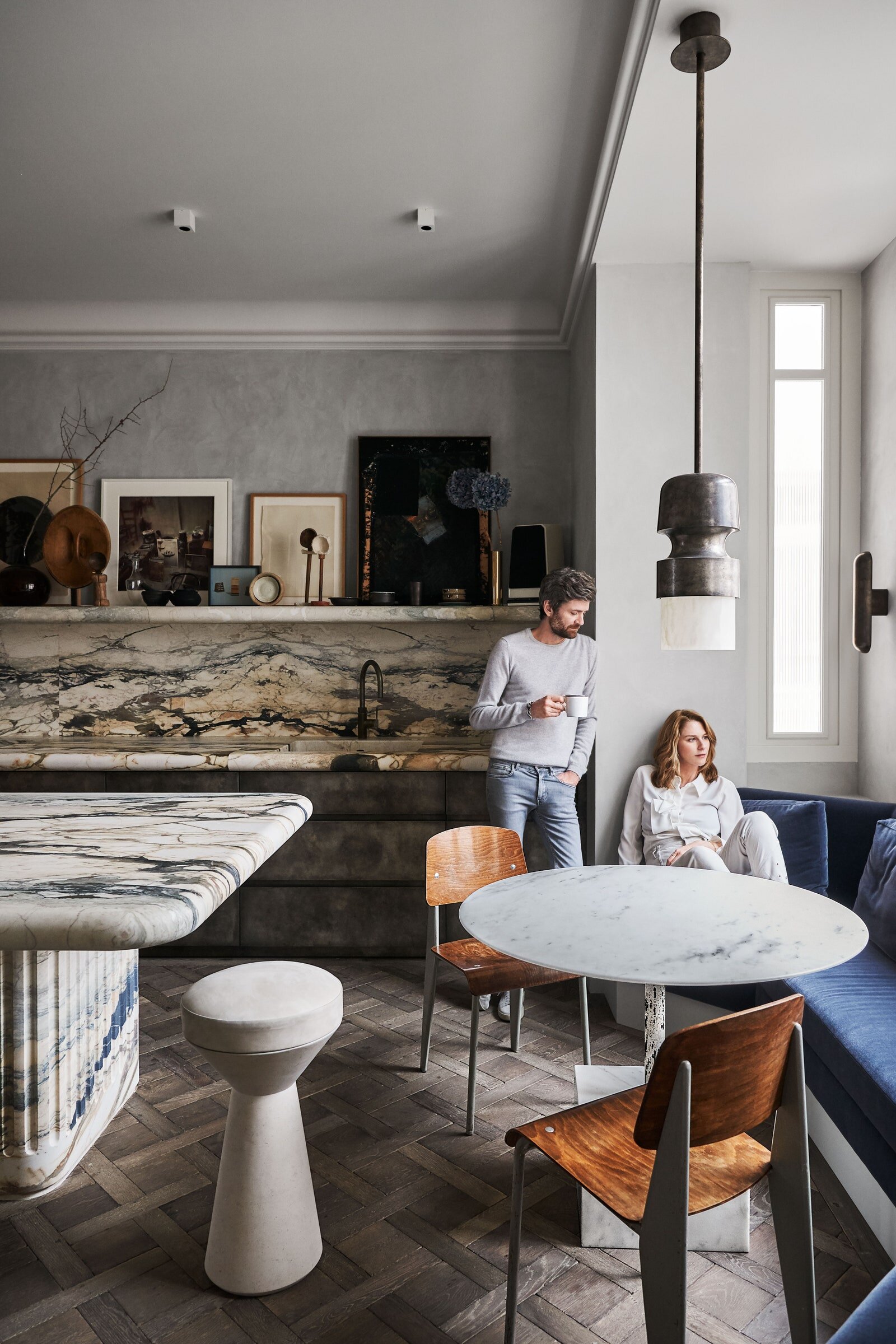
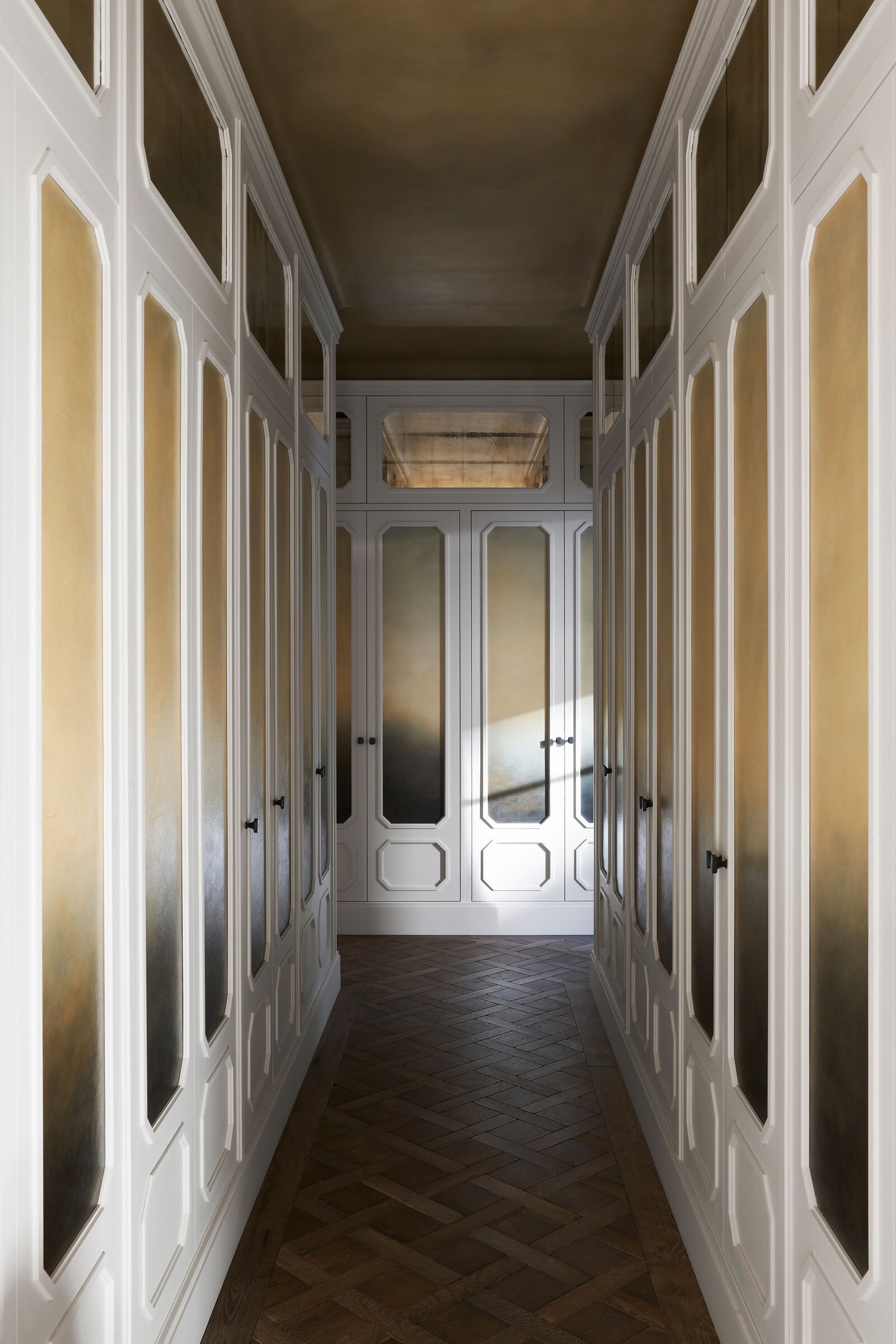
It was probably inevitable that Joseph Dirand would go into architecture and his brother Adrien would turn to photography. The pair were sons of Jacques Dirand, one of the decor world’s preeminent photographers. Throughout their childhood in Paris, they’d hover over the light box, loupe to eye, and gaze at the mesmeric locales their father had captured on 35mm slides. “Venetian palaces, Palladian villas, artists’ houses, masters’ ateliers, cabinets of curiosity, princesses’ boudoirs, Tuscan castles, Napoleonic apartments, fishermen’s huts,” Adrien, who took the pictures for this story, wrote in Joseph Dirand: Interior, published by Rizzoli several years ago. “We would relive these trips with few words, passion, and a hint of mischief.” That’s also an apt way to describe Dirand’s work. He sees his approach as “ornamental minimalism,” he explained on a winter Friday night at his new home on the Right Bank. “I create space with equilibrium and a classic base.” Yet “there are details and compositions,” he continued, like mixing marble powder into cement to give it a glistening silkiness, or painting mirrored closet doors with foggy, Turner-esque murals, or scorching silver-clad kitchen cabinets to evoke the smoky allure of a Belle Époque bordello. This would be the mischief.
Dirand, his wife, Anso, an events planner, and their two daughters (each from their previous marriages) lived for six years on the Left Bank. But with a baby on the way, they needed to upsize. They searched without much luck—even in Paris, “a noble building is hard to find,” he noted. Then their landlord mentioned a flat available in a building constructed on the Passy hill as a hotel for the Exposition Universelle of 1900.
As soon as Dirand laid eyes on the 2,600-square-foot space, with its picture-postcard view of Paris, he knew he’d found what he’d been looking for, and how he would make it his. “I’ve spent my career putting together settings for others, but rarely do I get to do it for myself,” he said. “So I was very precise about what I wanted. Design for me must always serve its function—a space well studied delivering a certain quality of life.”
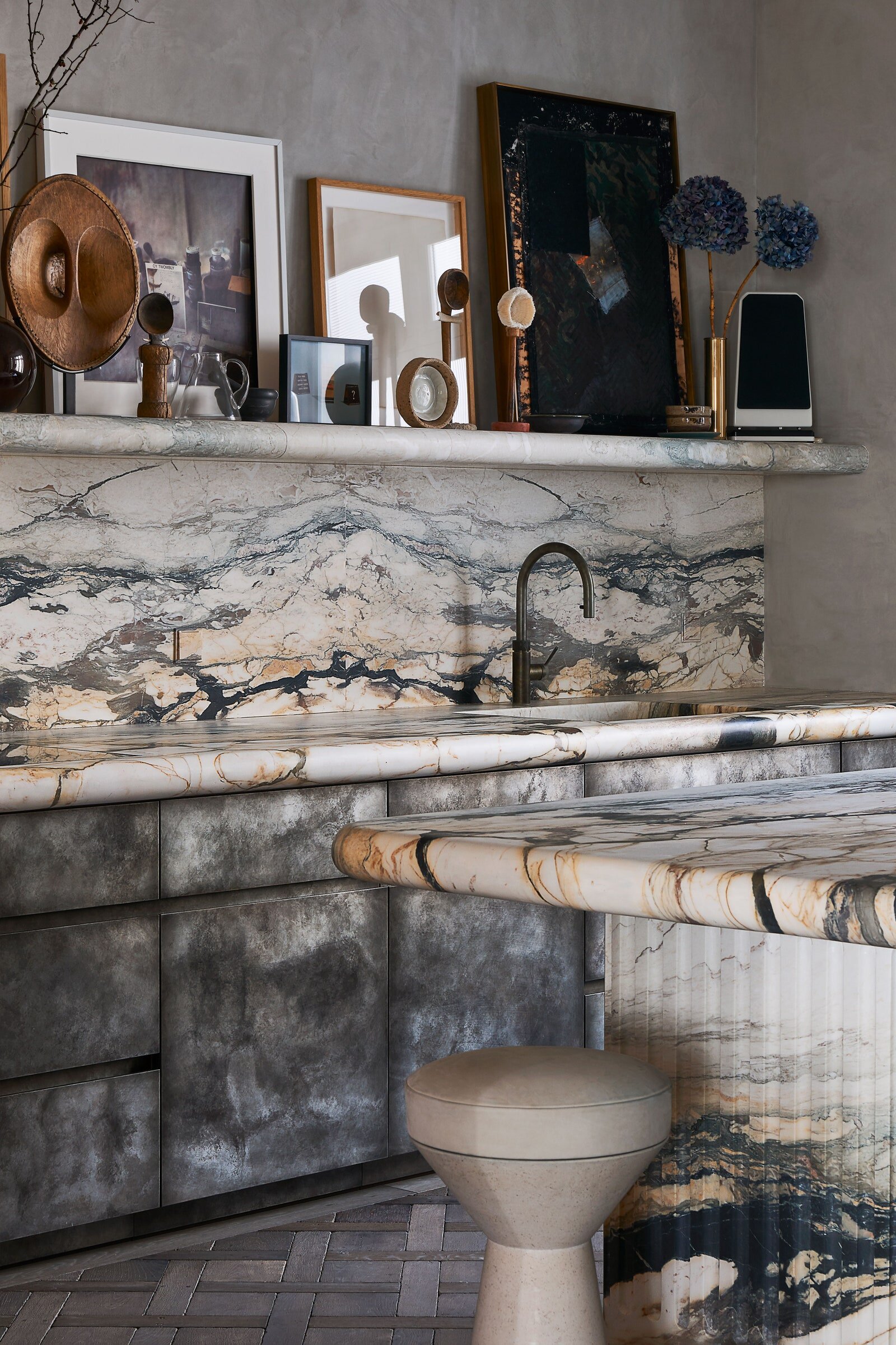
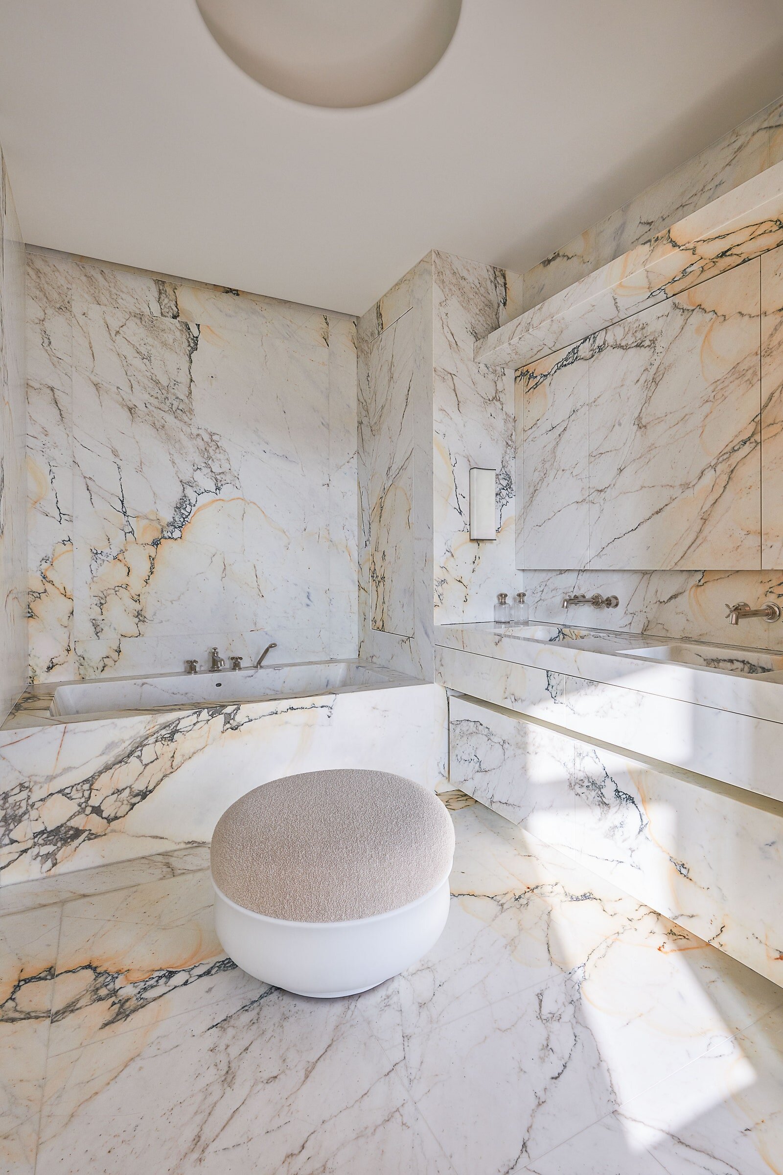
Clearly, stone is Dirand’s preferred material. Walls, flat surfaces, baths are all in soft-tone stone or marble—often cut from massive blocks he purchased years ago and stored, “waiting for the right moment.” As with all his commissions—which currently include a ground-up resort on Norman’s Cay in the Bahamas and interiors for the new Rosewood hotel on London’s Grosvenor Square, as well as design-world favorites like Paris’s Loulou and Monsieur Bleu (where he met Anso, a former manager there), The Surf Club in Miami, and Le Jardinier and Shun in New York—he brought on his favorite artisans, who know how to execute his “taste for details,” as he put it.
Words by By Dana Thomas and photography by Adrien Dirand for Architectural Digest
CASA M BY VINCENT VAN DUYSEN IN MELIDES PORTUGAL
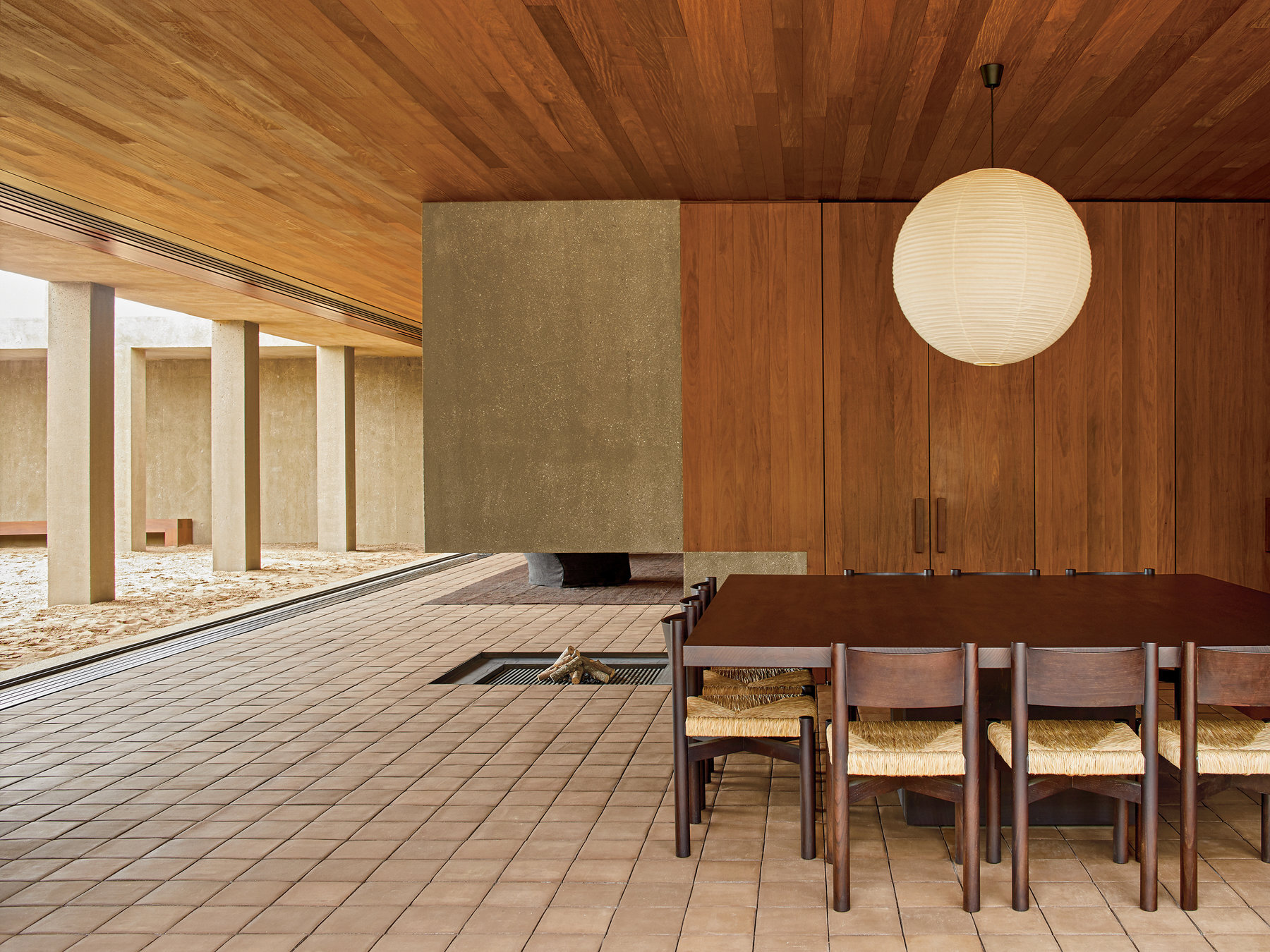
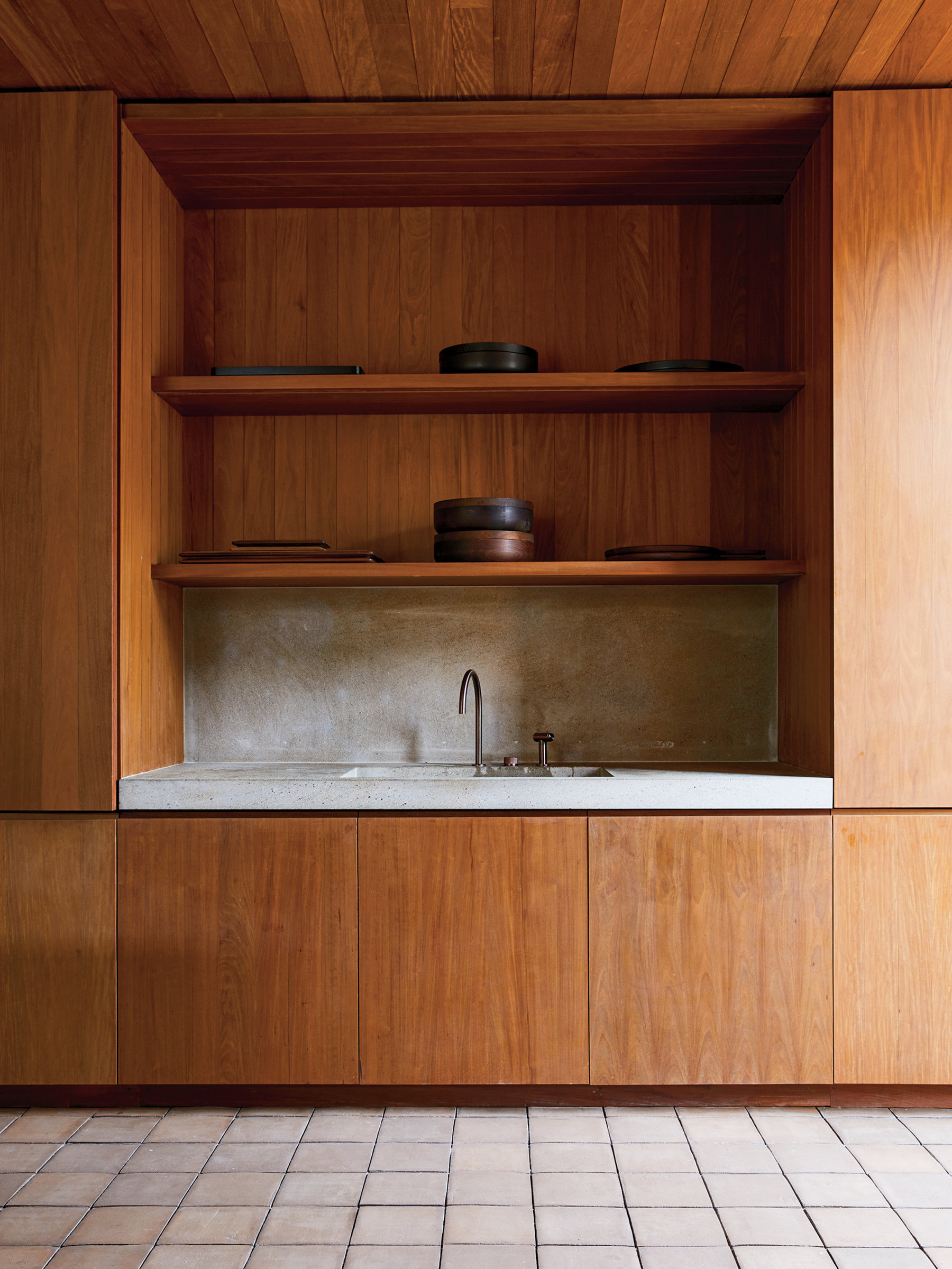
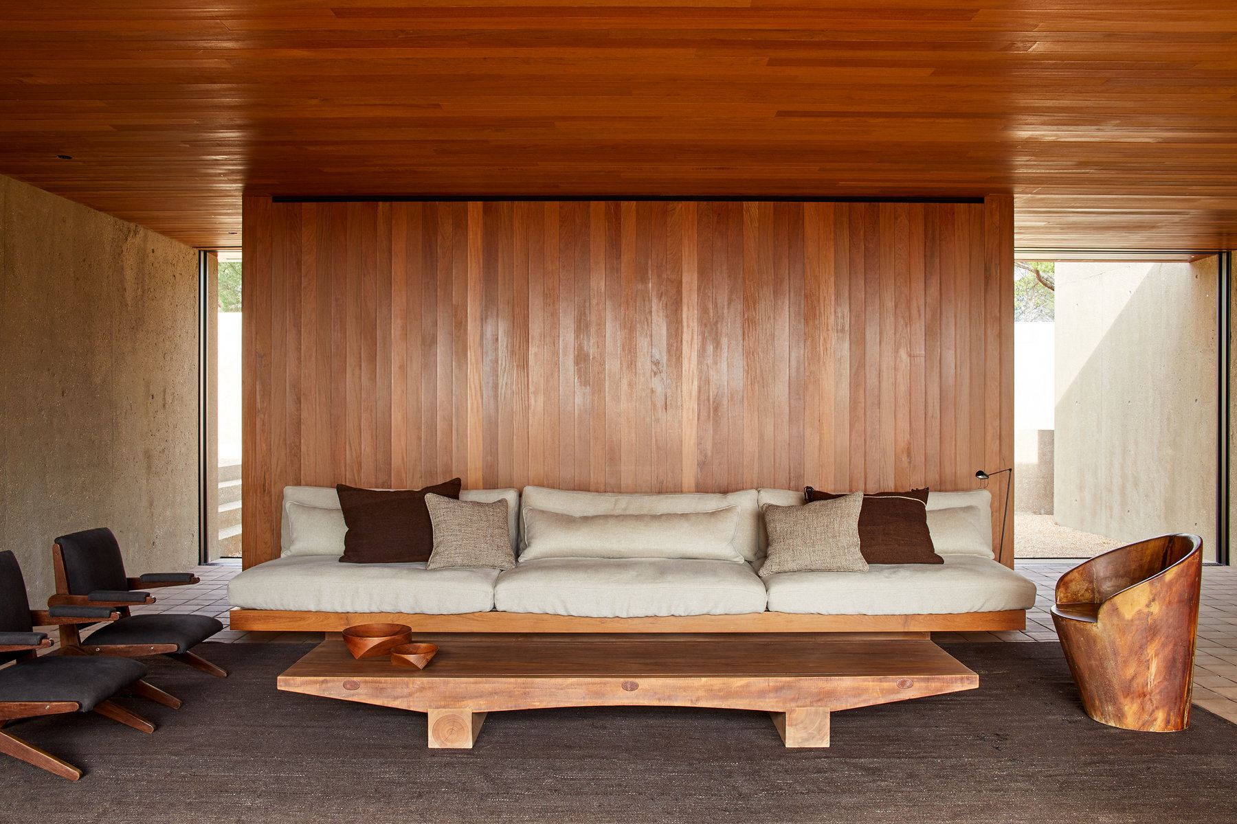
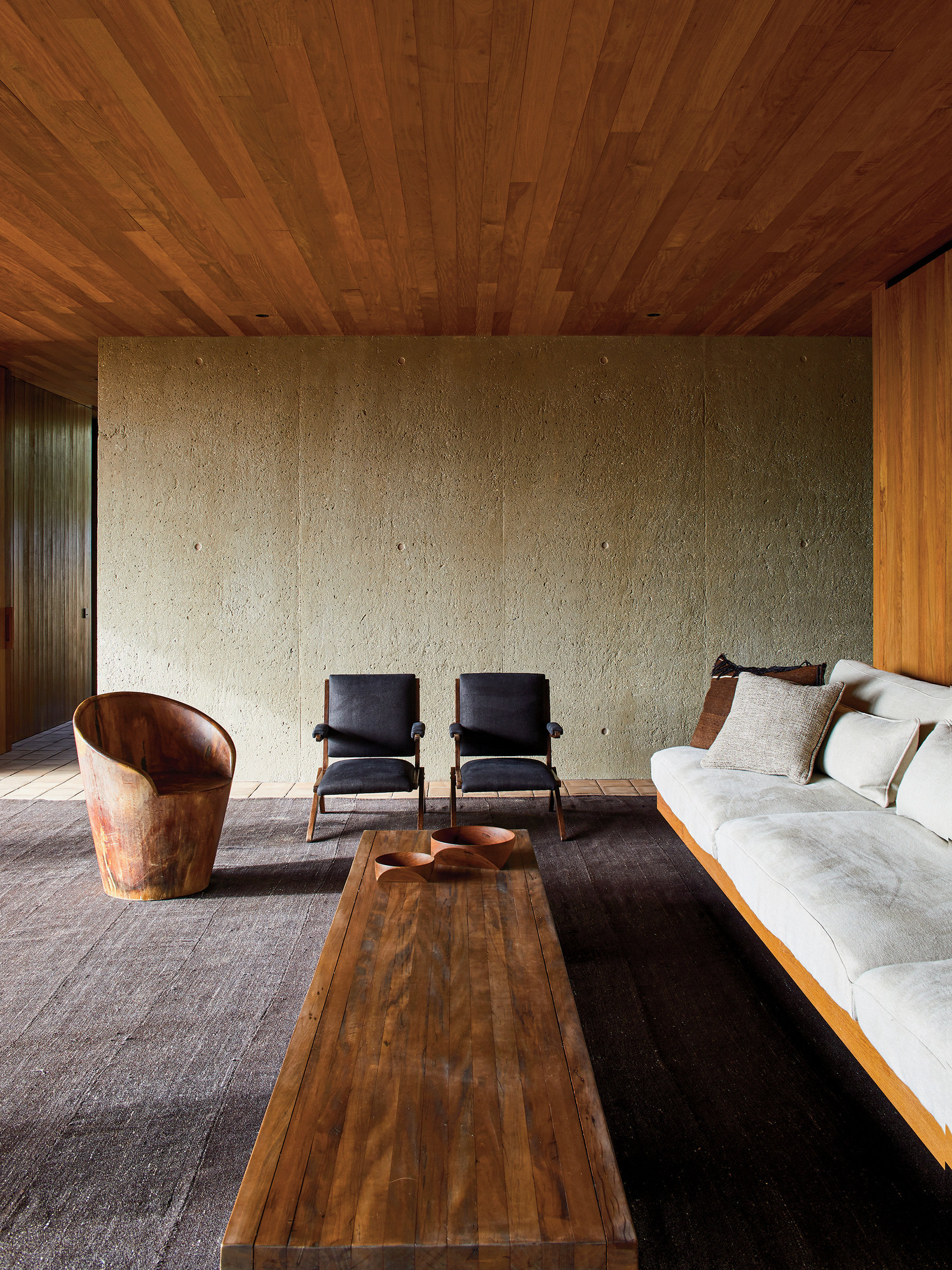
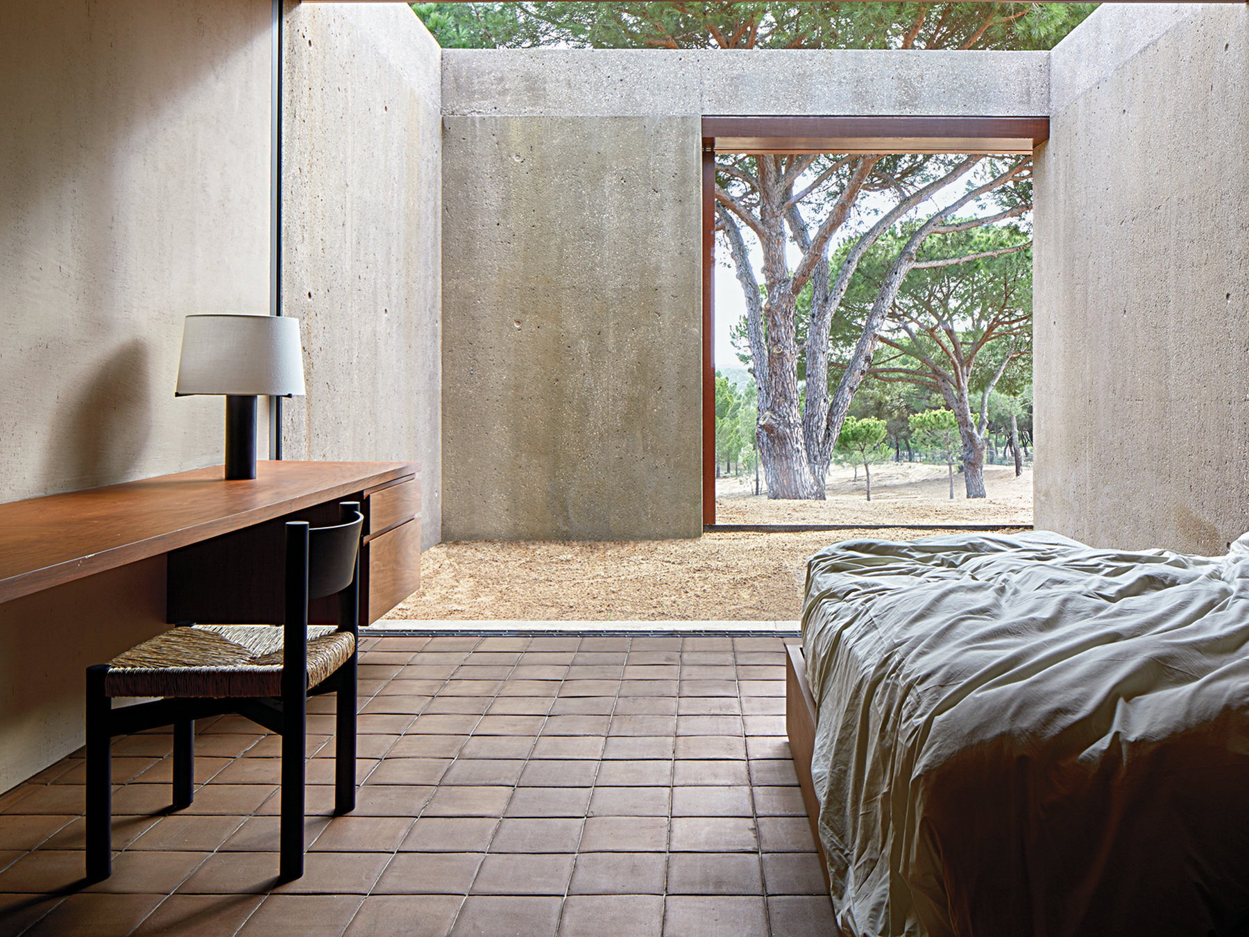
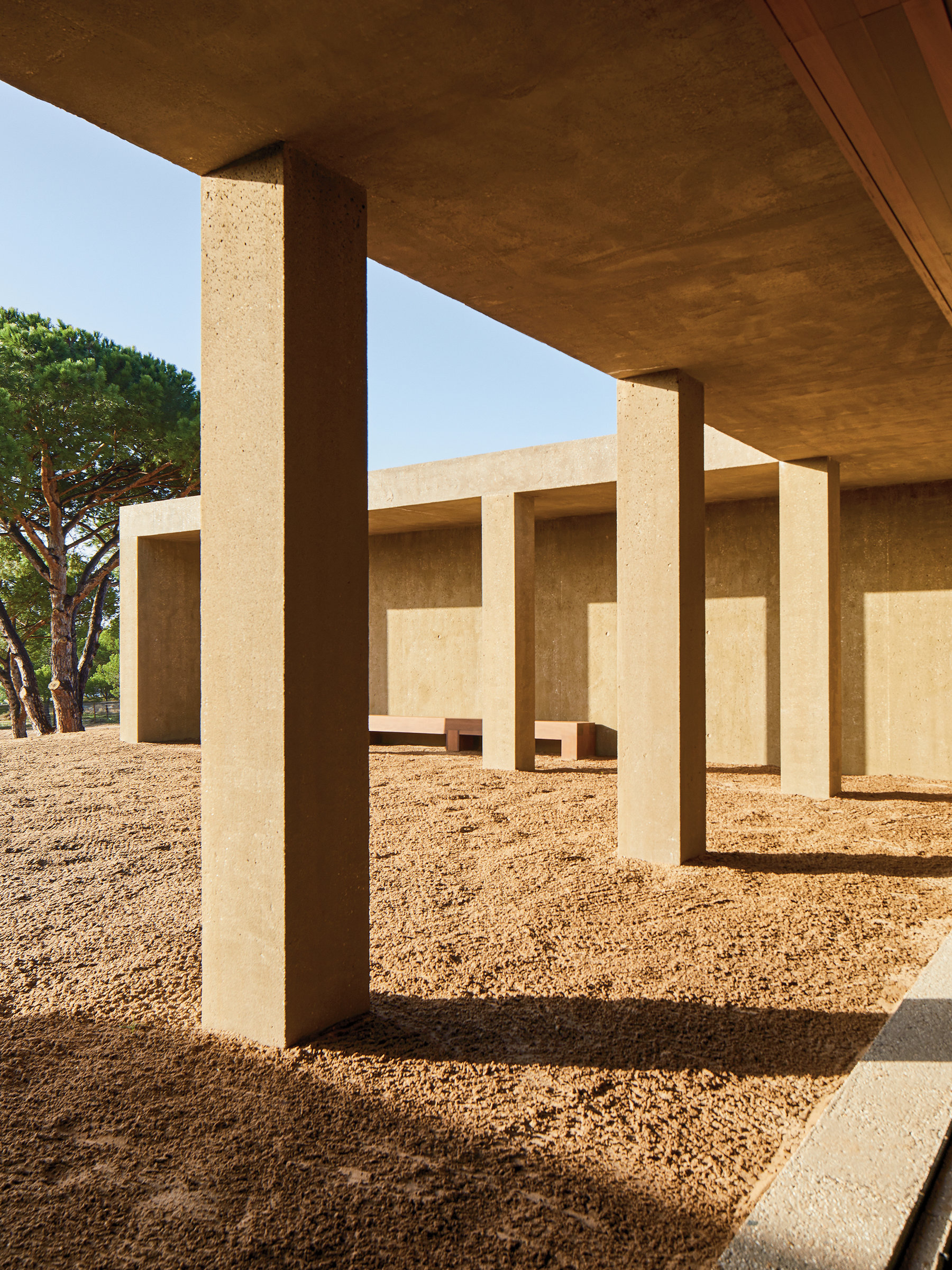
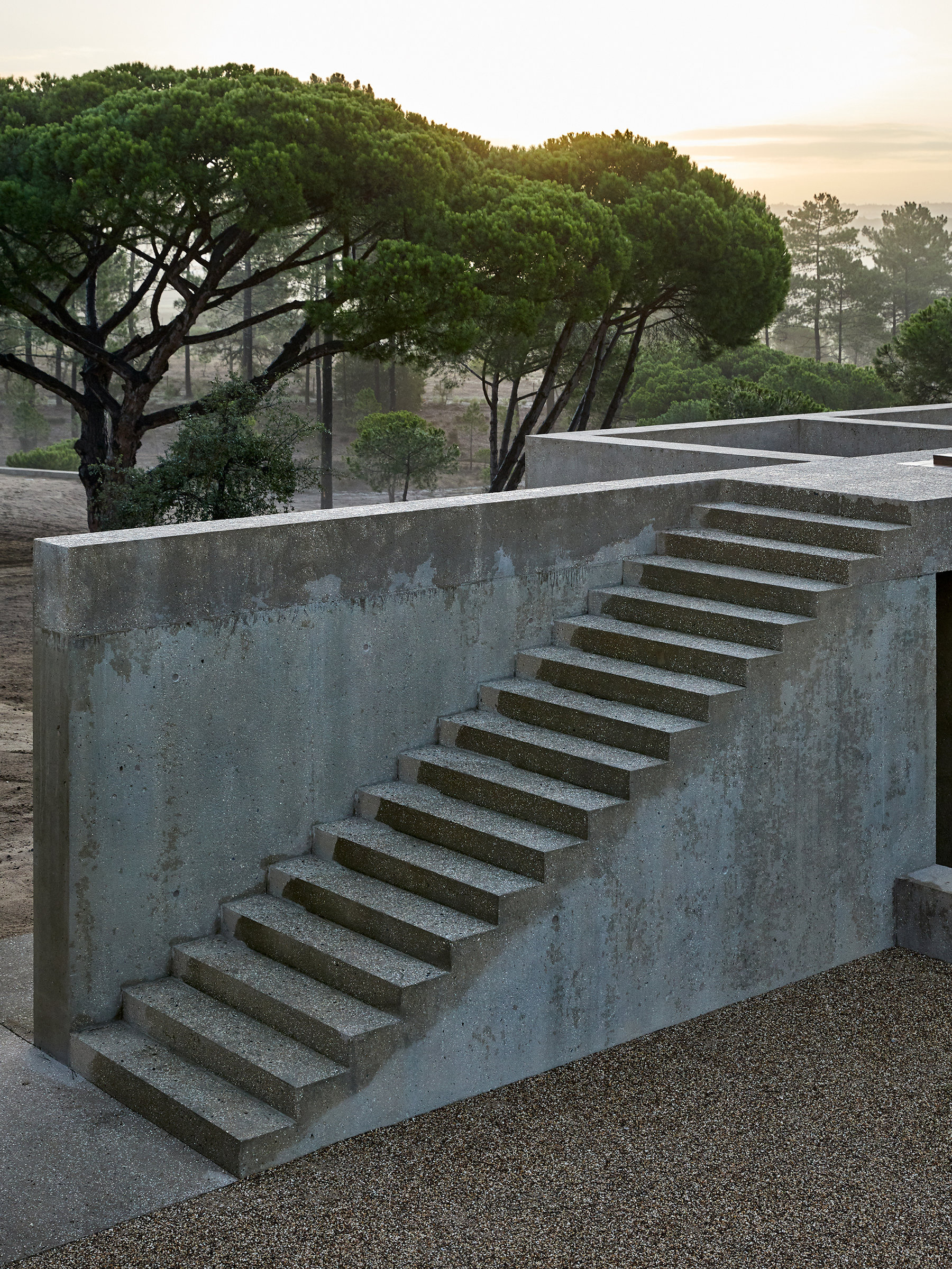
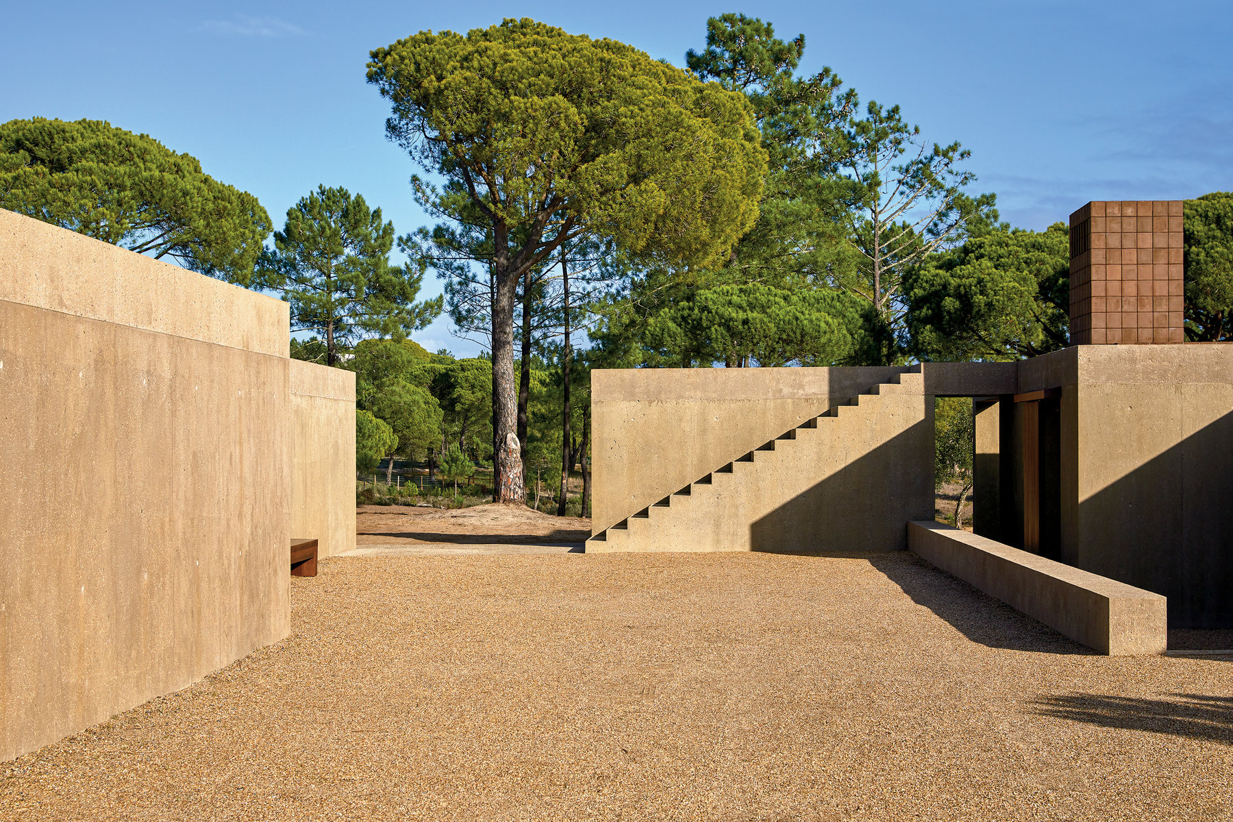
TEXT VIA THE NEW YORK TIMES “Viewed from the end of a long, dry dirt driveway on an October morning, the house looks like nothing special: a decommissioned military bunker, maybe, though barely recognizable as that, a pair of one-story, sand-colored rectangle structures nestled against a 45-degree dune like a set of dresser drawers. But once you get closer, you see that their ordinariness is an illusion. Here, in Melides, Portugal, a half-hour drive down the coast from the stylish resort town of Comporta, the 57-year-old Belgian architect Vincent Van Duysen and Mateo Bou Bahler, his 30-year-old boyfriend, a model, sit in the shade of the umbrella-shaped Mediterranean pines on the grounds of Casa M, a deceptively high-concept vacation compound built over three years by Van Duysen’s 30-person Antwerp studio.
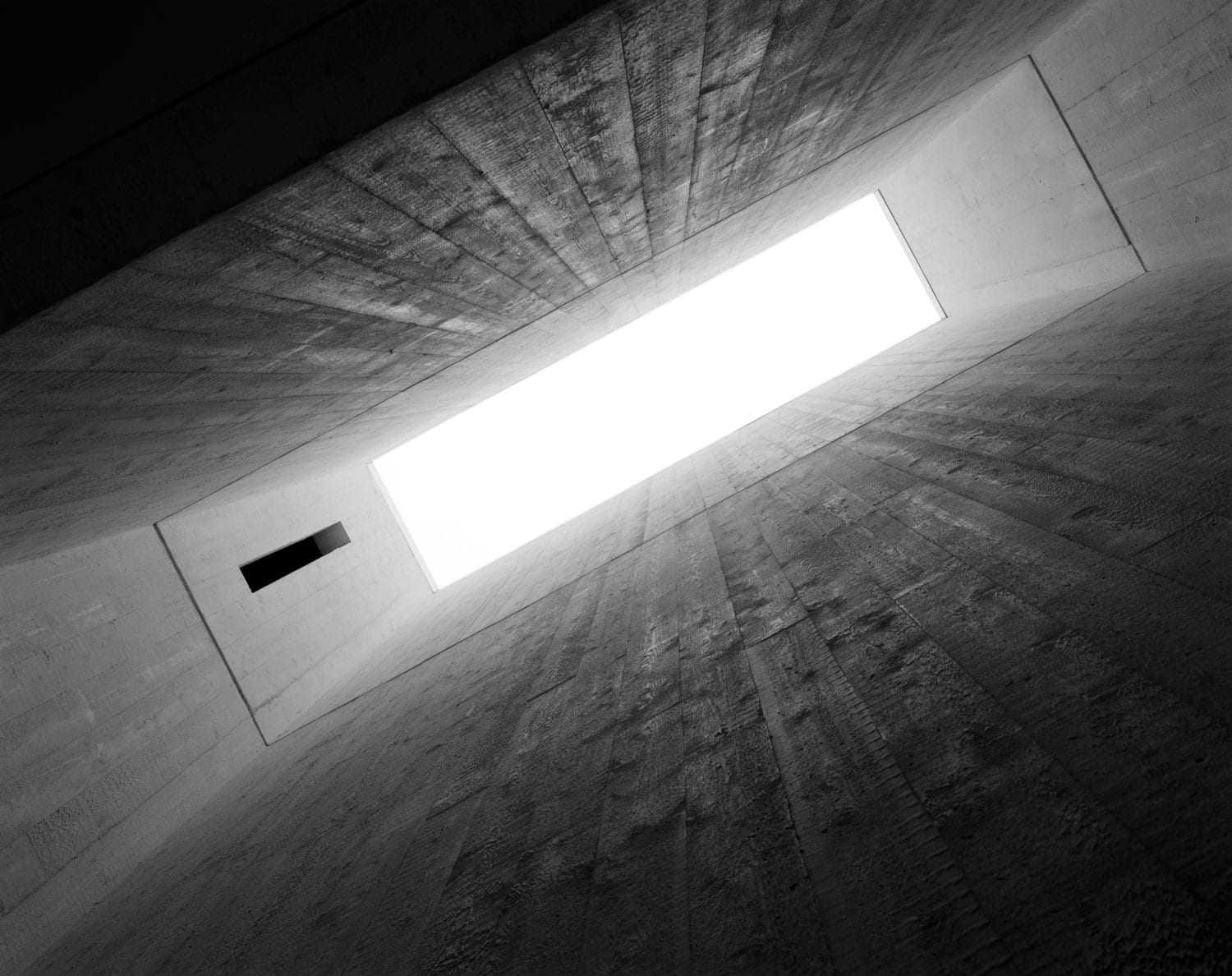
The 14-acre, 7,104-square-foot complex — which includes the main U-shaped house, a detached garage with a rooftop pool and a guest cabana — is, for the man who conceived it, both a disappearing act and the purest expression of the texture-obsessed, materials-driven strain of modernism that has defined his work for more than three decades. Though Van Duysen’s sparsely furnished, whitewashed, raw-wood-hewn residences and commercial projects throughout Europe, including the August hotel in Antwerp and the Aesop store in Hamburg, have established him as one of design’s leading minimalists, he detests the label; he’s always felt his work is softer, richer and more livable than the movement with which he’s often associated. “You could call this minimal, but it’s not minimalist,” he says of Casa M. He prefers the term “warm Brutalist” instead, suggesting an approachable, even sumptuous take on the concrete-driven construction that in the mid-20th century challenged the steel-and-glass orthodoxy of the International Style. With an exterior of exposed aggregate (a type of concrete left unsealed to reveal its craggy components) tinted a bone hue that Van Duysen tested a dozen times to ensure it would vanish, mirage-like, into its sandy surroundings, the compound achieves the opposite effect of its Brutalist forebears, which overpowered cityscapes.”
Photography by Ricardo Labougle
Park-House in London by David and Gabriel Chipperfield
From the architects: “The project consists of an extensive renovation of a Grade I listed park-facing house and mews house with a newly-built link building. This new building connects the two original properties together to create a 40-metre thoroughfare from front to back on two levels.
Whilst the link building is an entirely new structure, the ‘new’ mews house is constructed within the skin of the original one, revealing the interior architecture of both these buildings to appear seamless from within.
The palette of the new architectural elements is restricted to in-situ terrazzo, fair-faced concrete, Petersen bricks and over-sized timber sash-windows with curved glass, by Capoferri.
The bowed-shape of the new building plays homage to how John Nash, the architect responsible for planning the layout of Regents Park and its surroundings, often designed rear facades. It allows for neither of the original facades to become obstructed, whilst giving depth to the rooms within the link building and permitting them to be used as more than just thoroughfares.
Meanwhile, the original front-house has been restored to a former opulence, with the careful reinstatement of original details and integration of modern infrastructure. The new interventions around the original house are intended to be far more subtle and integrated, from the opening-up of main the reception rooms to the new roof-lantern on the top floor.”
Concept design - David Chipperfield
Executive design, Construction & Project management - Gabriel Chipperfield Ltd.
Photography - Simon Menges
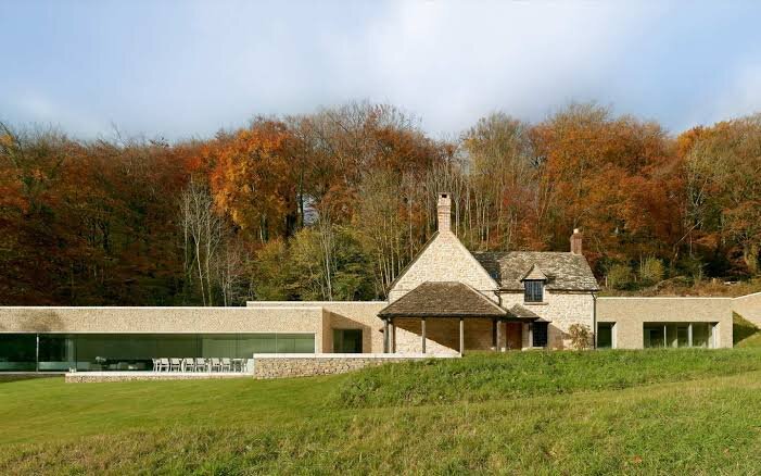
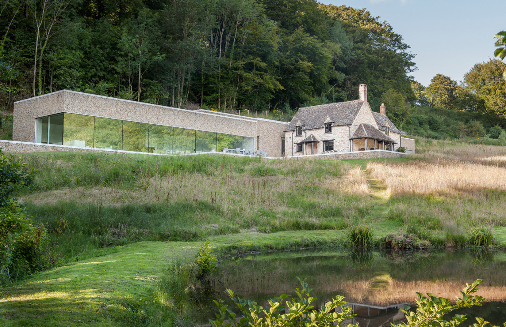
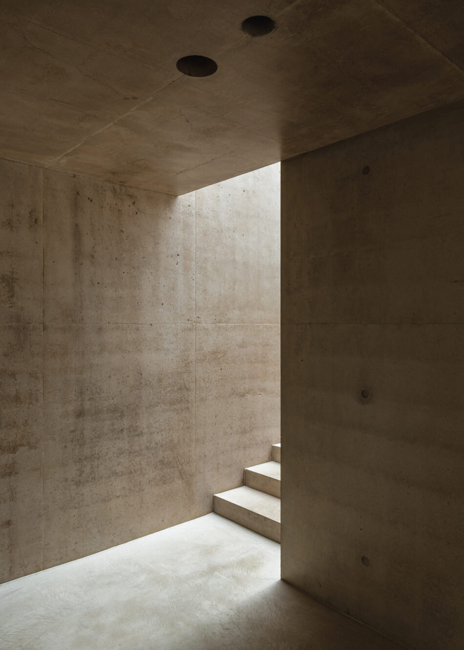
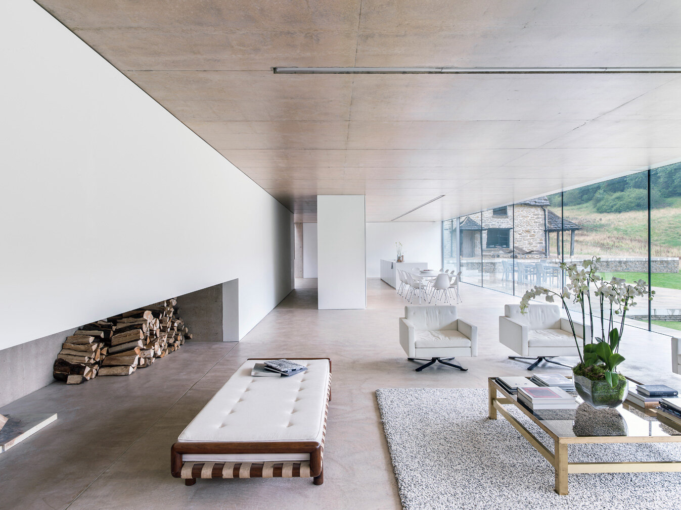
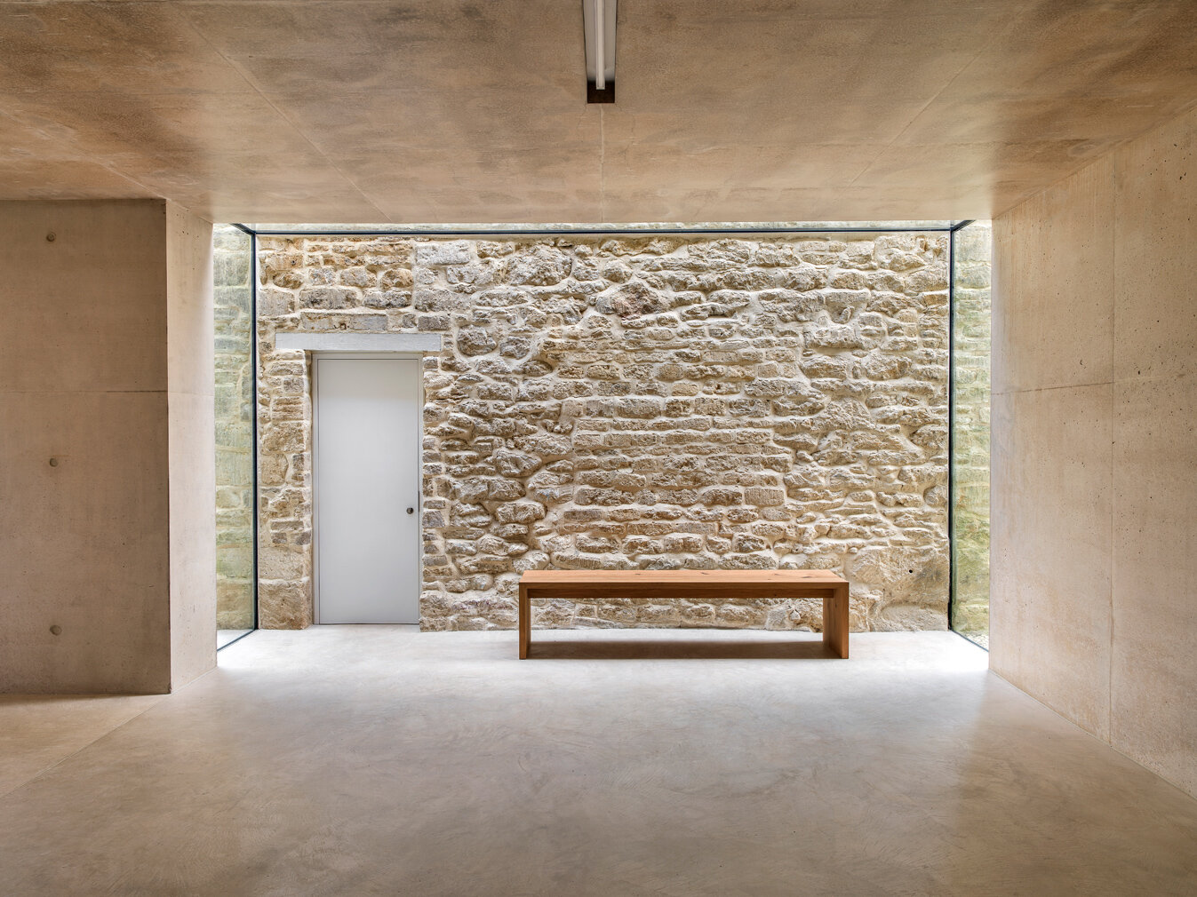
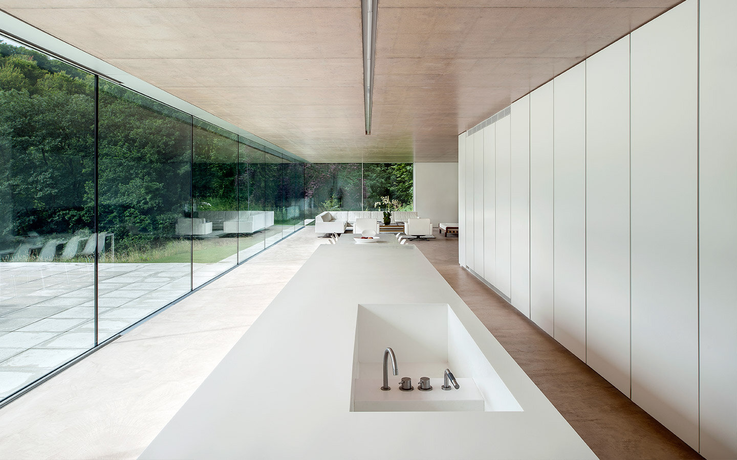
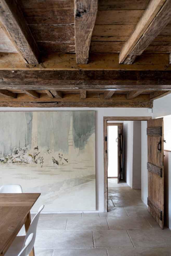
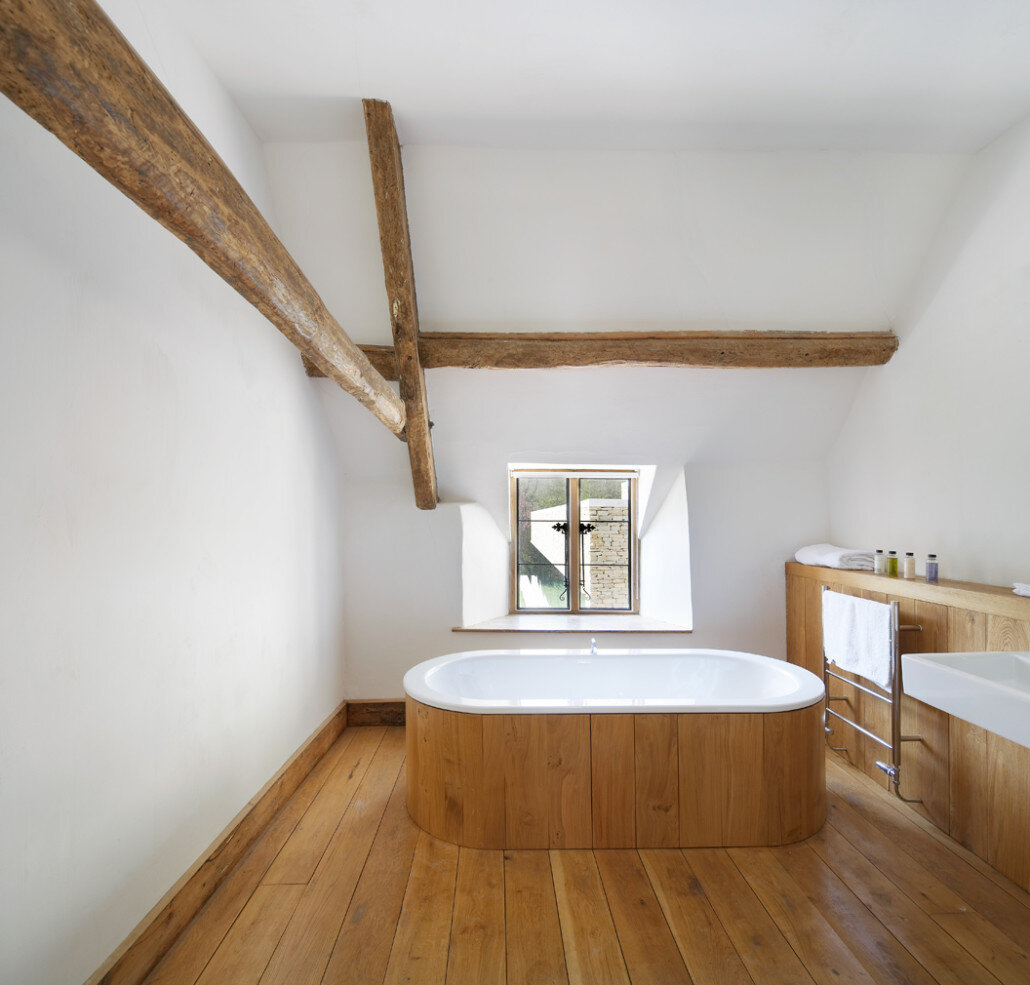
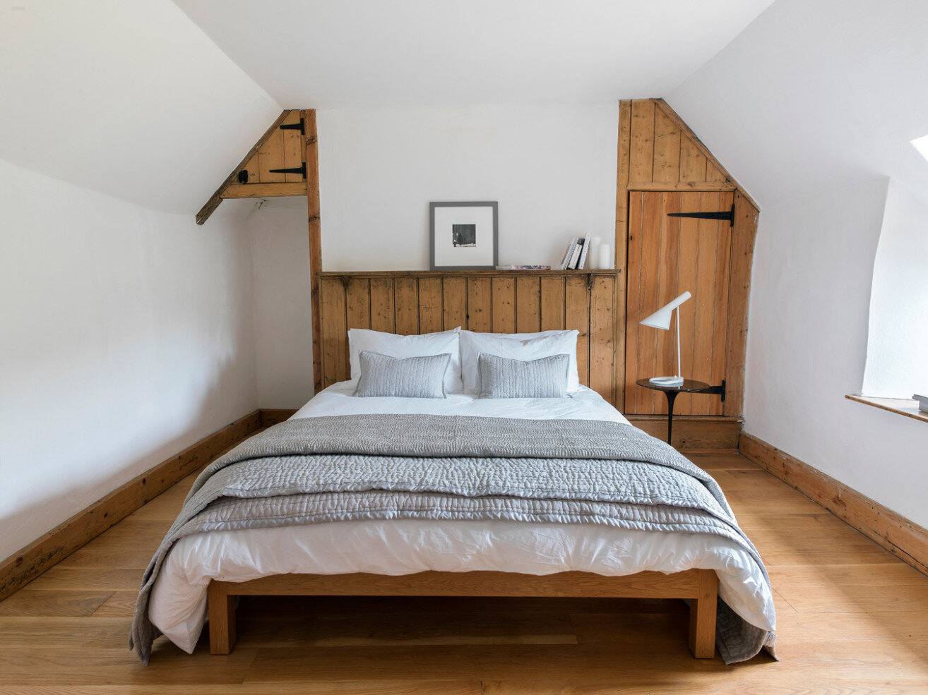
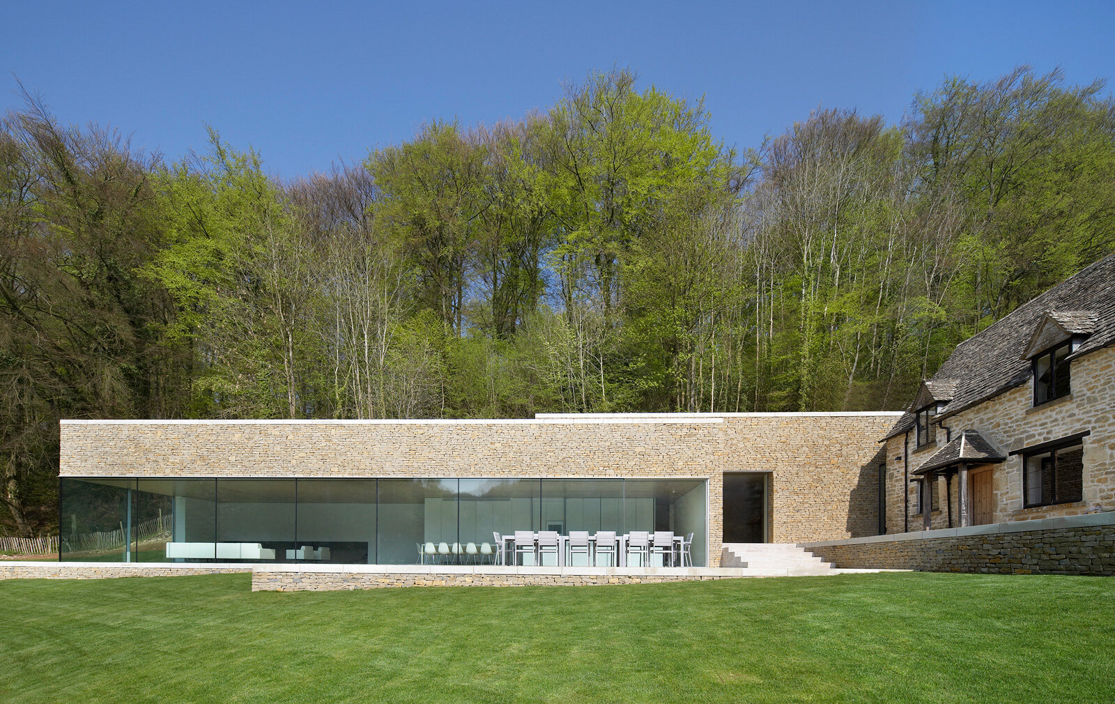
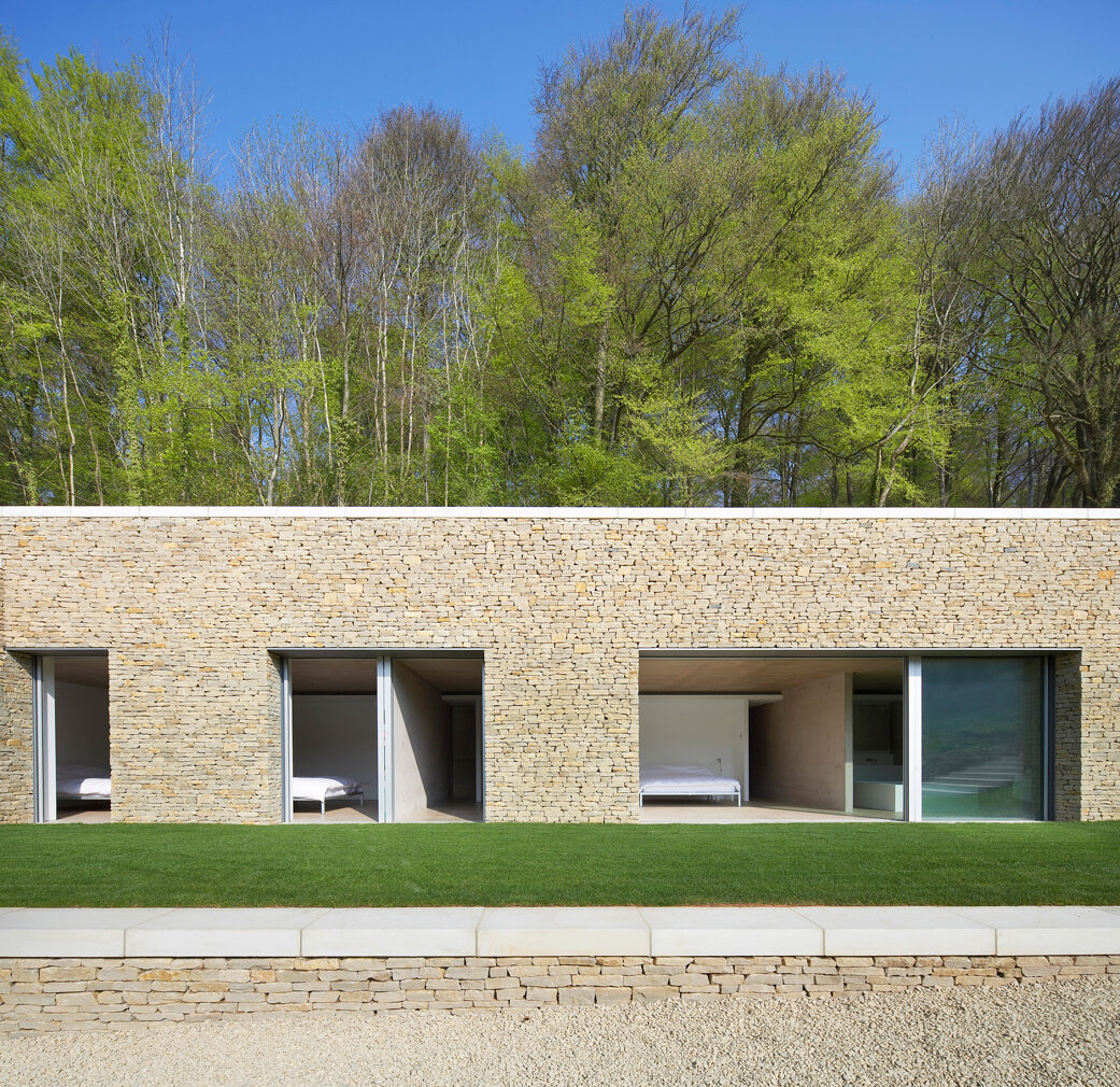
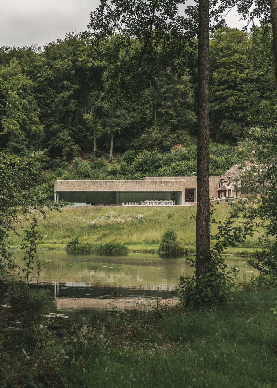
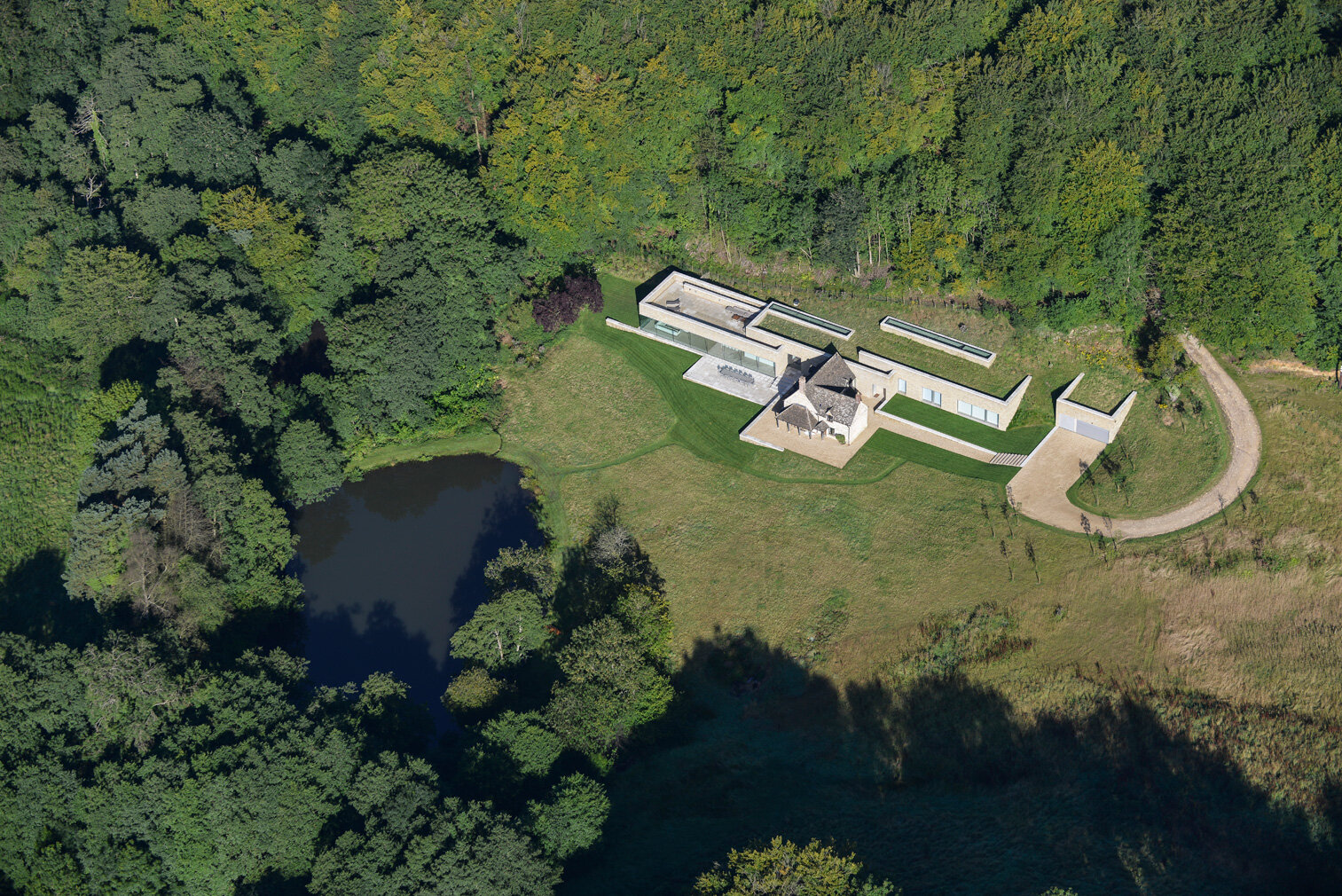
Architect Richard Found carves his home into the Cotswold landscape with a contemporary design that embraces an 18th-century cottage
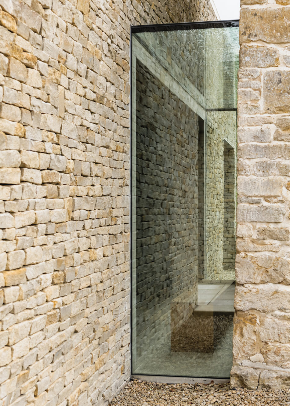
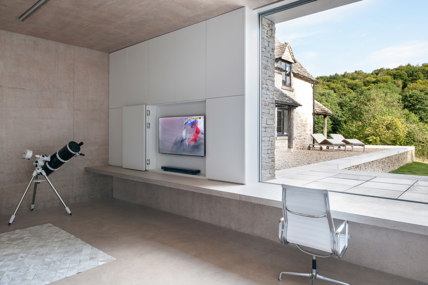
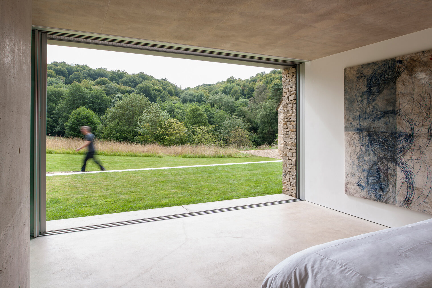
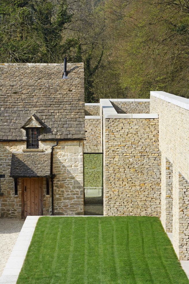
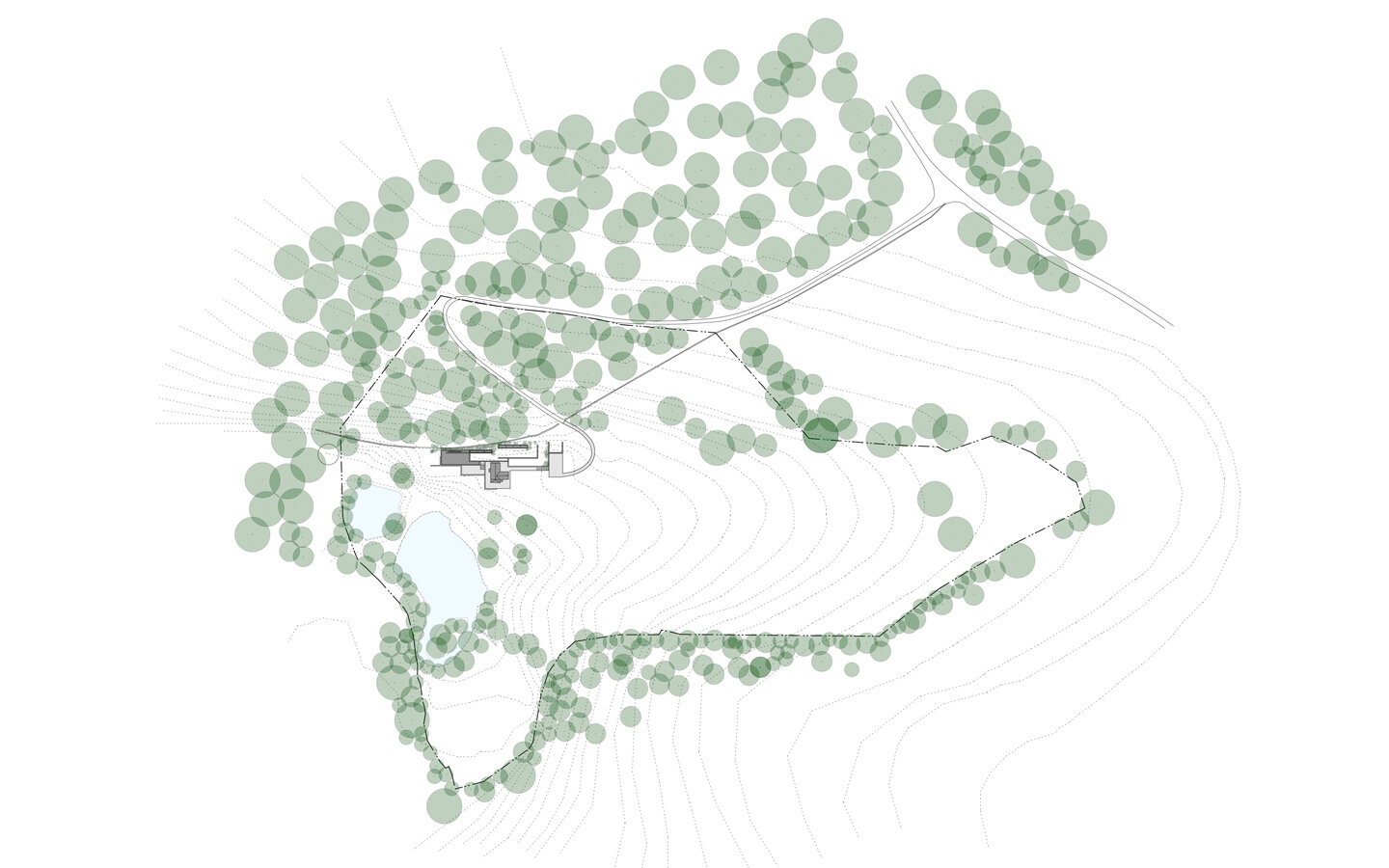
From the architects: “Found Associates, as residential architect, designed this contextual country house consisting of a restored and updated gamekeeper’s cottage and an innovative series of fresh, inter-connected pavilions tucked into the landscape immediately behind it. Together, they form an inviting rural escape set within a secret valley on the edge of the Cotswolds, surrounded by woodland.
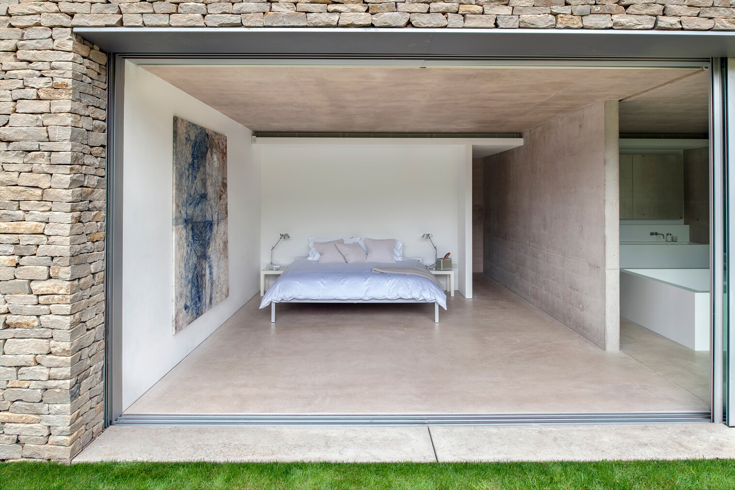
The original Grade II listed cottage – dating from the 18th century – remains an integral part of the property, chiefly used by visiting family and friends. The combination of three single-storey pavilions dramatically extends the available living space, with an open plan living area to one side, bedrooms to the other and a linking zone at the centre.
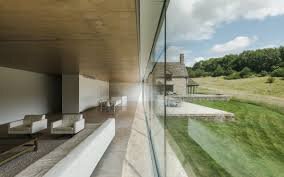
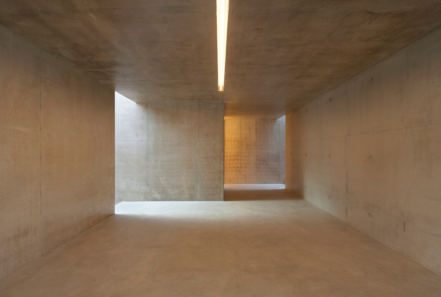
These new-build elements offer a striking contrast between the mass of concrete and local stone used in their construction and expanses of glass that frame select views of the landscape and open onto adjoining terraces. A planted green roof over the pavilions softens the impact of the new structures upon the landscape.
The house won a RIBA National Award and was nominated for the Manser Medal.”
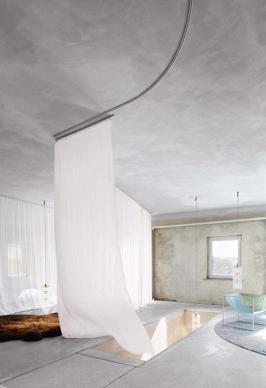
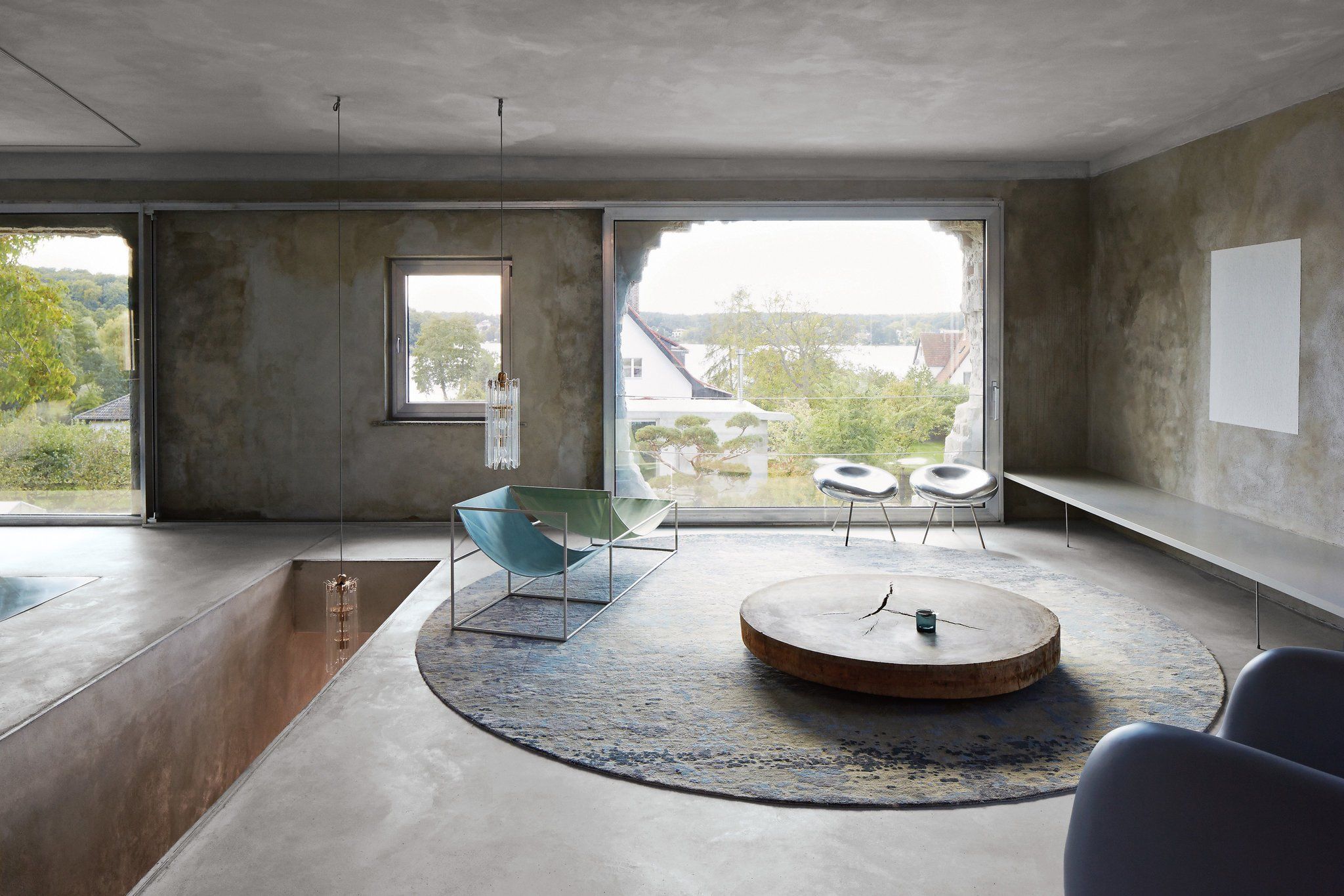
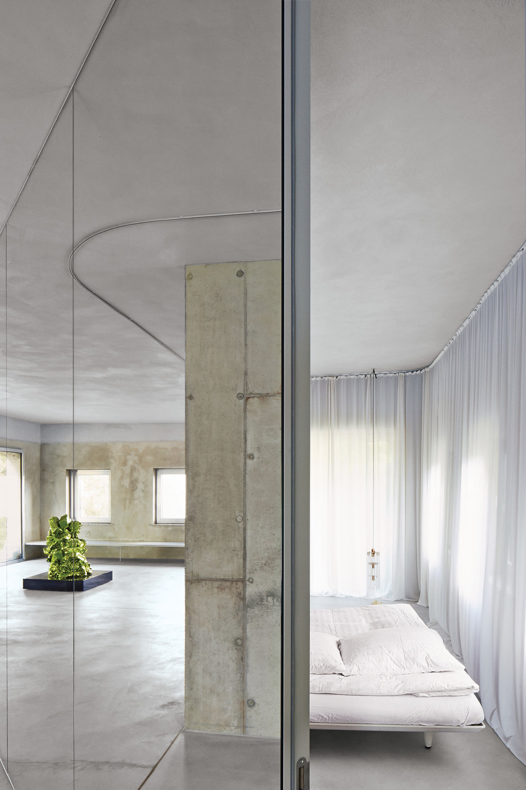
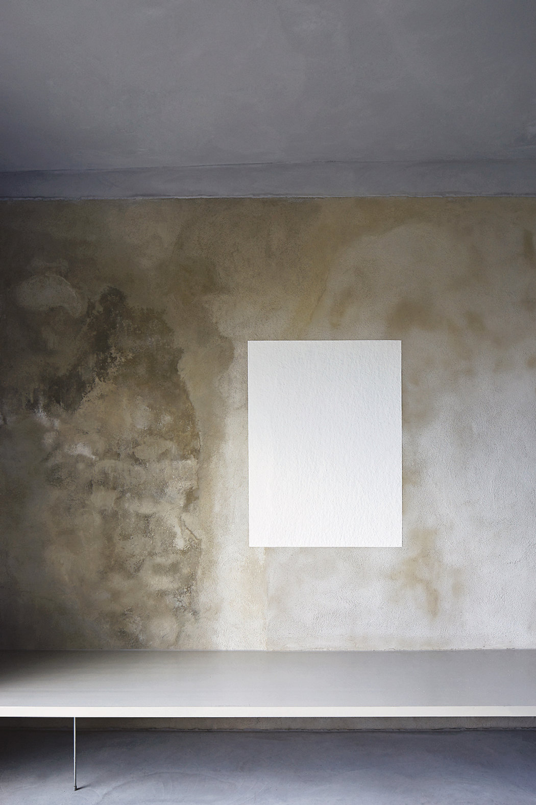
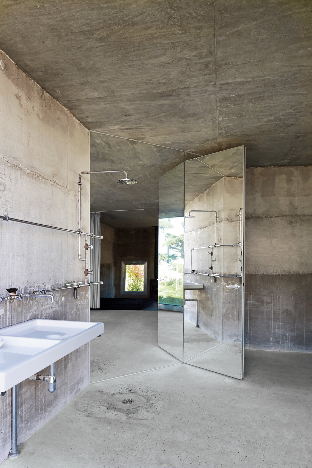
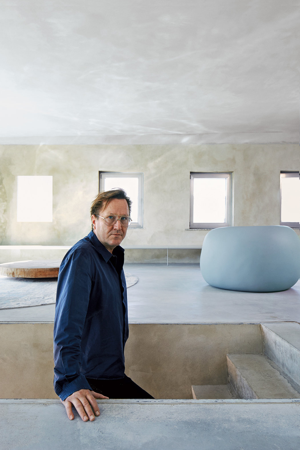
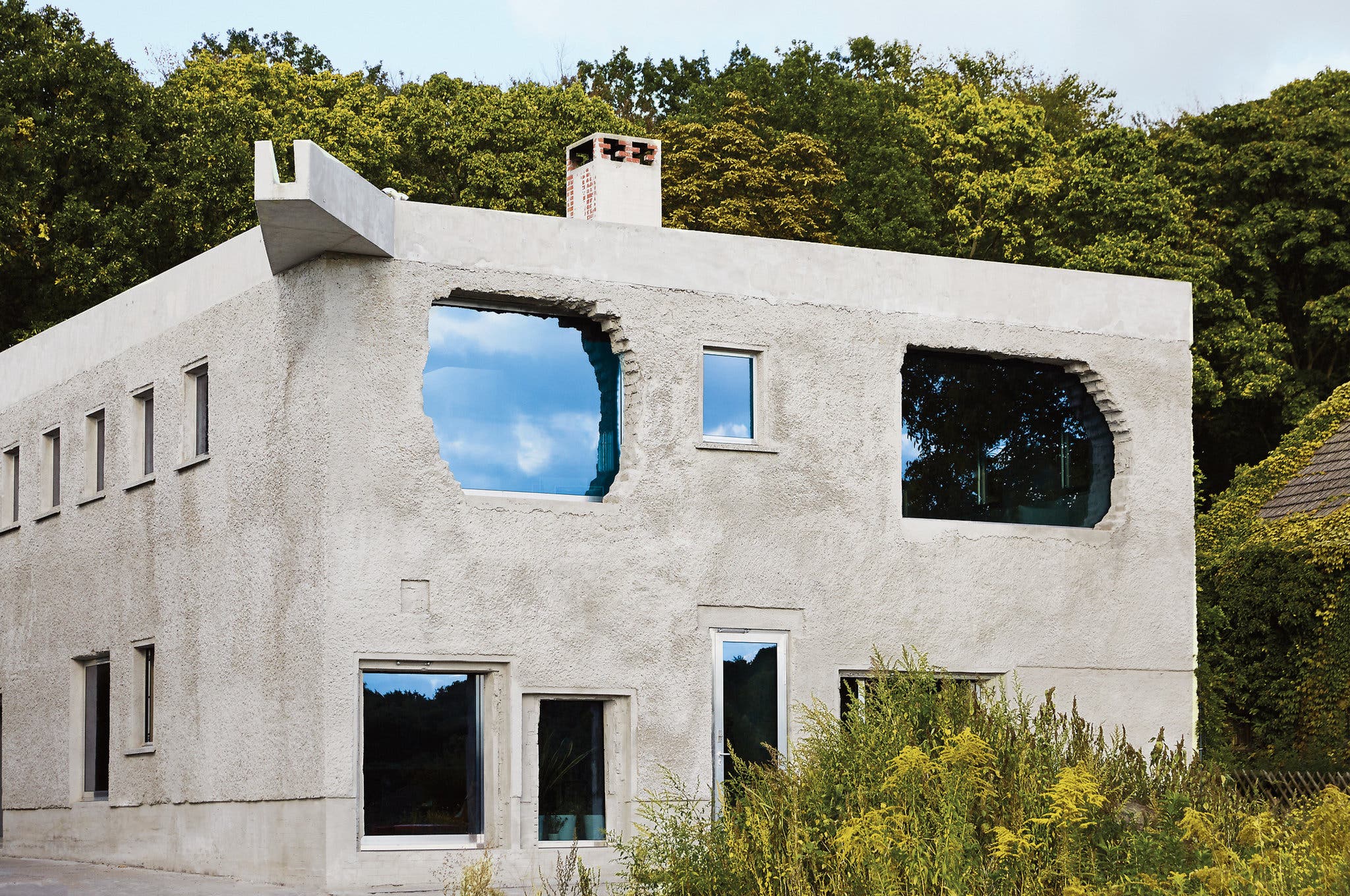
A former German underwear factory in Potsdam now serves as home to architect Arno Brandlhuber
OUT TAKES
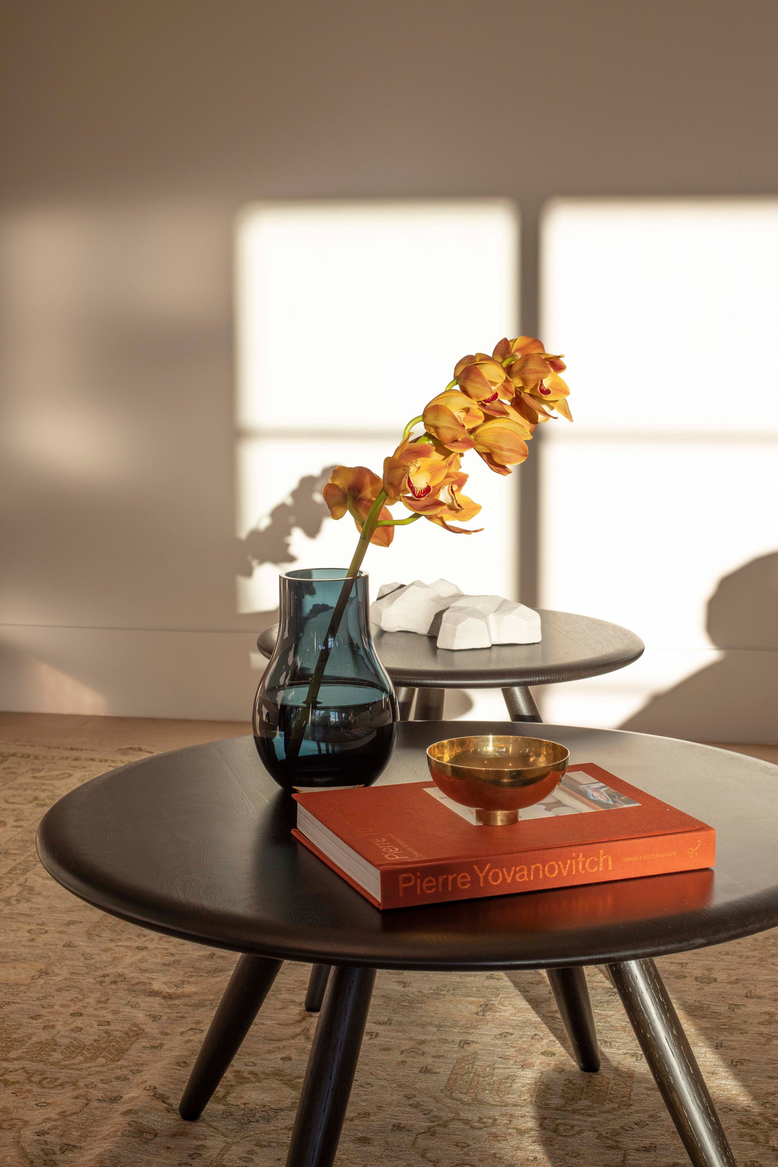
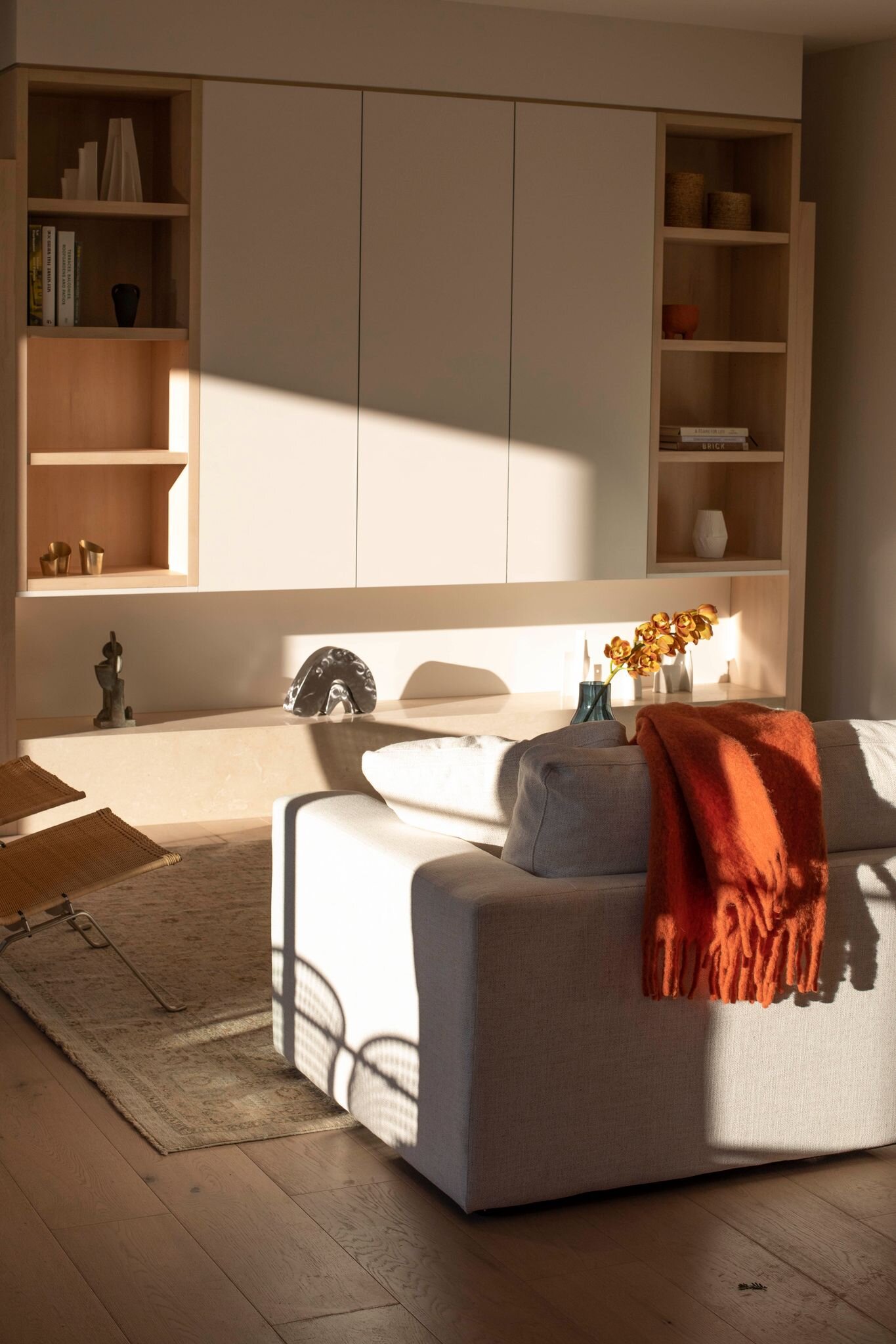
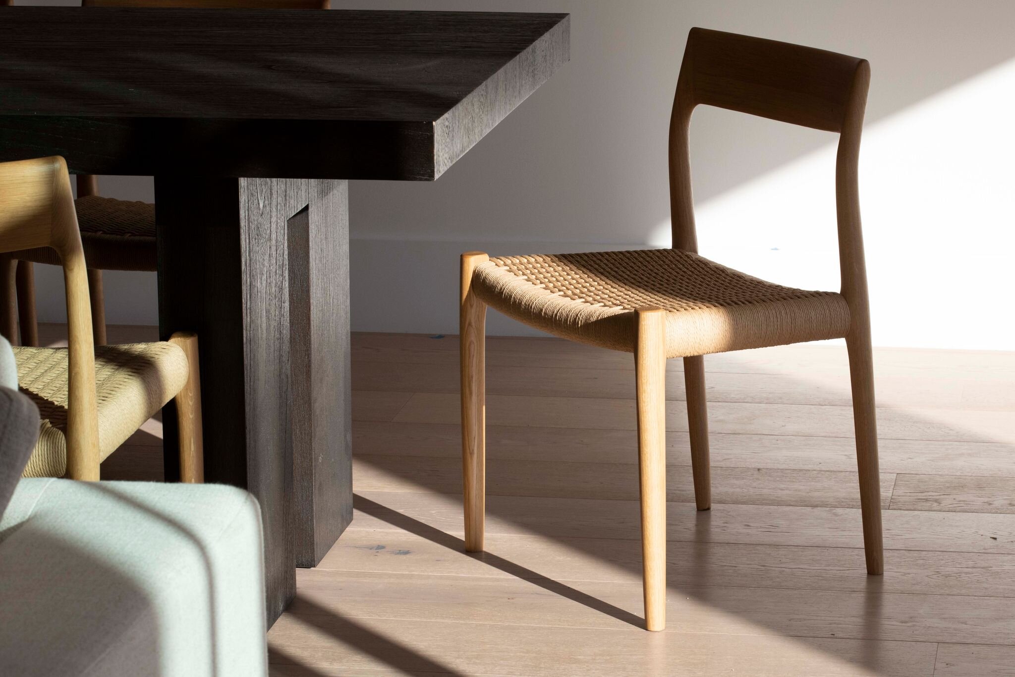
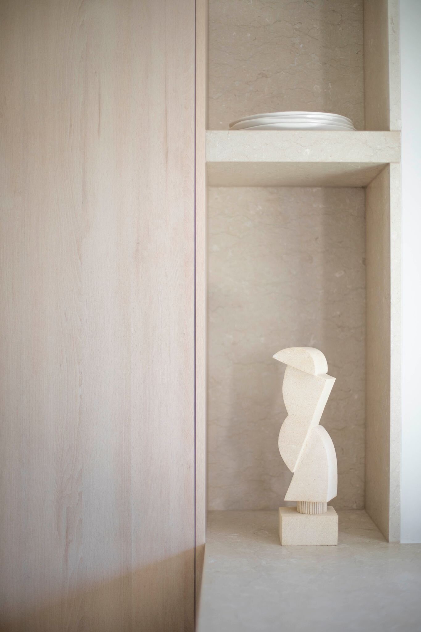
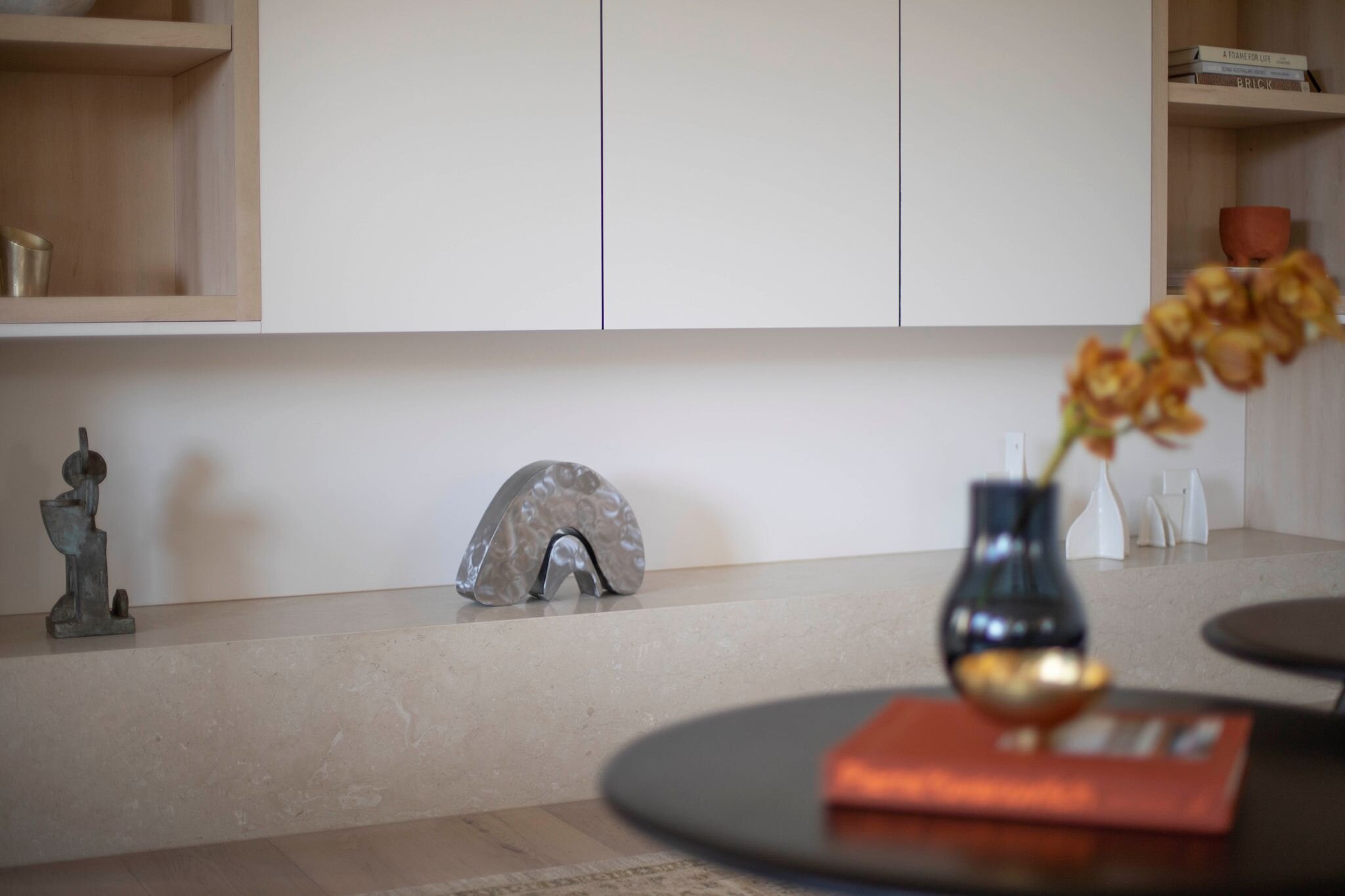
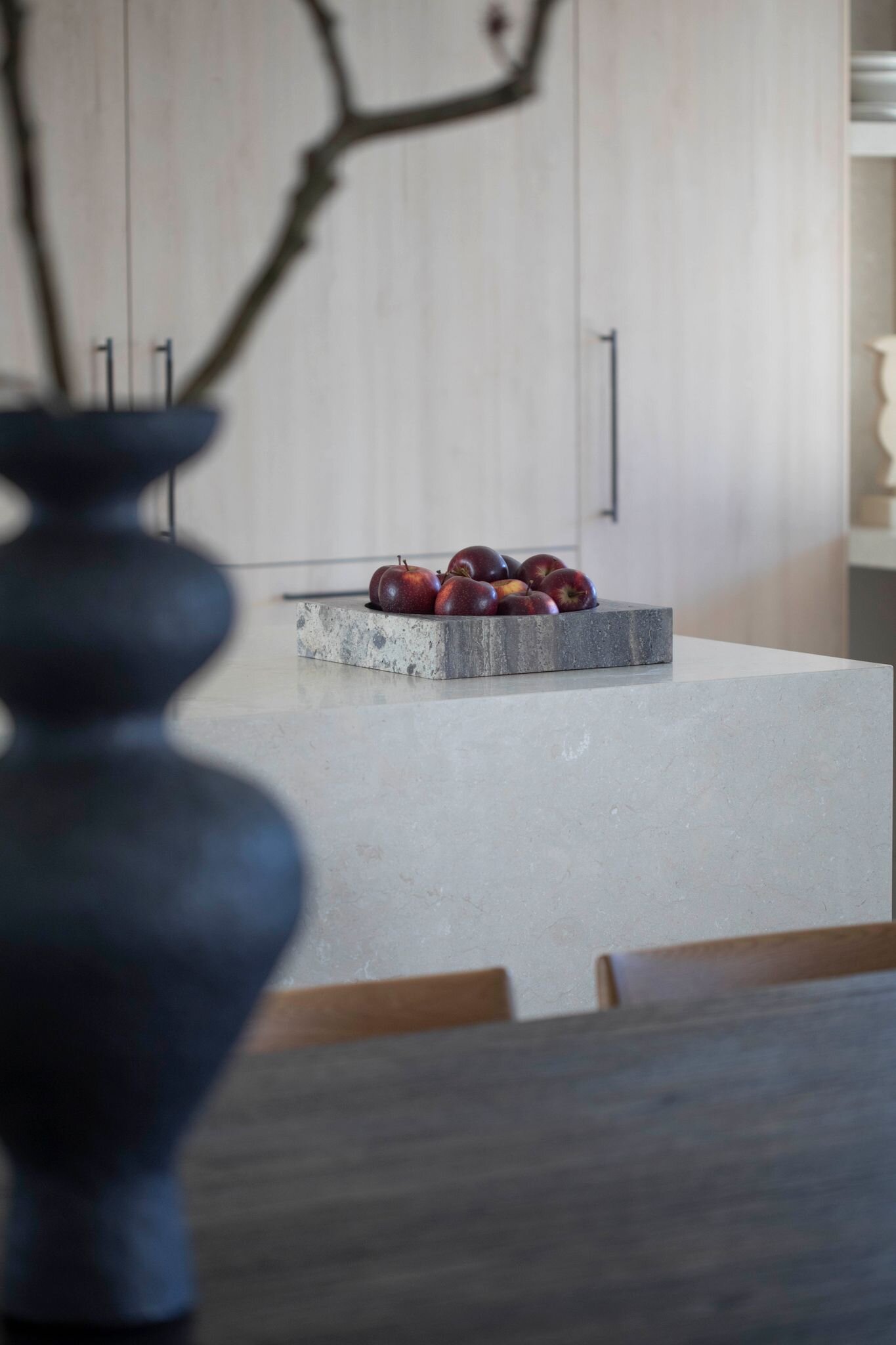
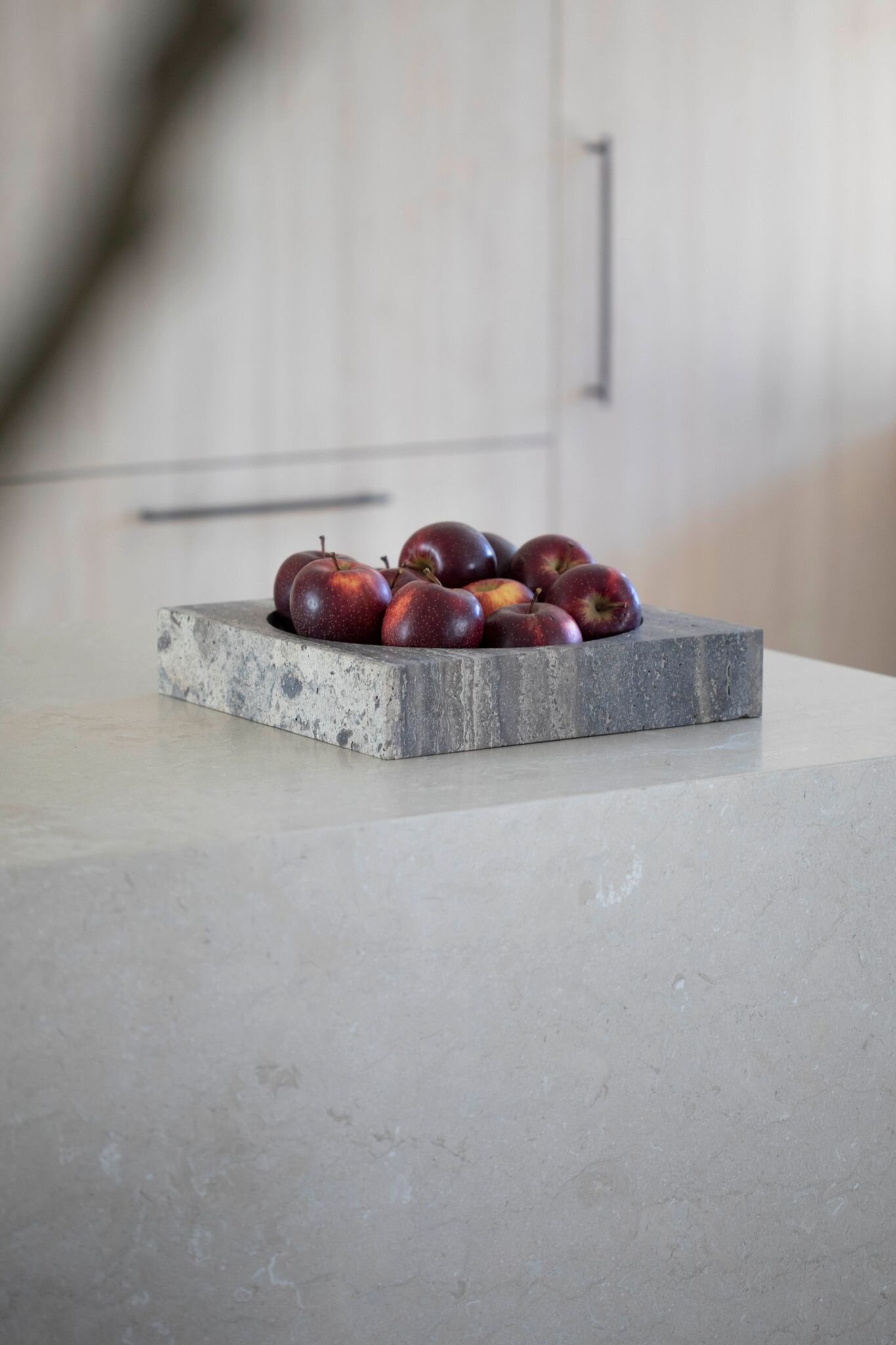
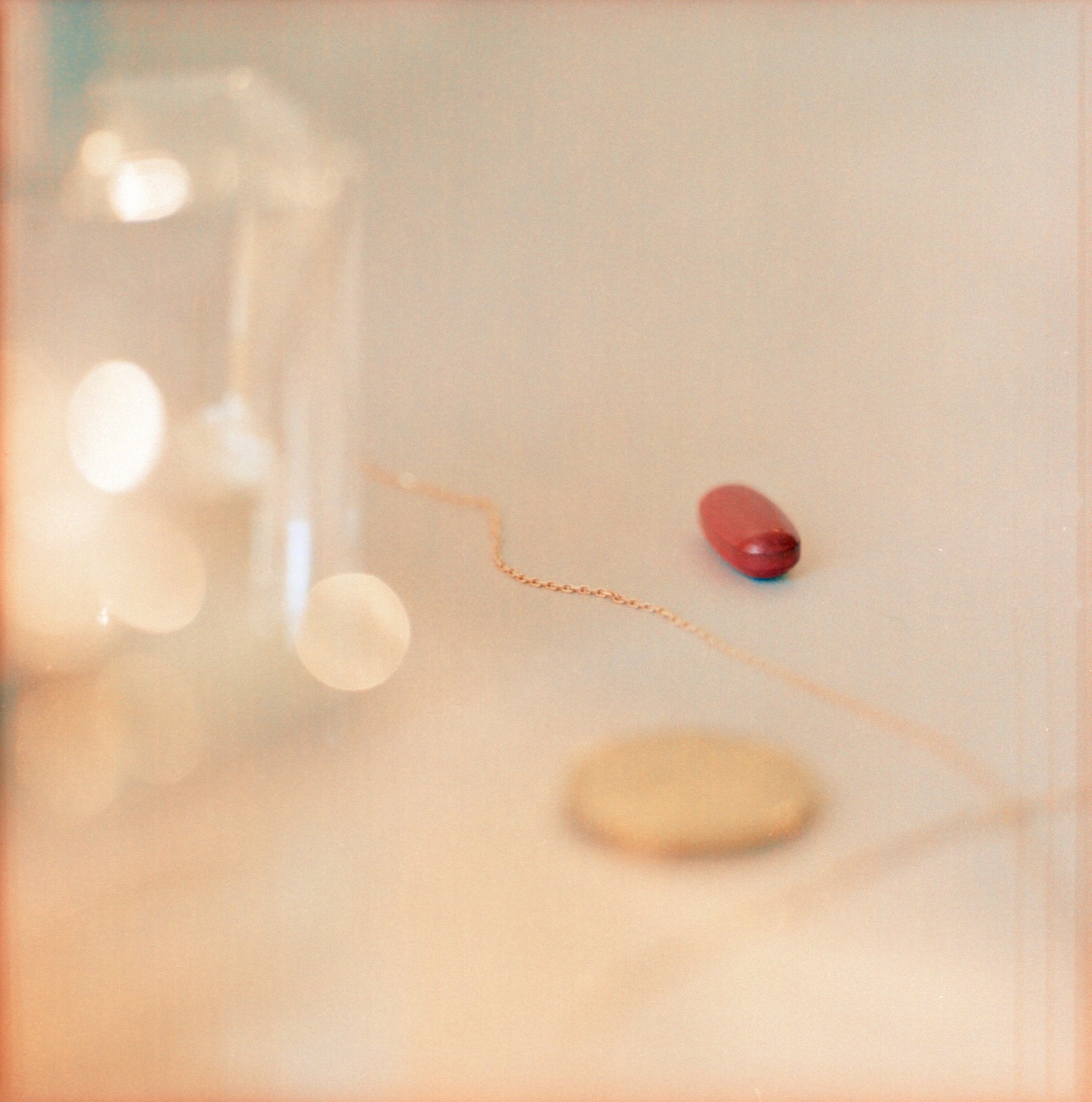
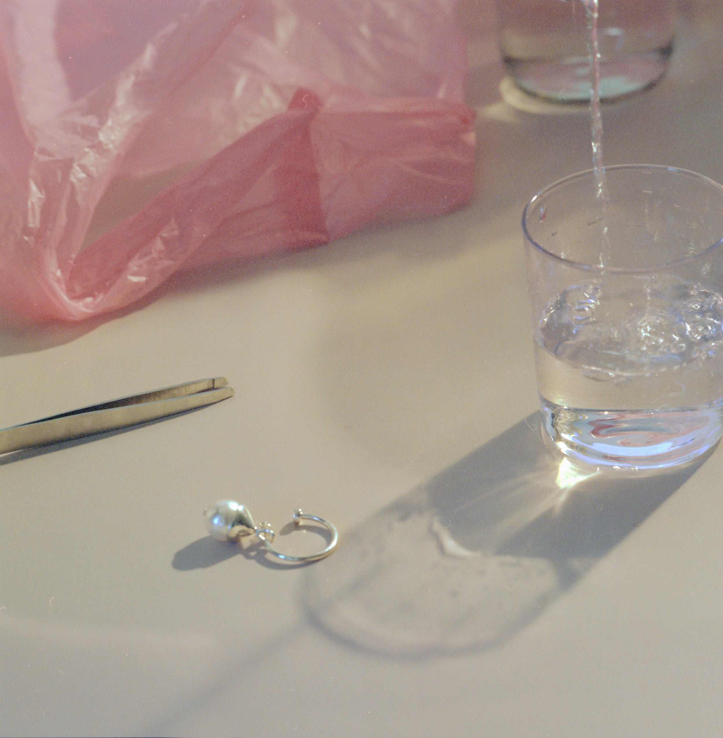
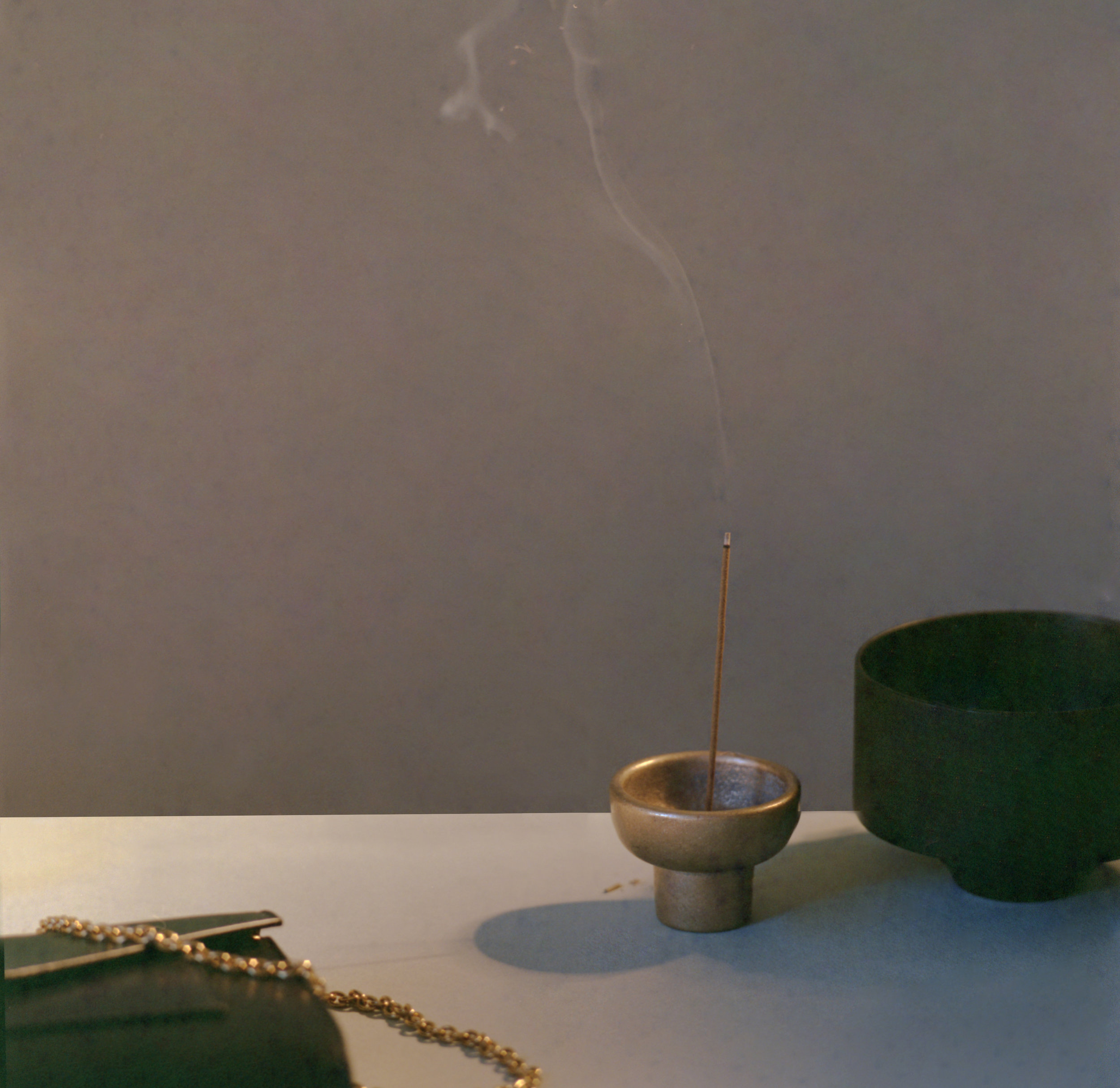
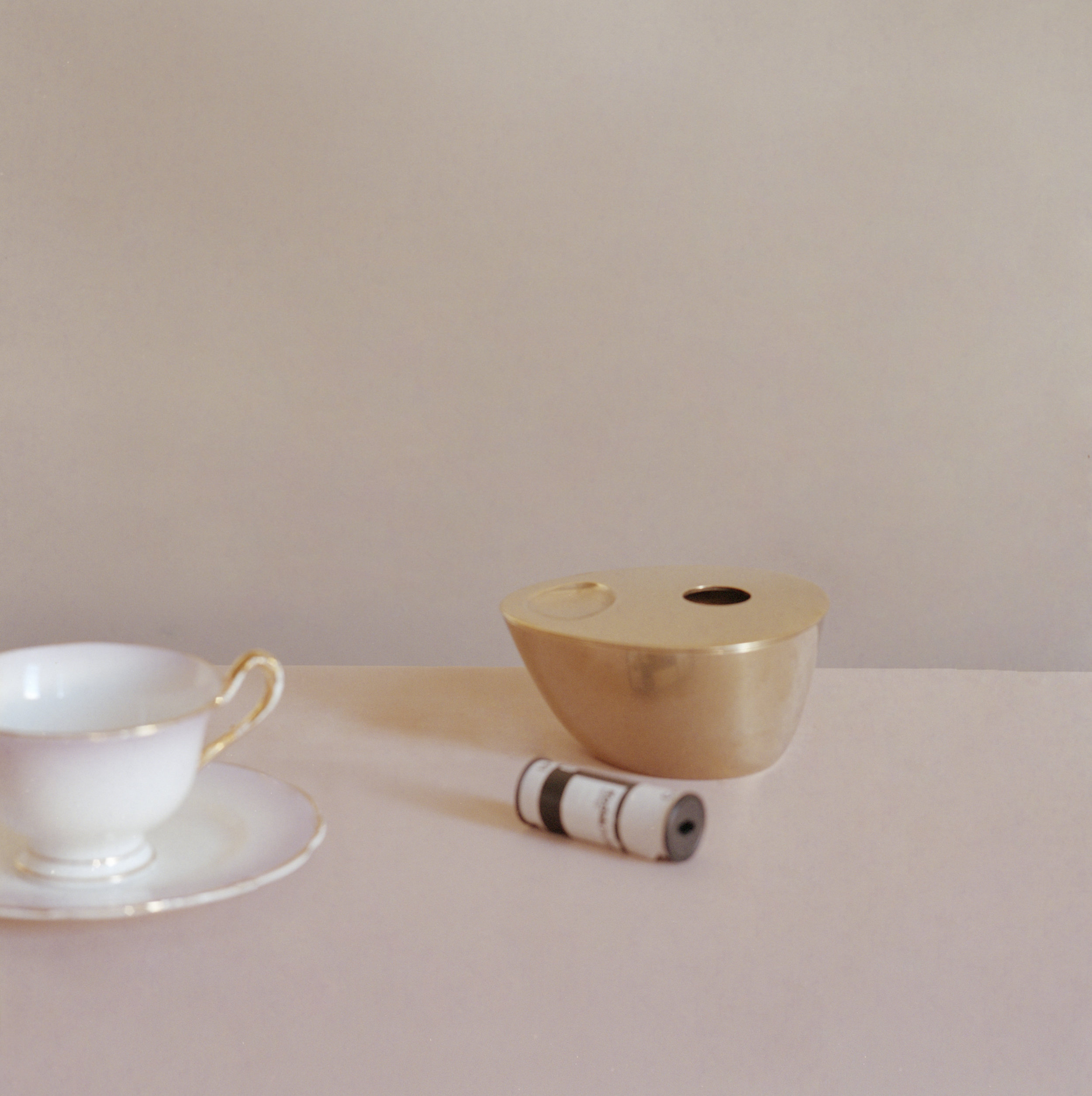
Still life styling by Room on Fire for an upcoming book project photographed by Holly Ward.
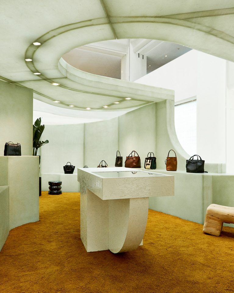
Céline popup store by Al-Jawad Pike
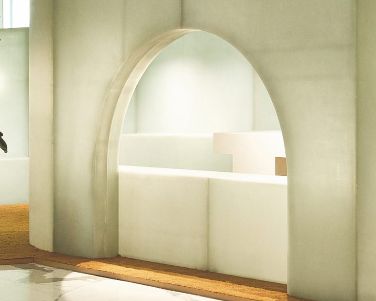
Translucent fibreglass modules make up this Celine pop up store by London-based architectural studio Al-Jawad Pike. According to the architects the design concept takes inspiration from “eroded sea shells and primitive stone structures – the arrangement of curving walls and arched thresholds form a carved interior space for the display of products. The prefabricated translucent fibreglass modules provide a sheltered atmosphere through the layering of subtle texture and light. The modular design of the structure was crucial in the shipment process, travelling from the manufacturing workshop in Manchester to Beijing, then on to a series of locations across China for temporary installations through 2018.”
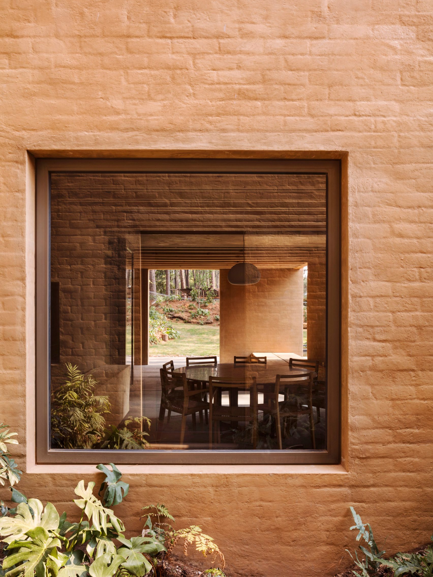
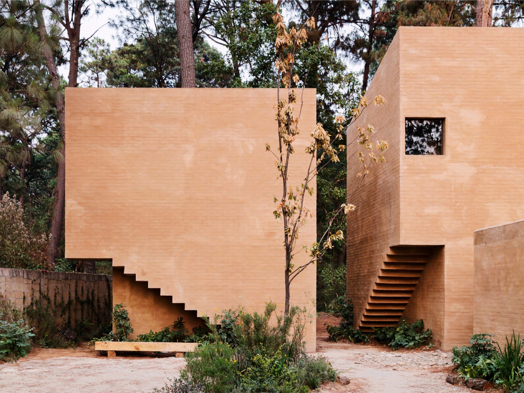
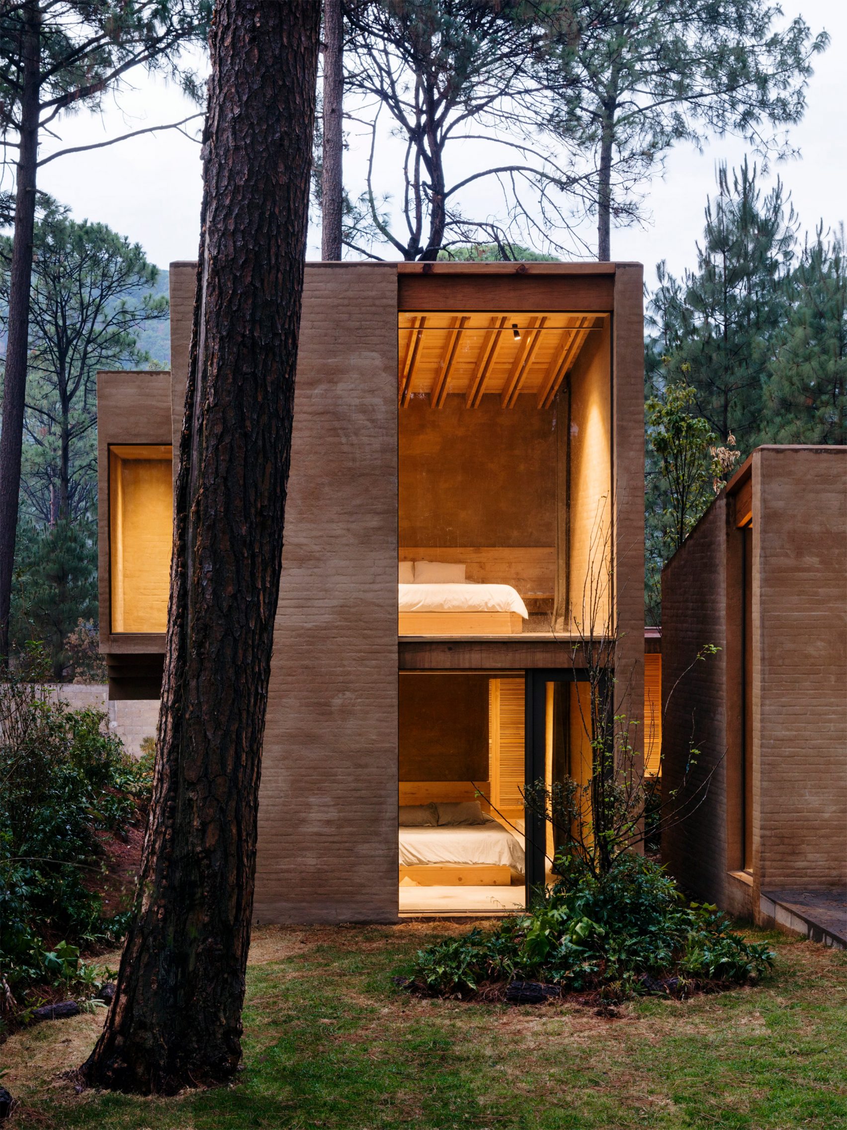
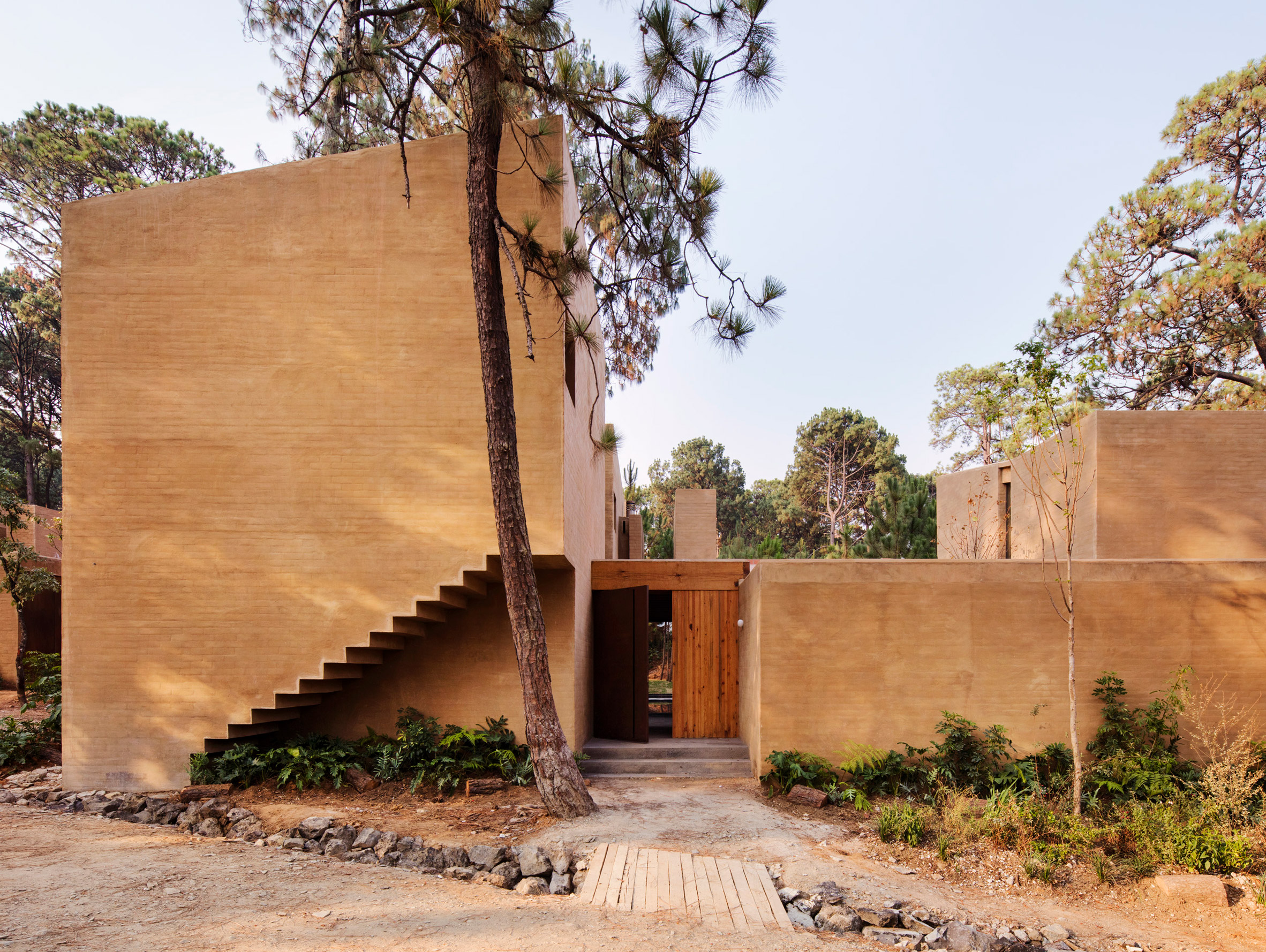
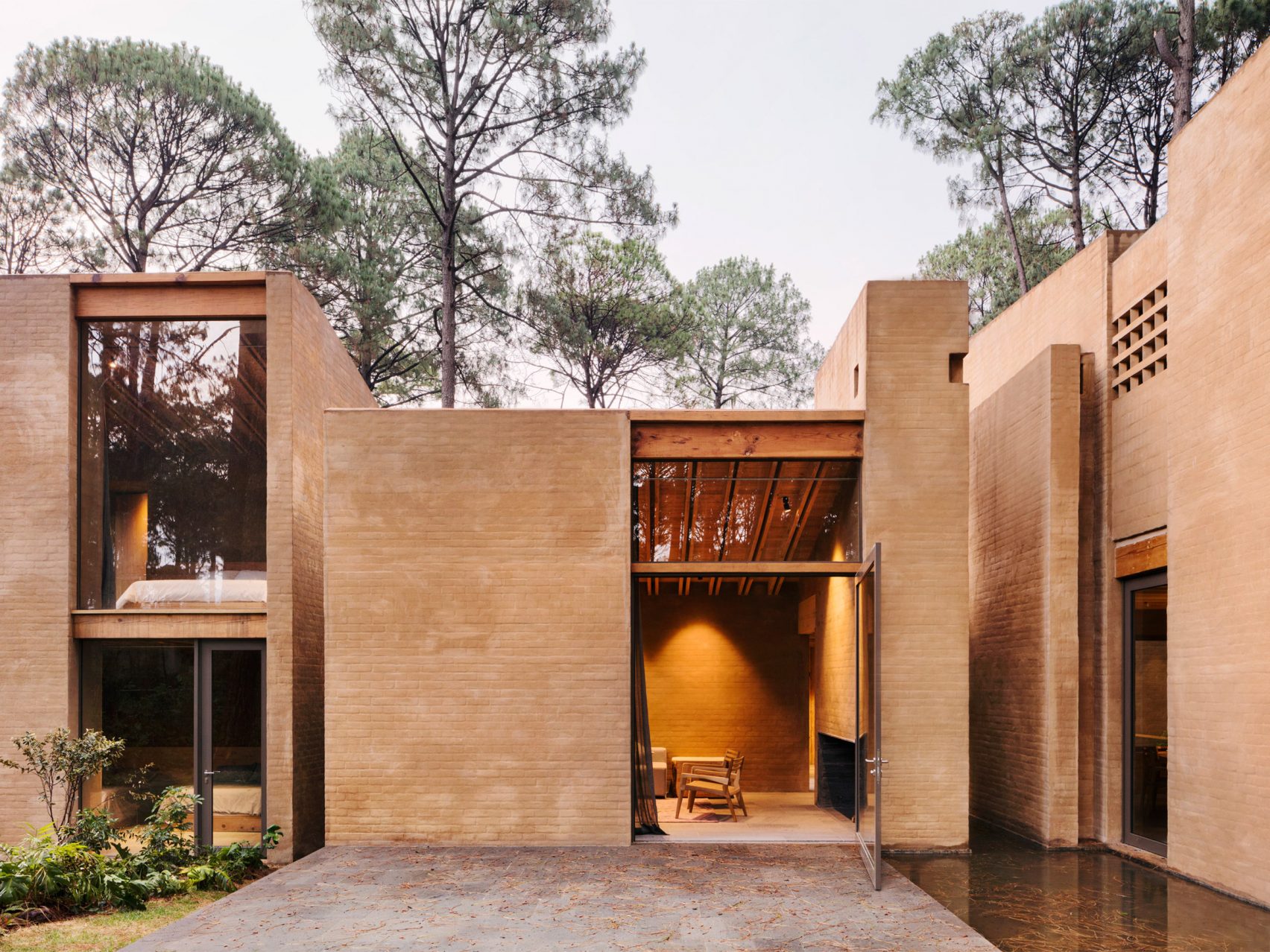
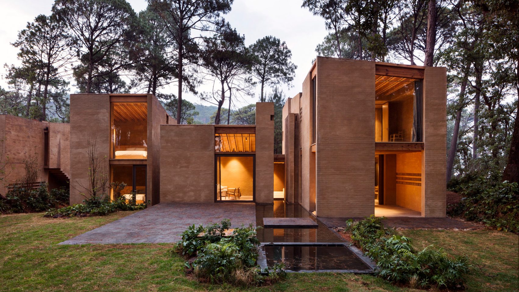
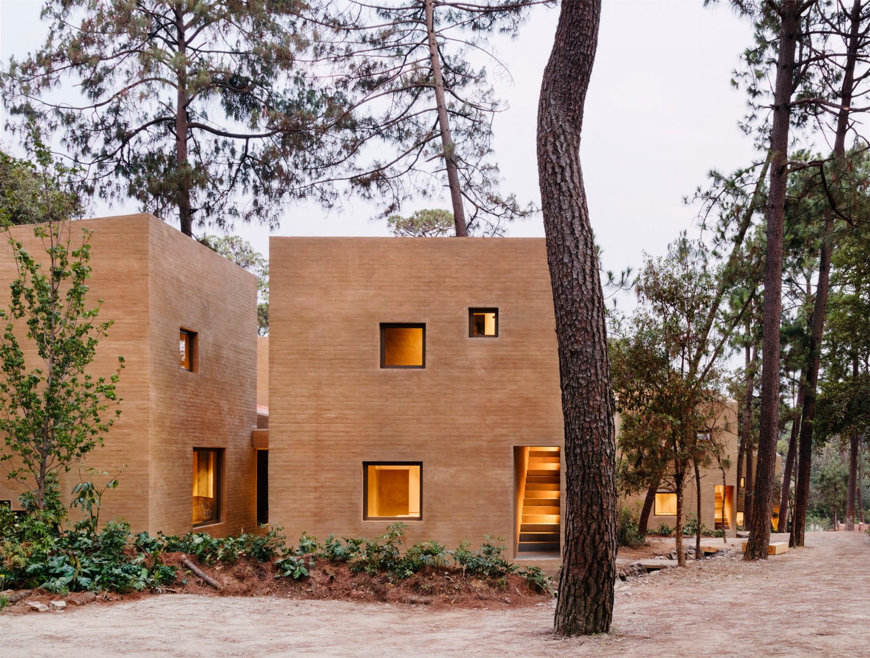
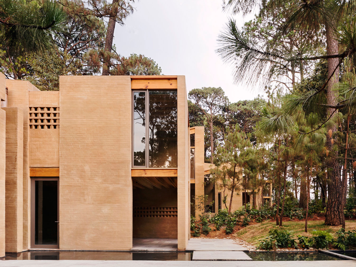
The Entre Pinos In Valle de Bravo, mexico by Taller Hector Barroso
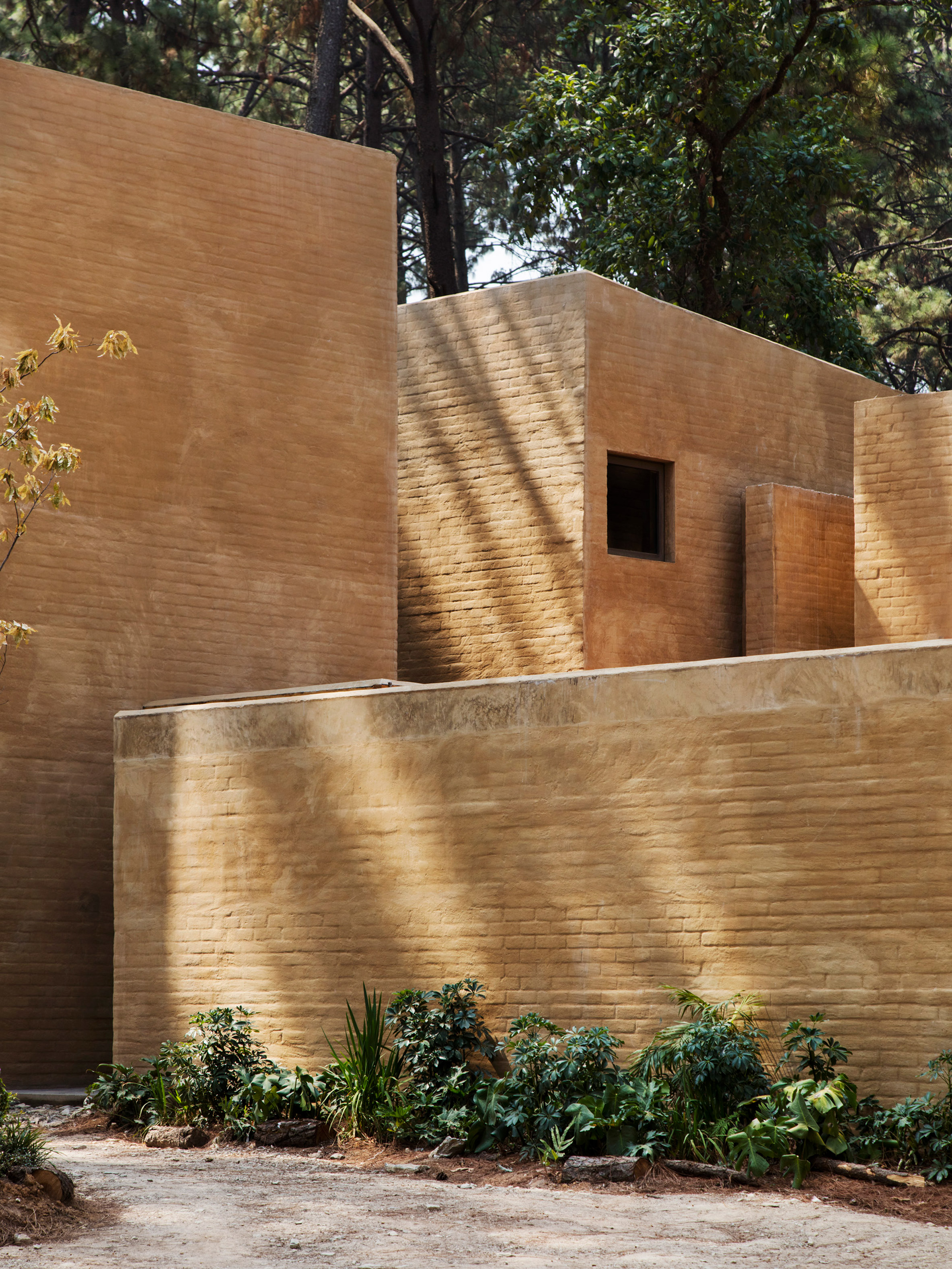
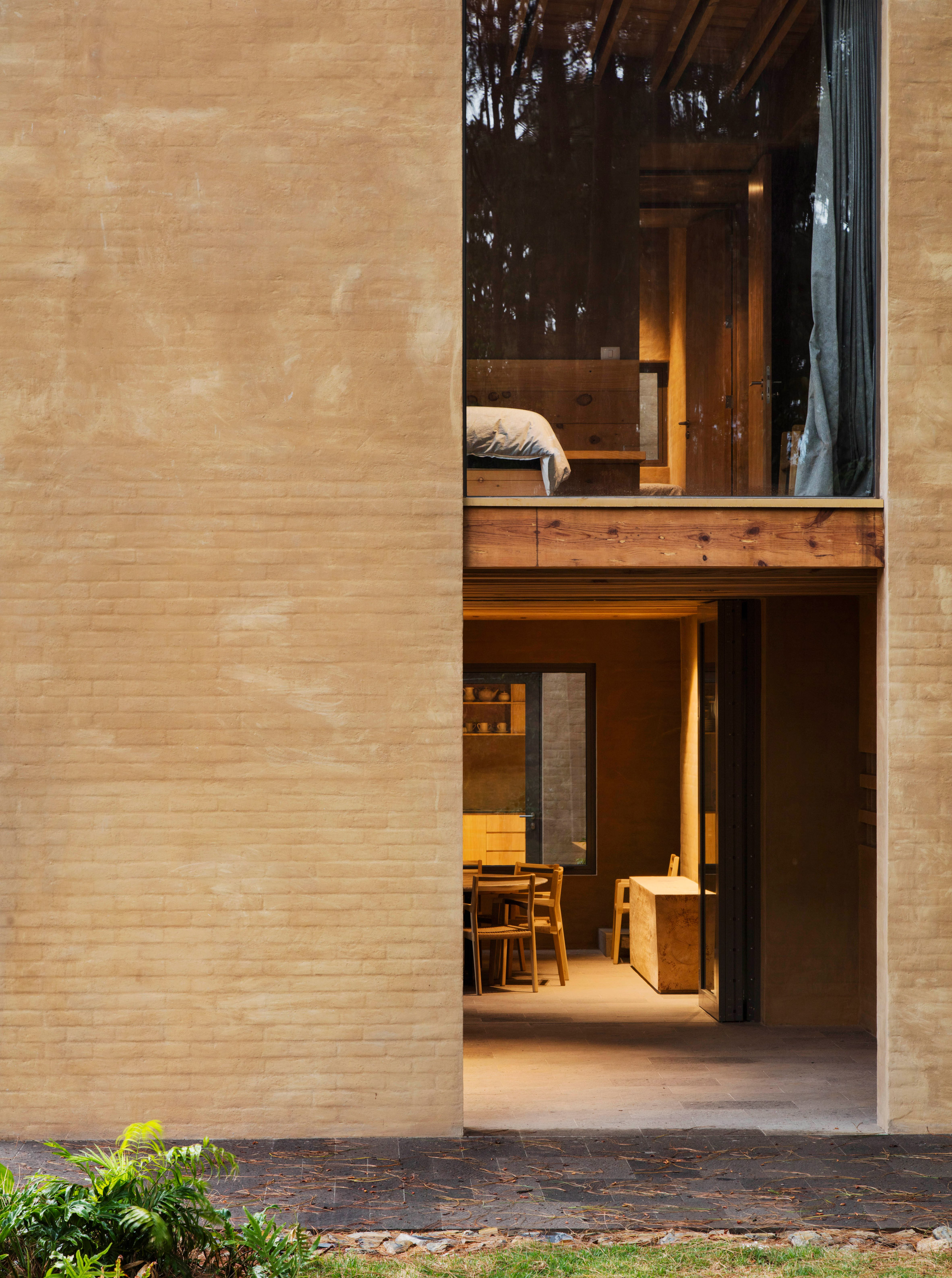
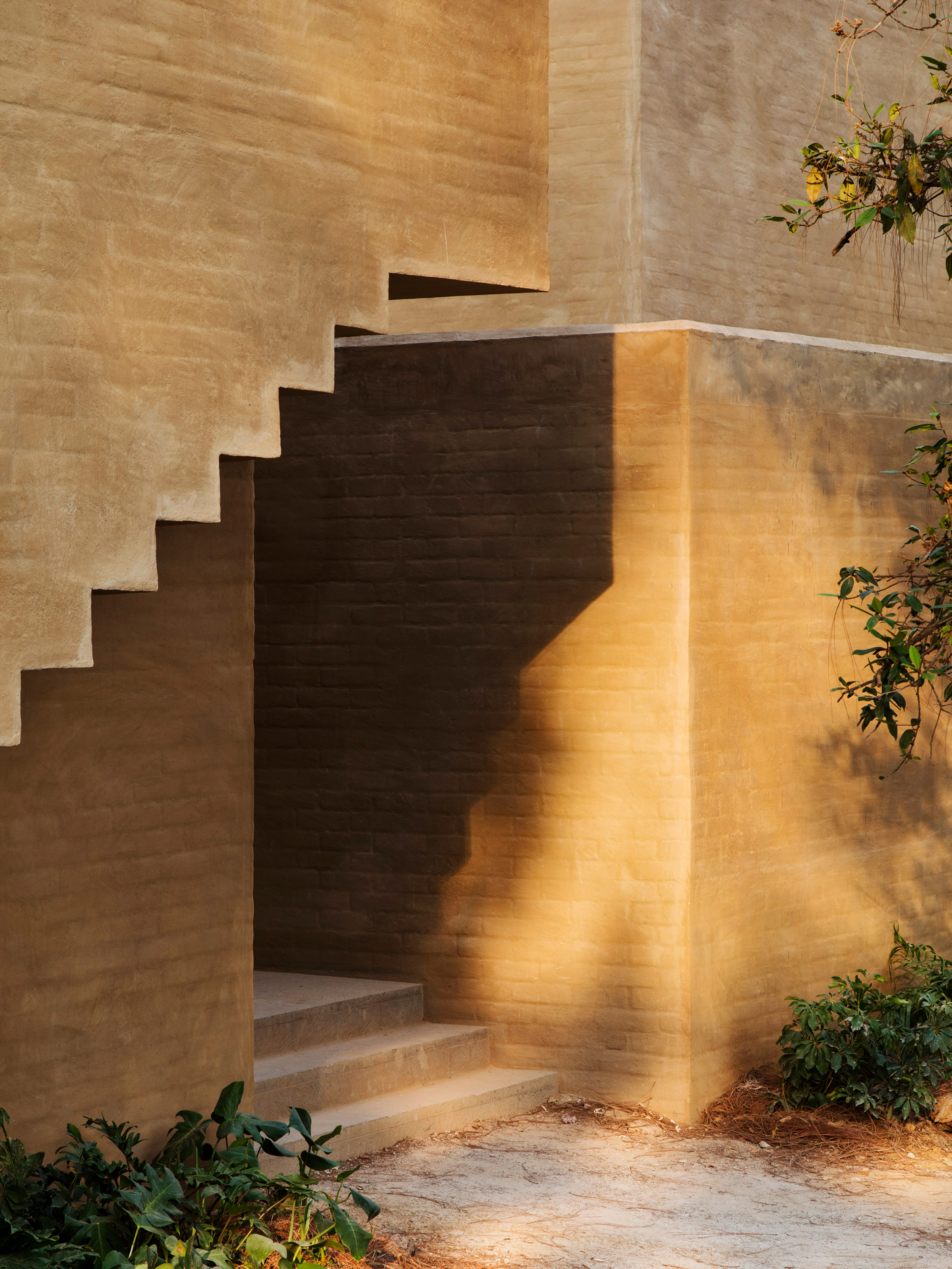
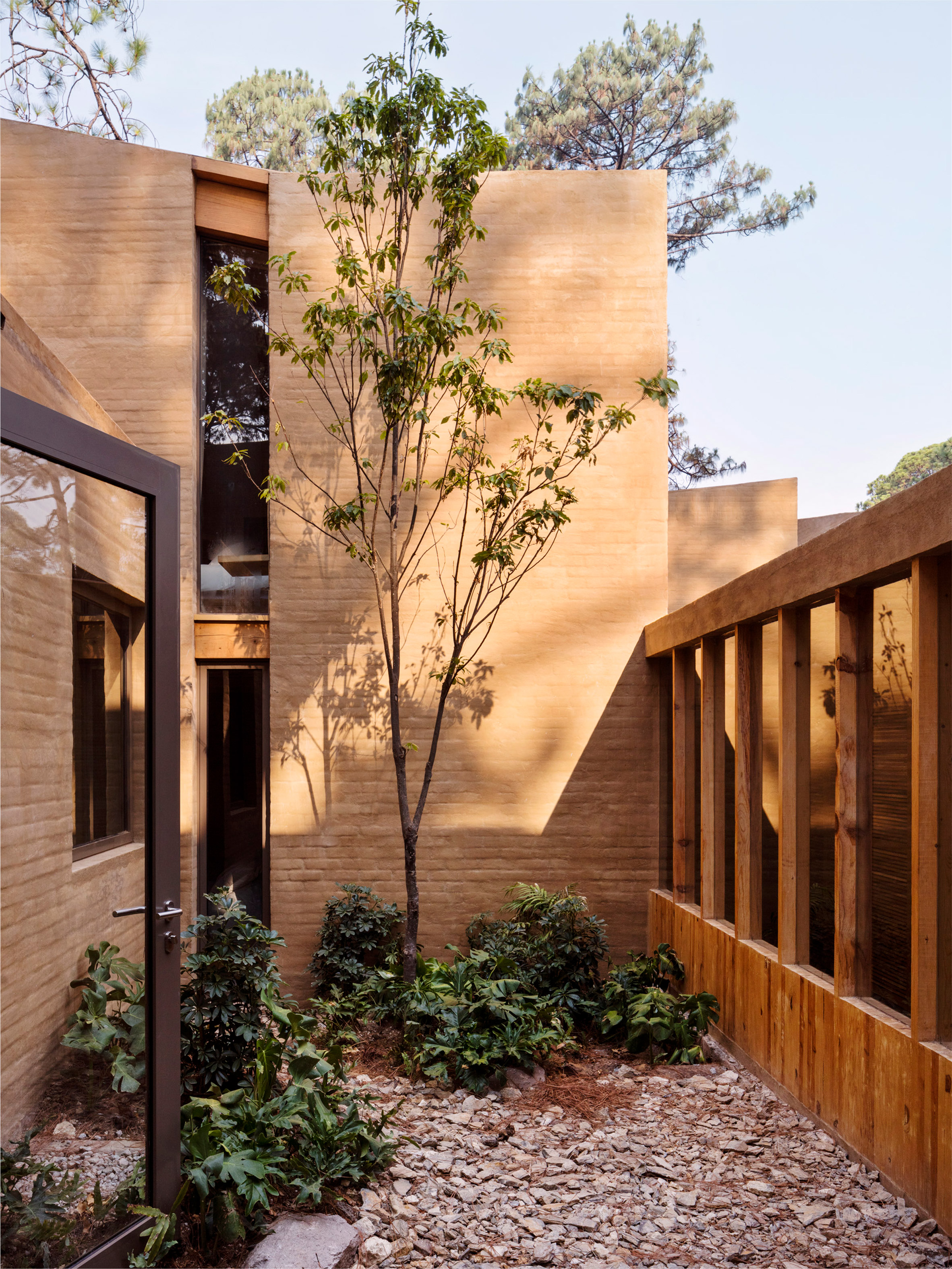
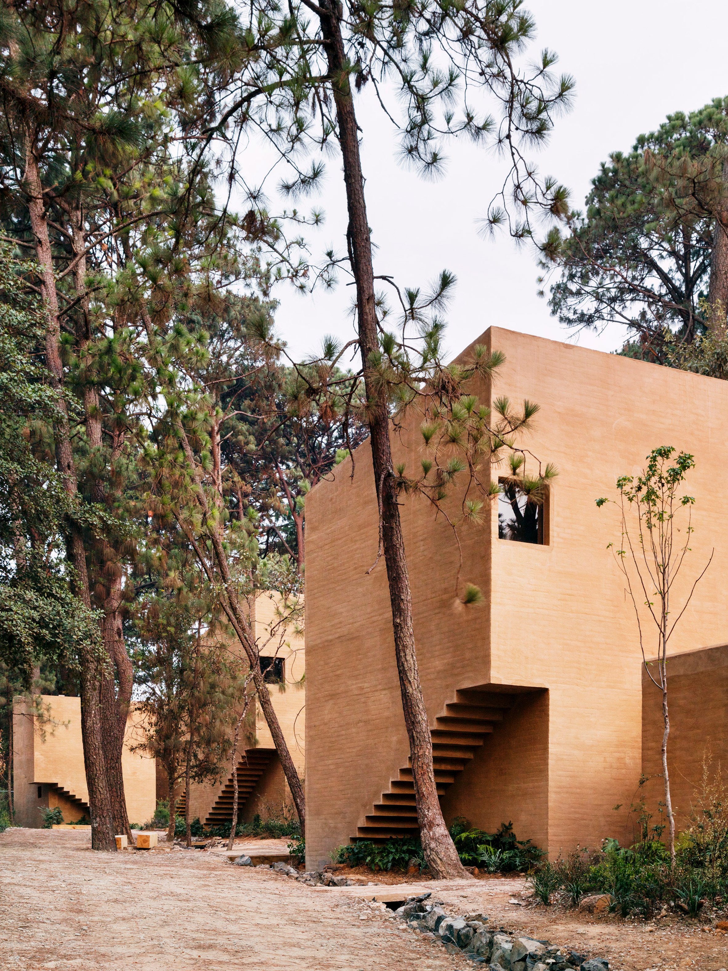
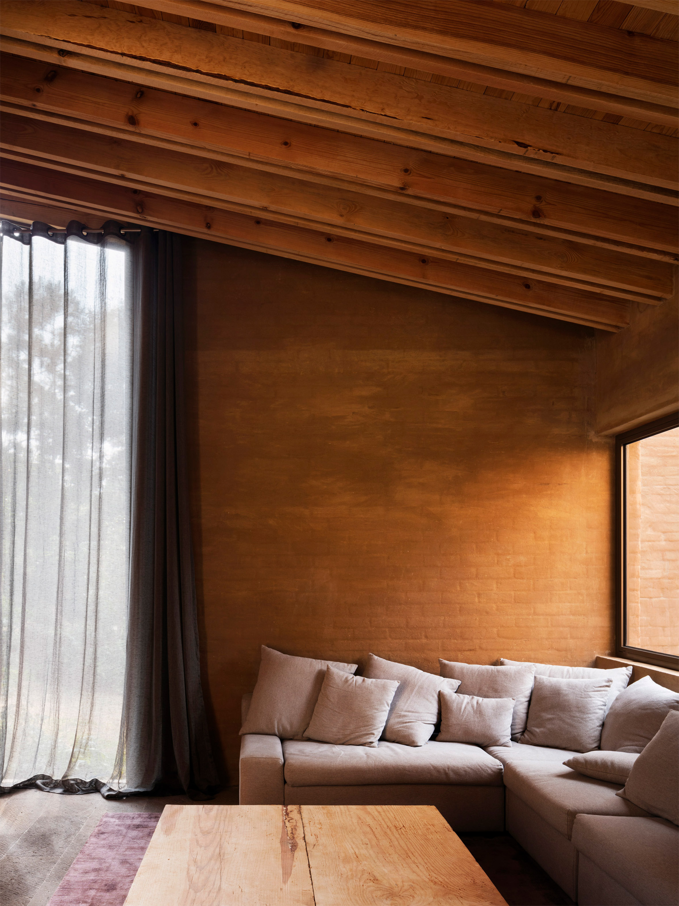
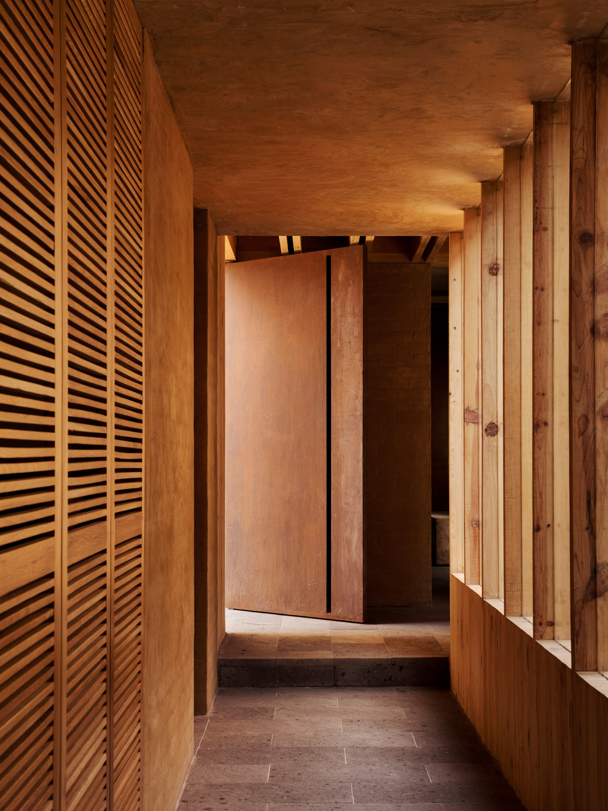
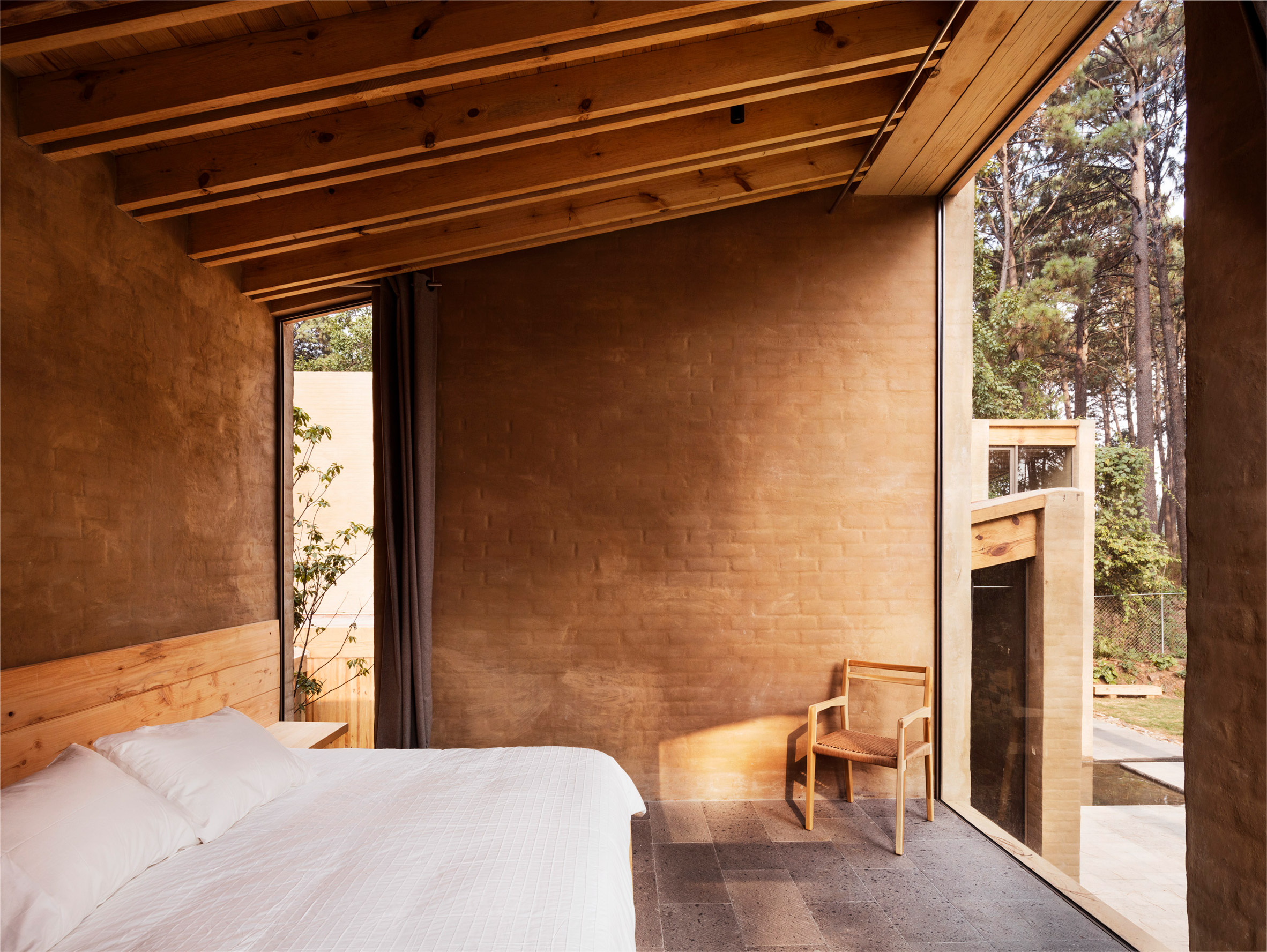
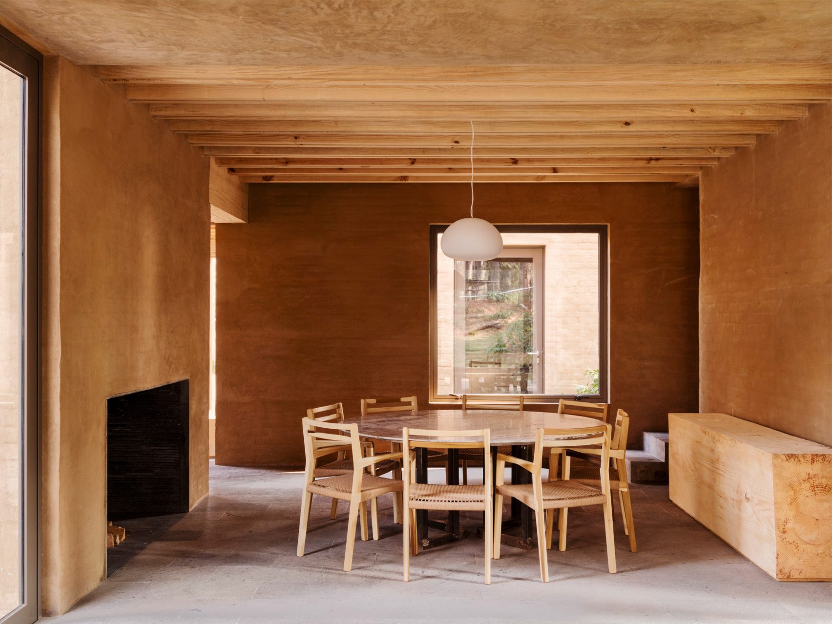
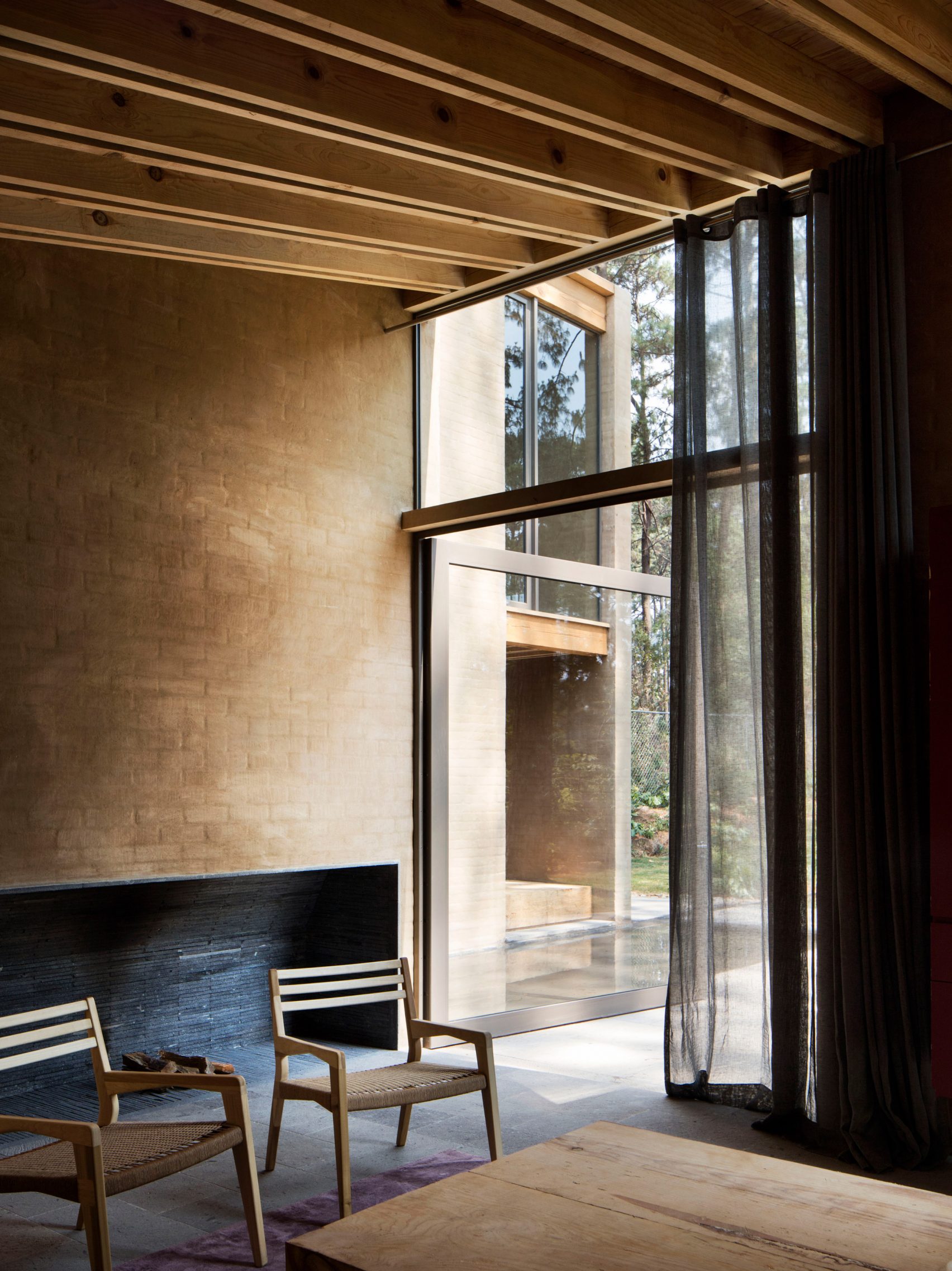
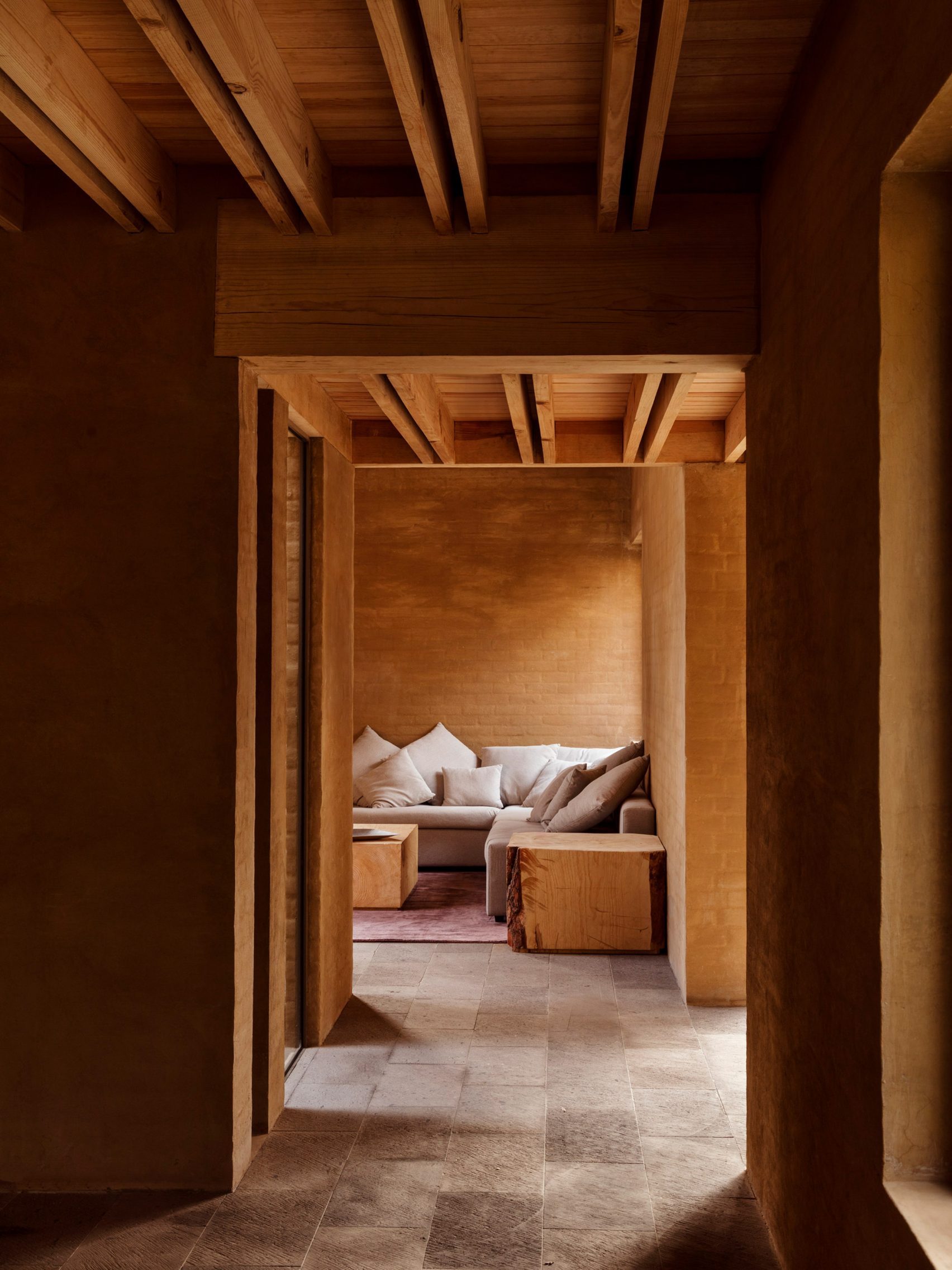
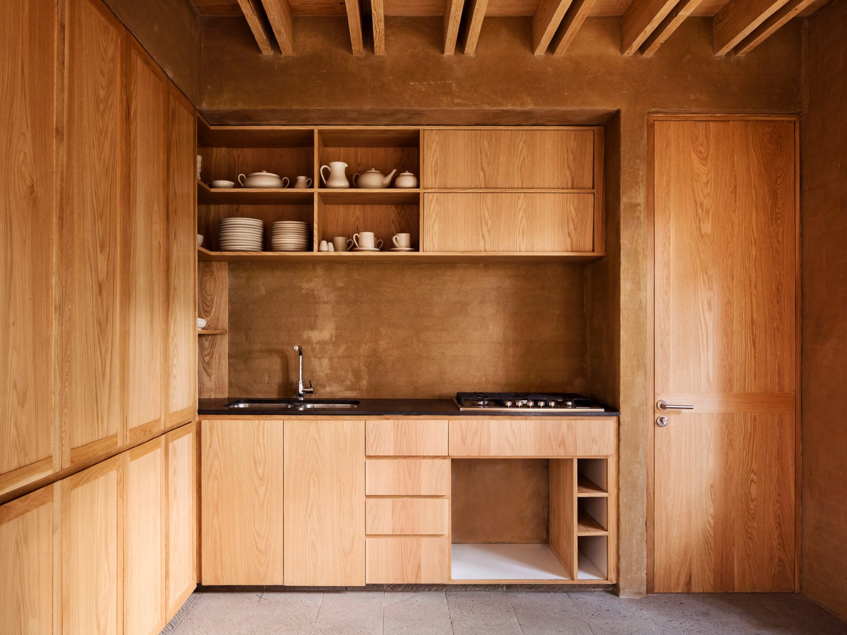
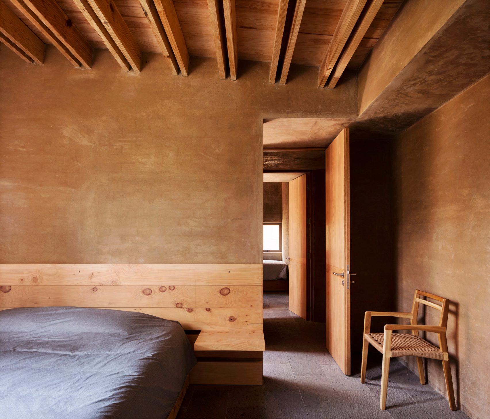
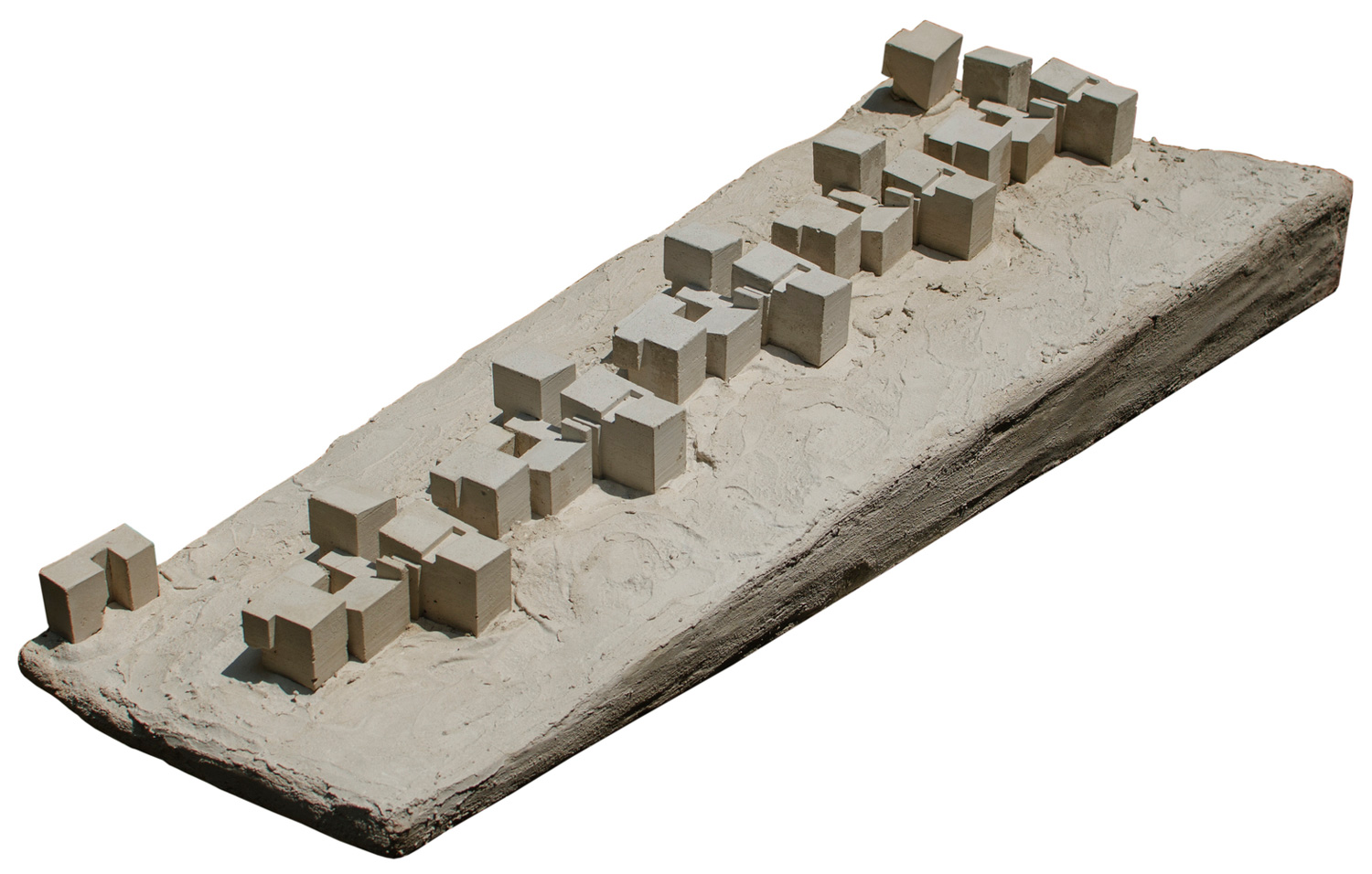
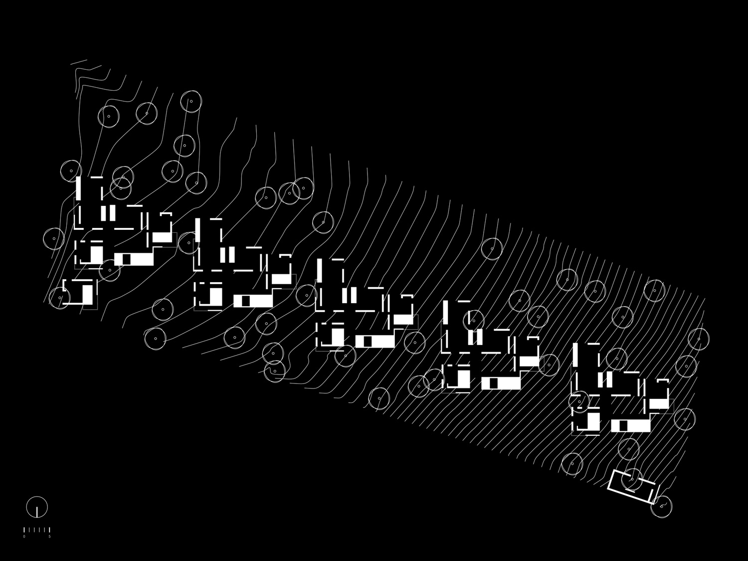
To help this cluster of houses blend into their setting in a Mexican forest, architecture studio Taller Hector Barroso chose to cover the walls in a render made using local soil. The Entre Pinos development comprises a row of five weekend houses, designed by the Mexico City-based design firm for a site in the vast forest surrounding the town of Valle de Bravo.
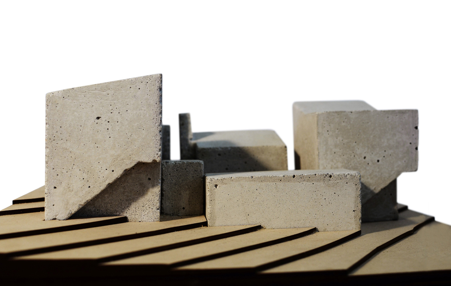
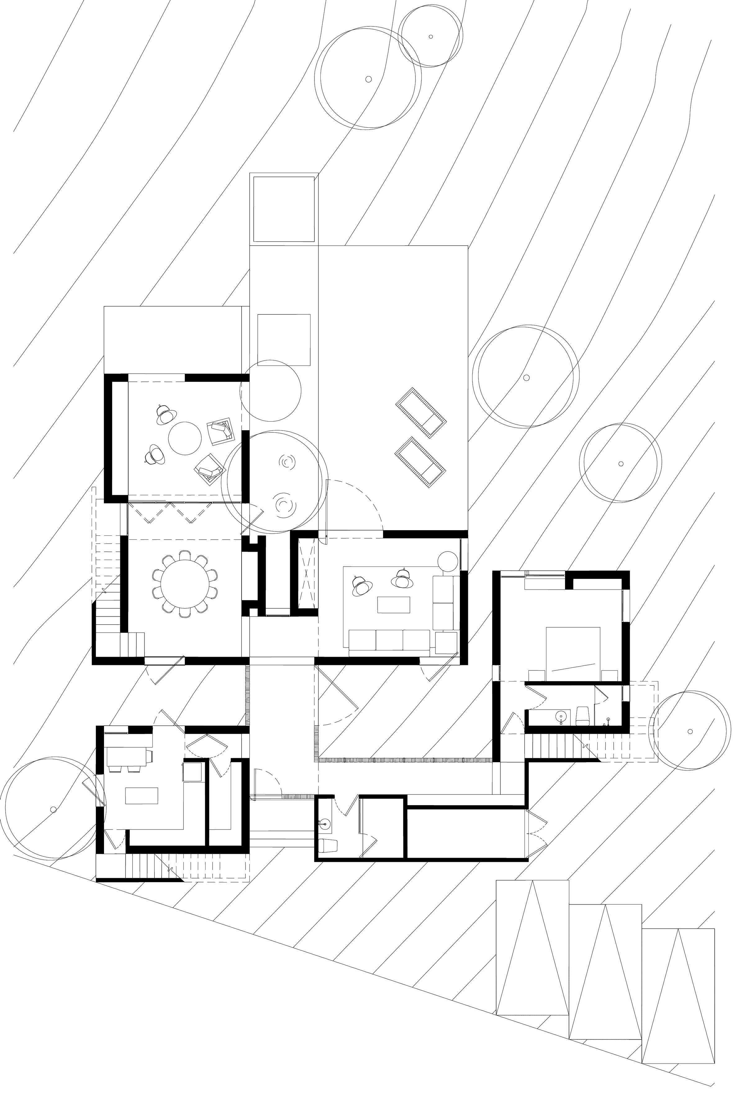
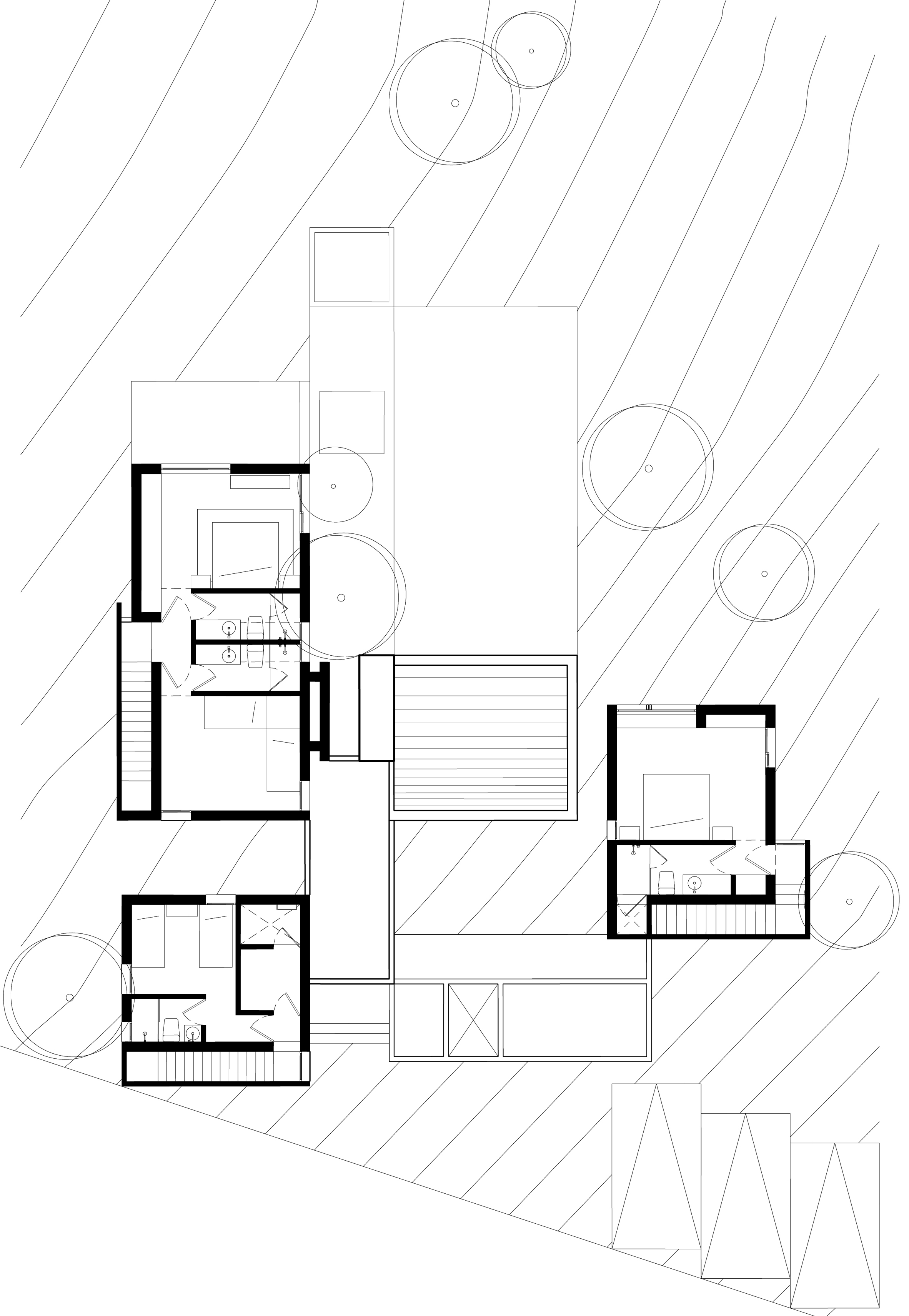
The properties are positioned among tall pine trees in a line that sees them descend gradually to follow the topography of the sloping forest floor. The five buildings are identical. Each one is made up of a series of blocks in varying heights, grouped around a landscaped patio.
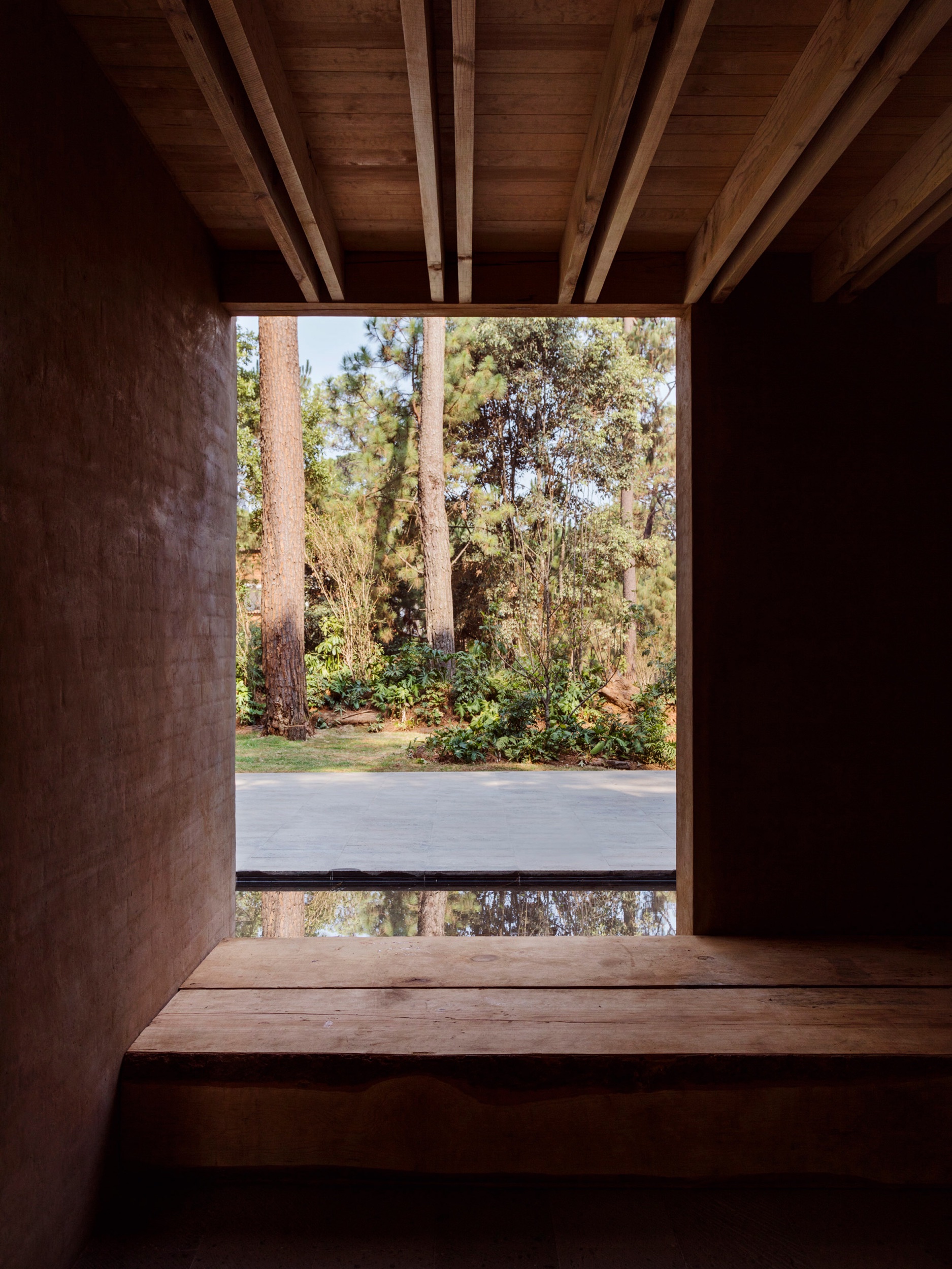
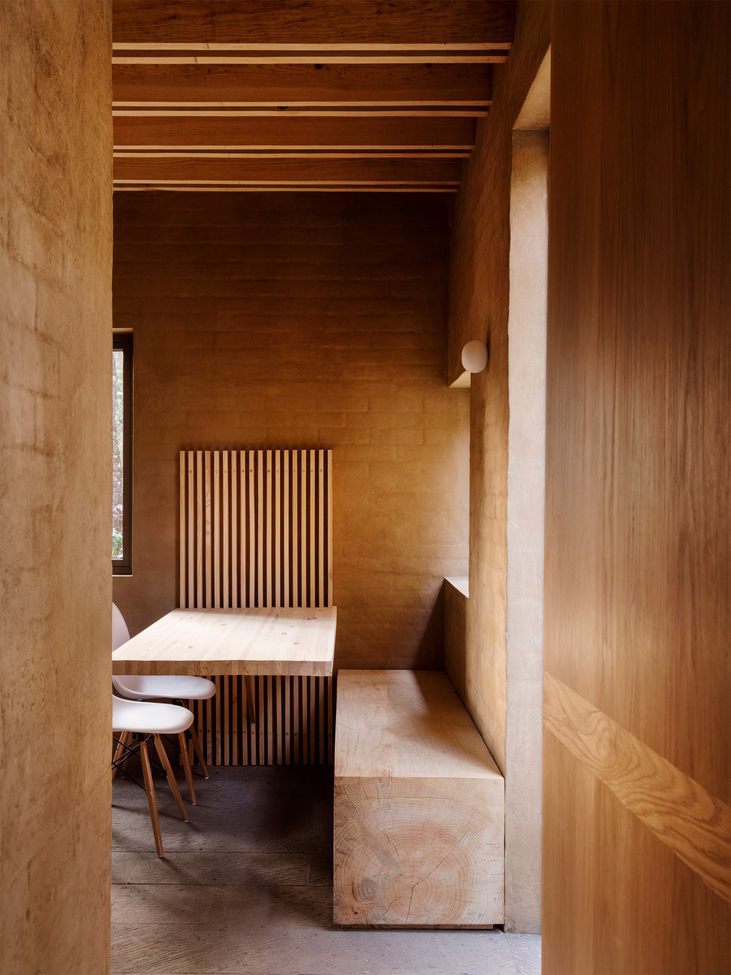
The architecture utilises local materials. These include timber and brick, as well as the soil used to mix the render applied to wall surfaces. The rendered brick gives the building its earthy pink tone. It creates a feeling of warmth and consistency throughout the interior spaces, complemented by natural stone flooring and the exposed timber framework.
Photography by Rory Gardiner.
VILLA WAALRE IN THE NETHERLANDS BY RUSSELL JONES
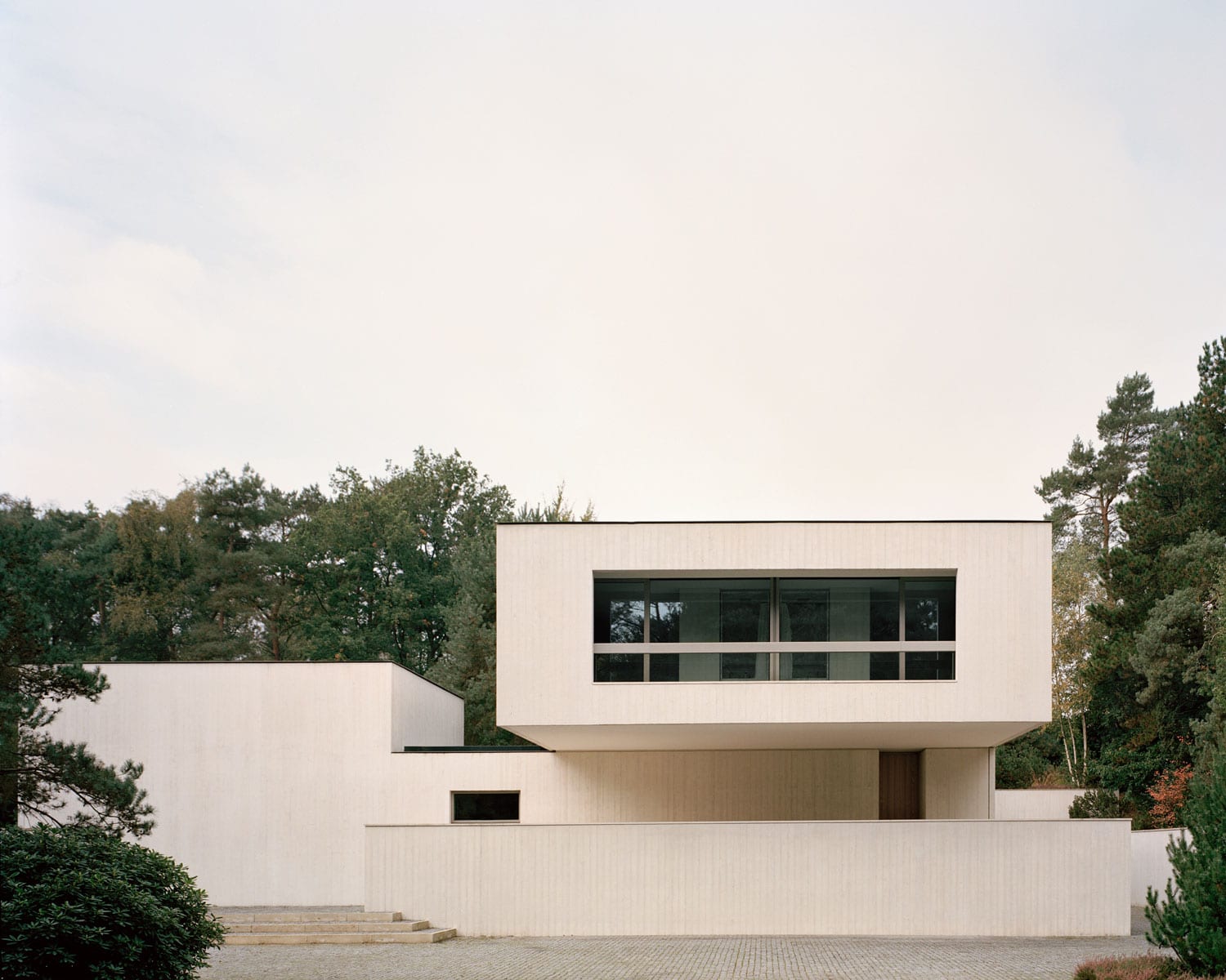
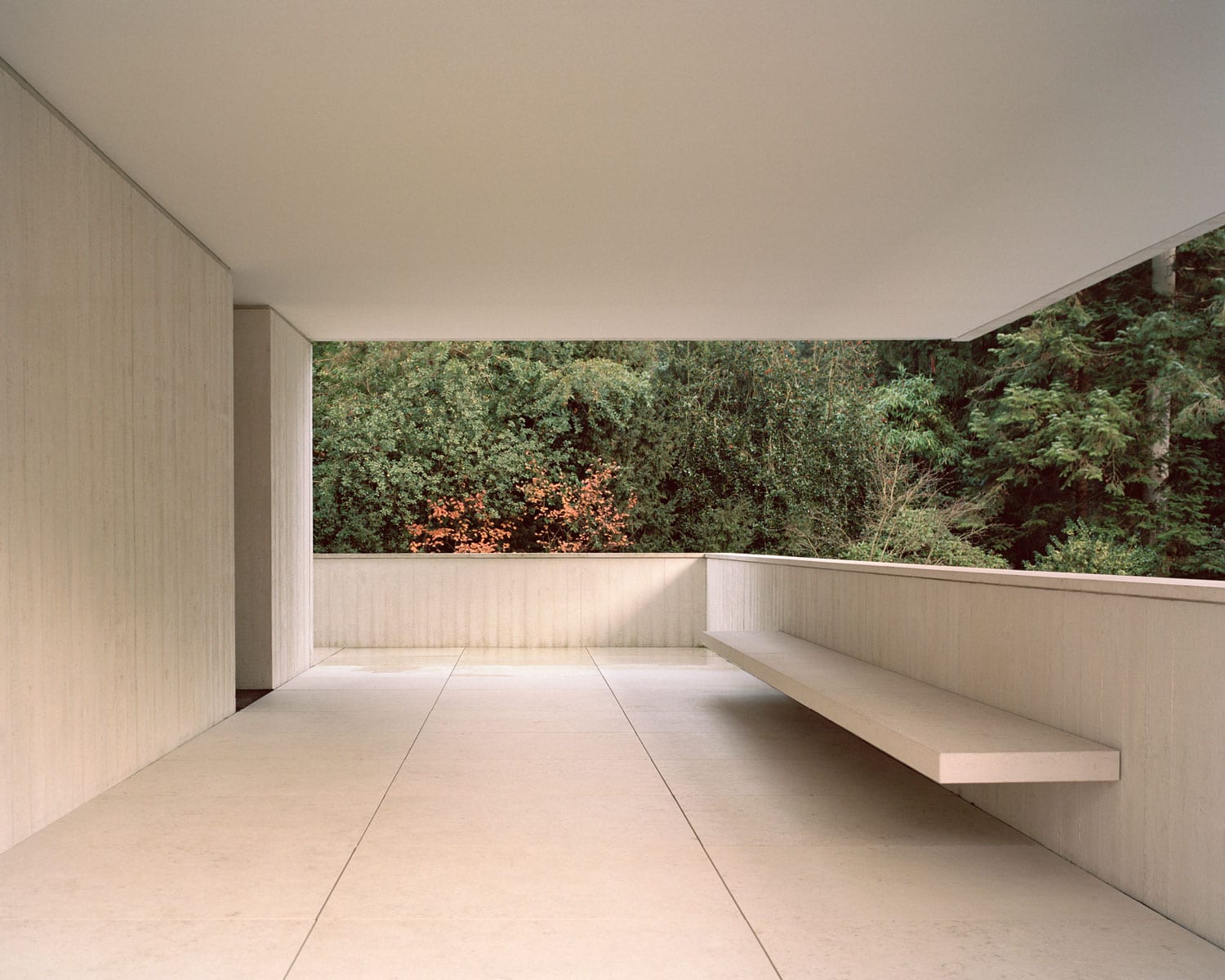
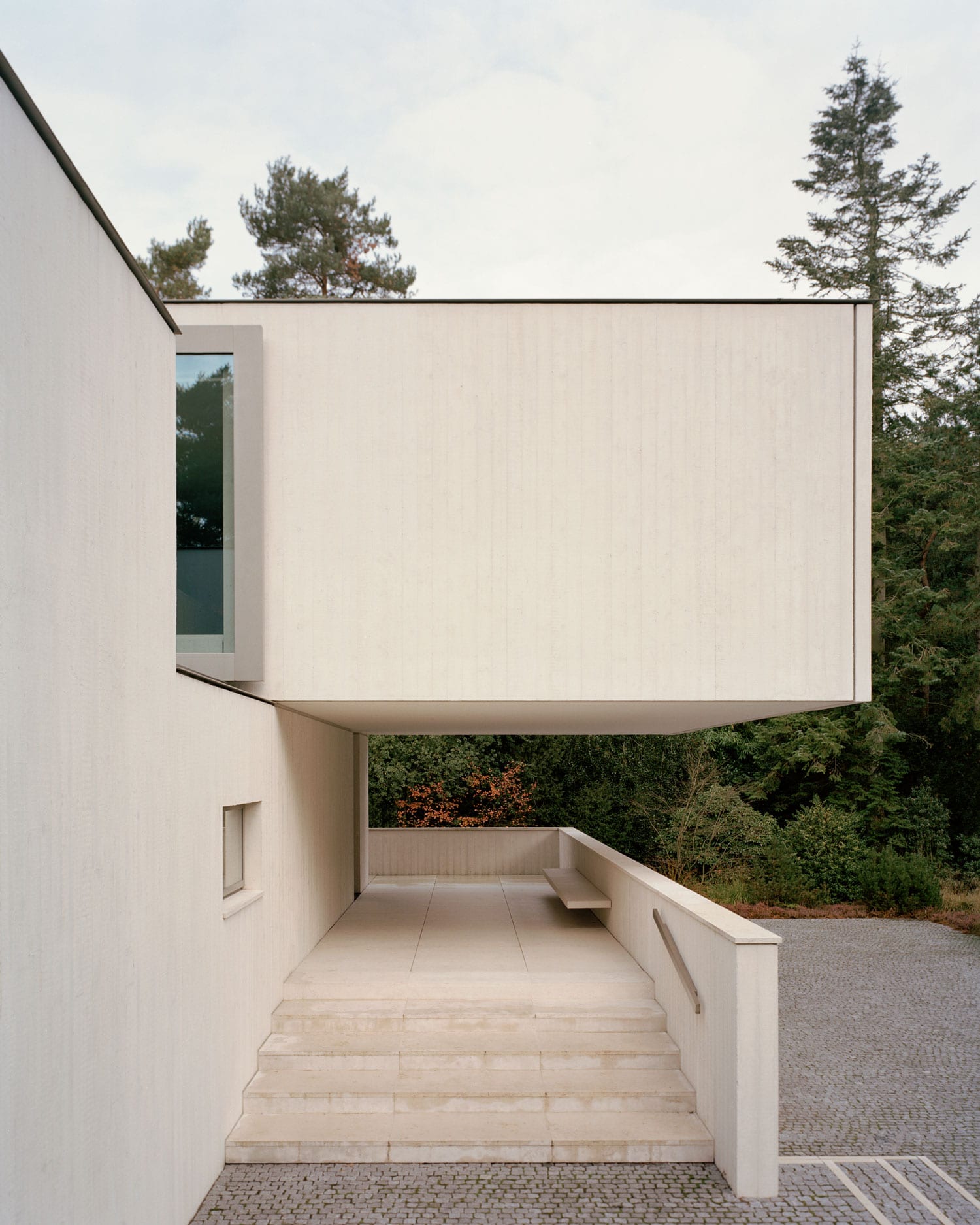
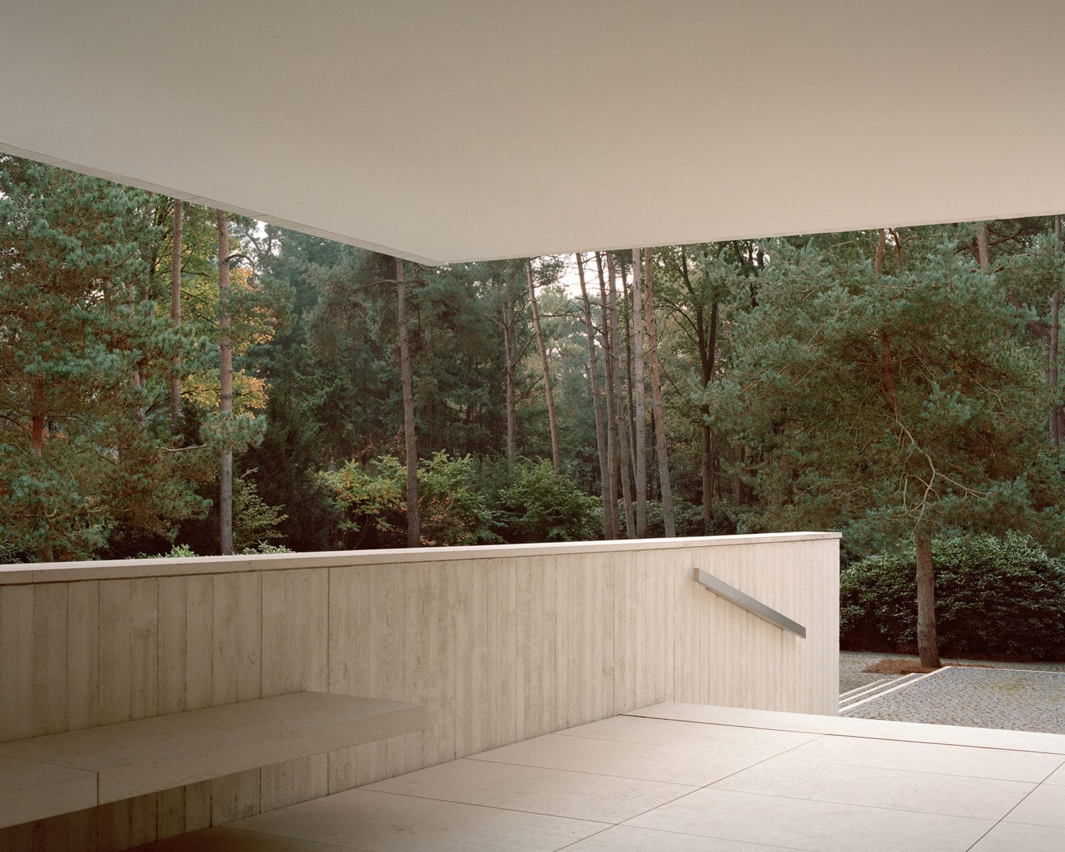
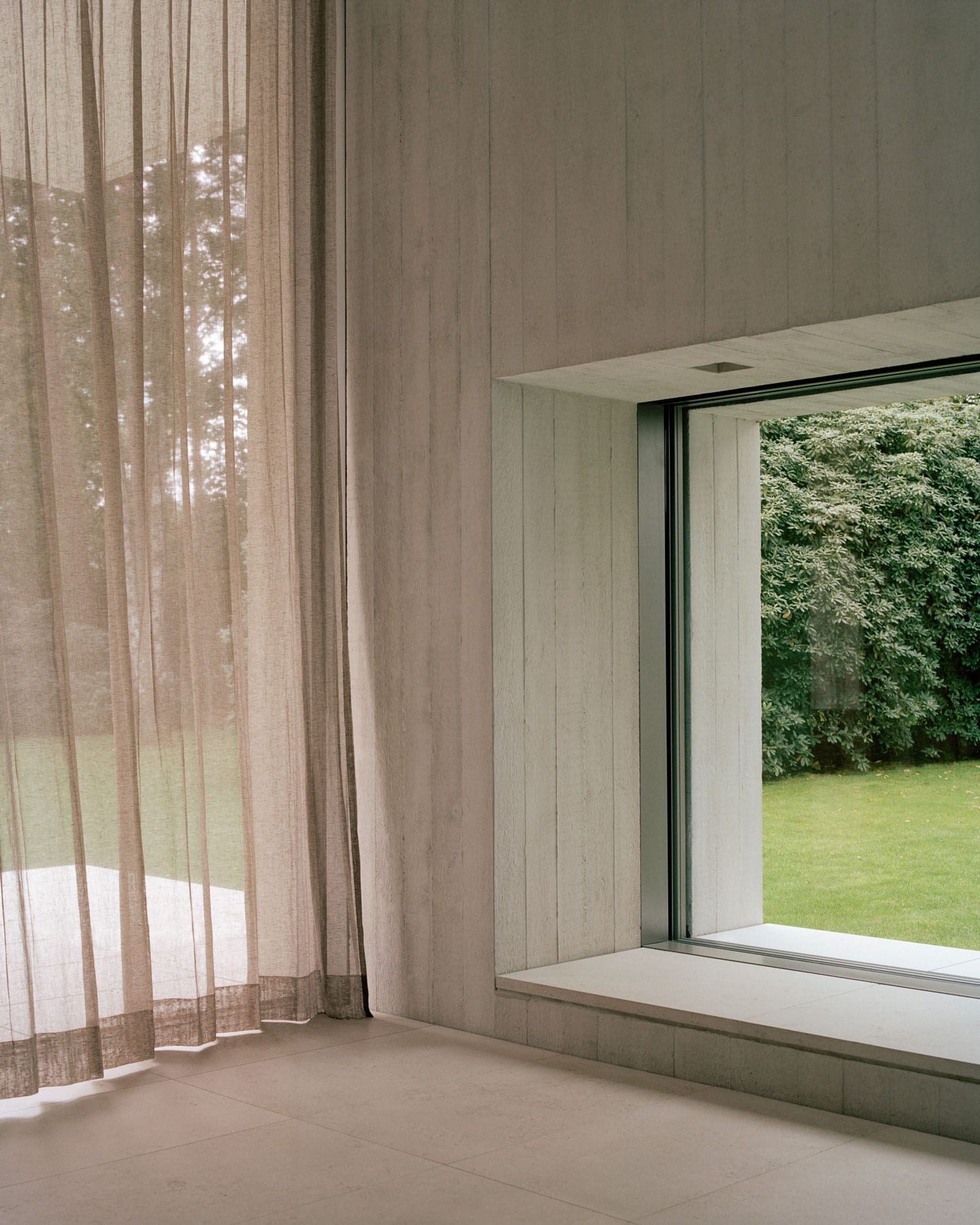
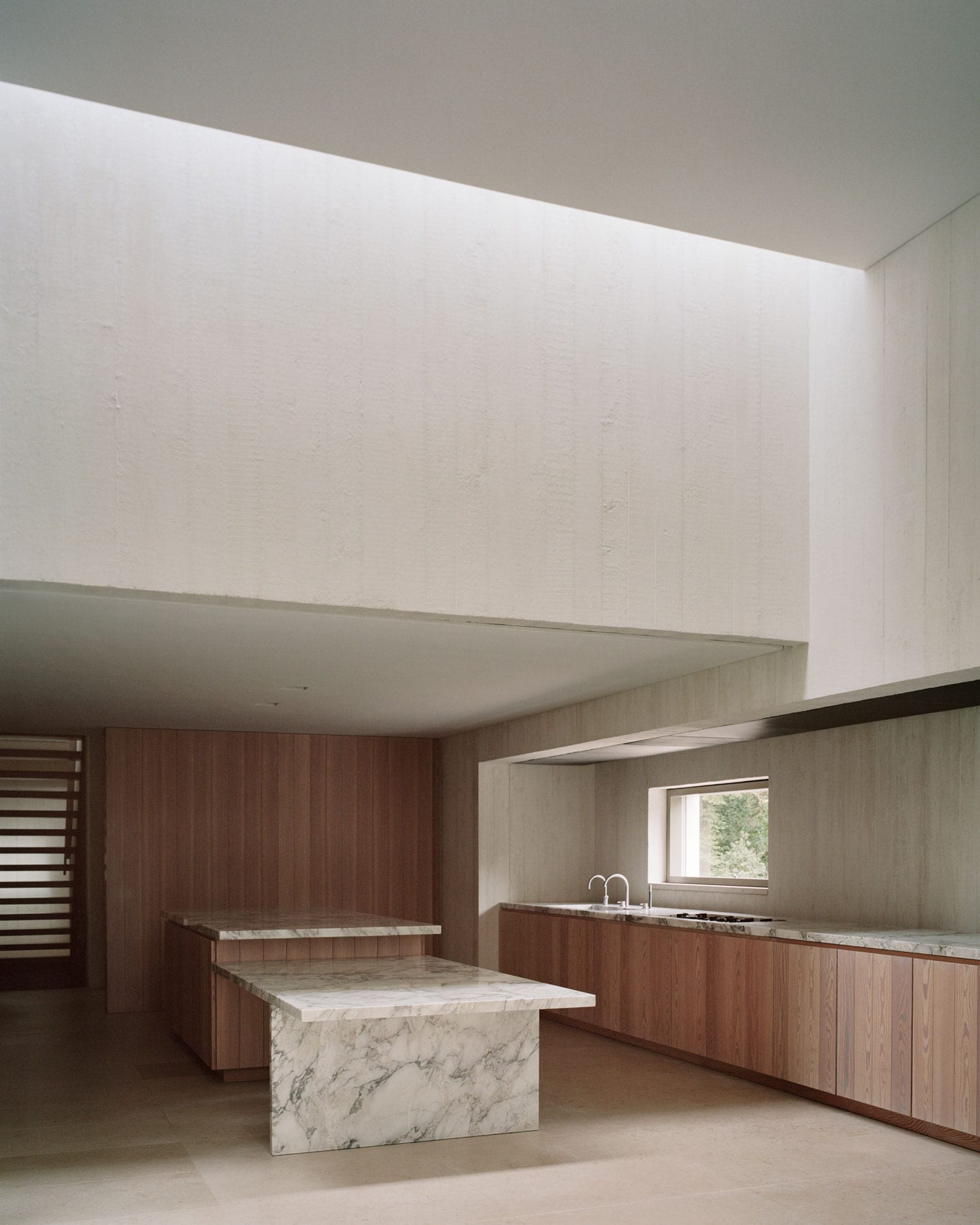
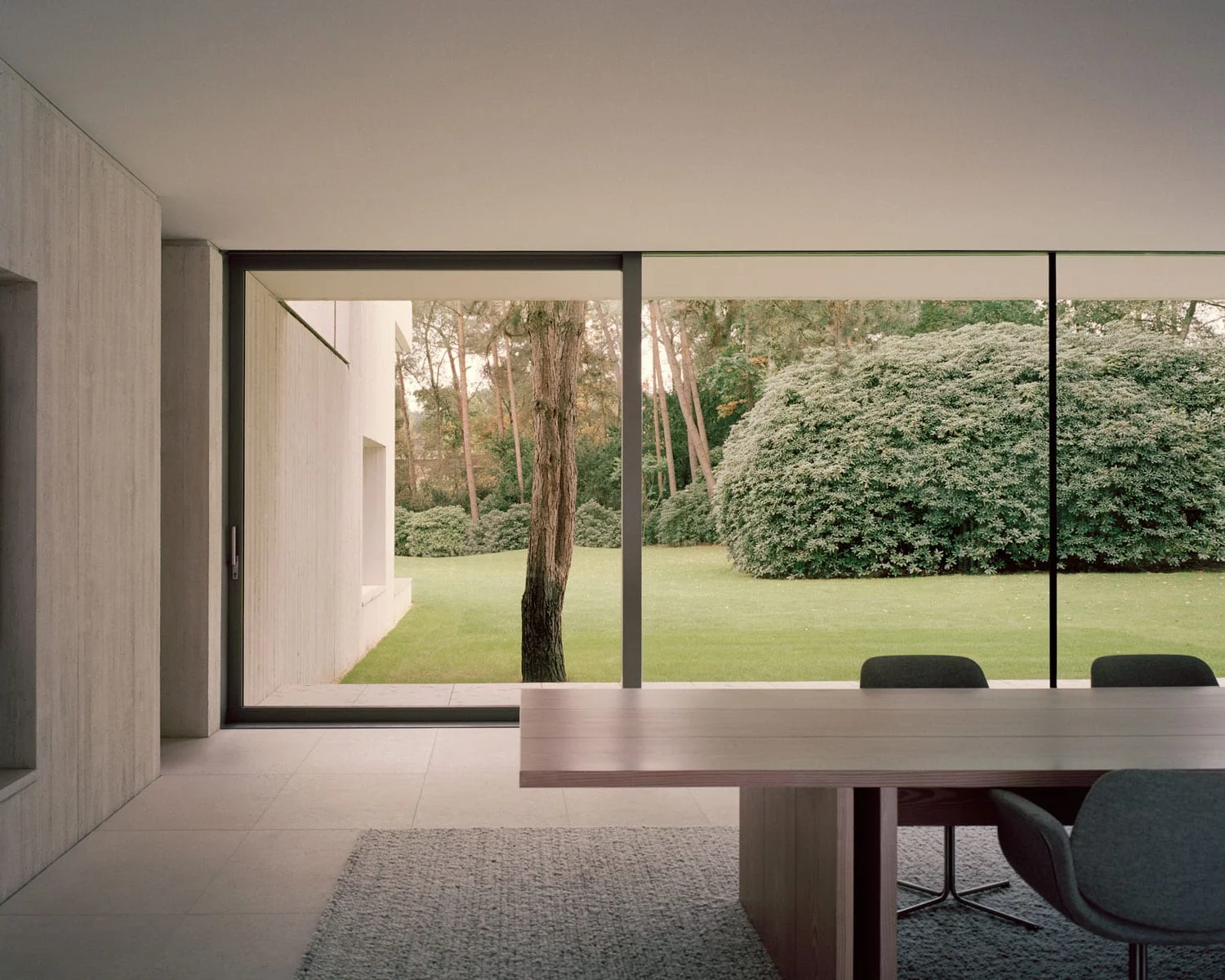
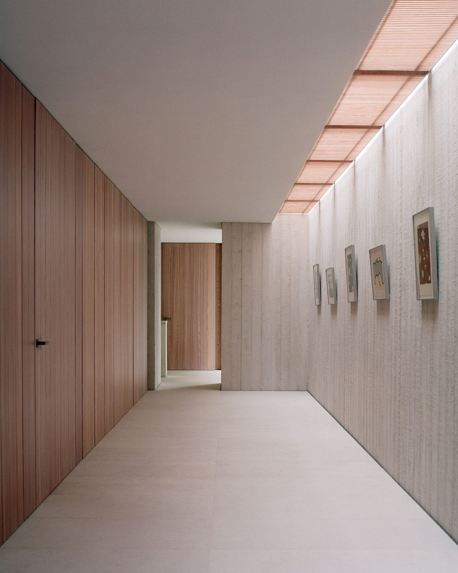
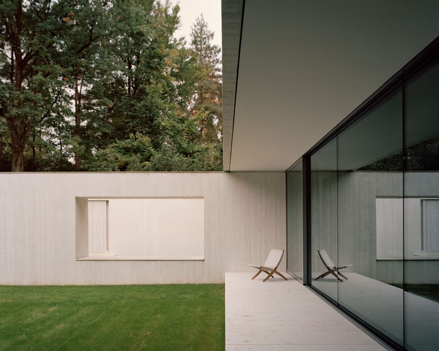
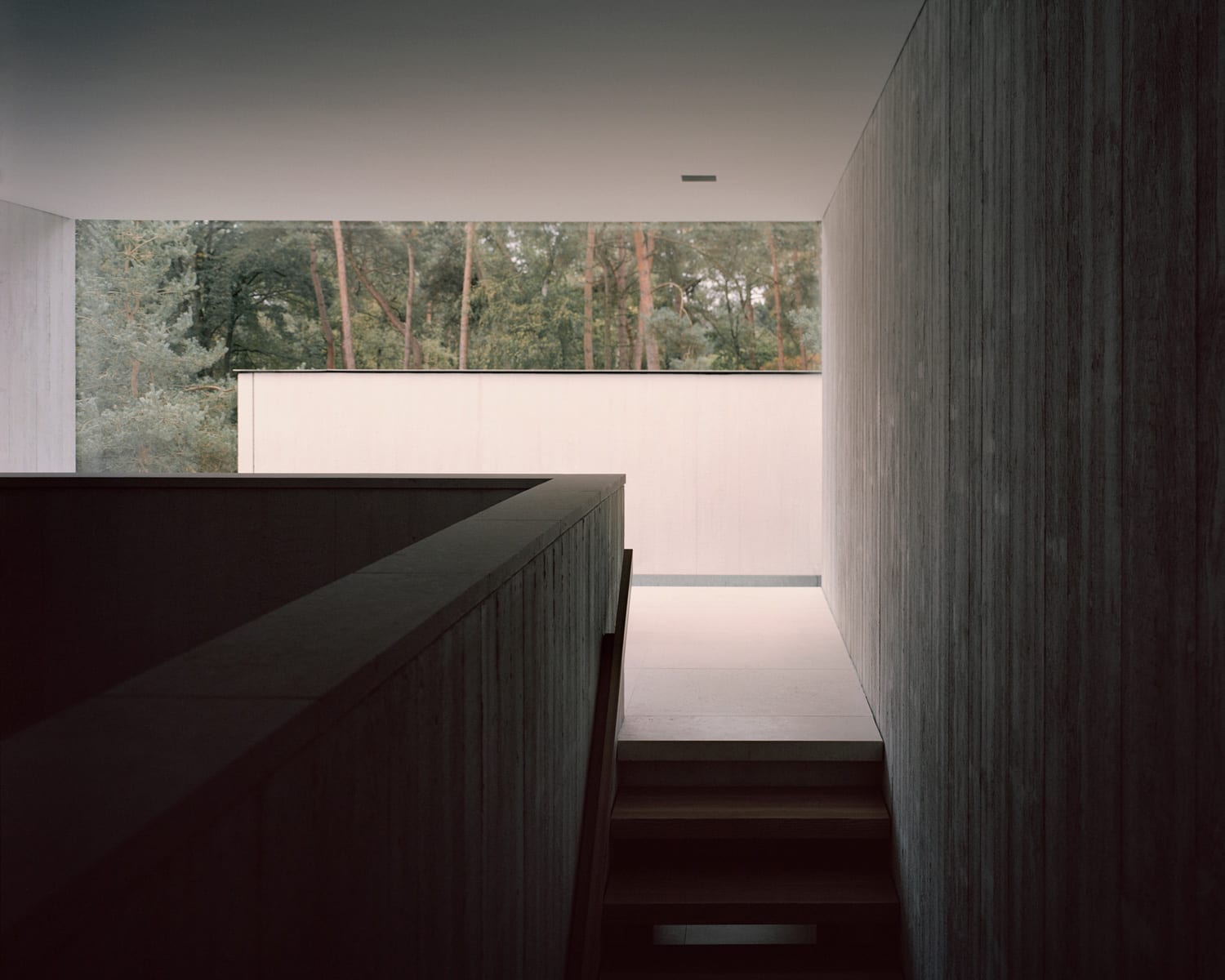
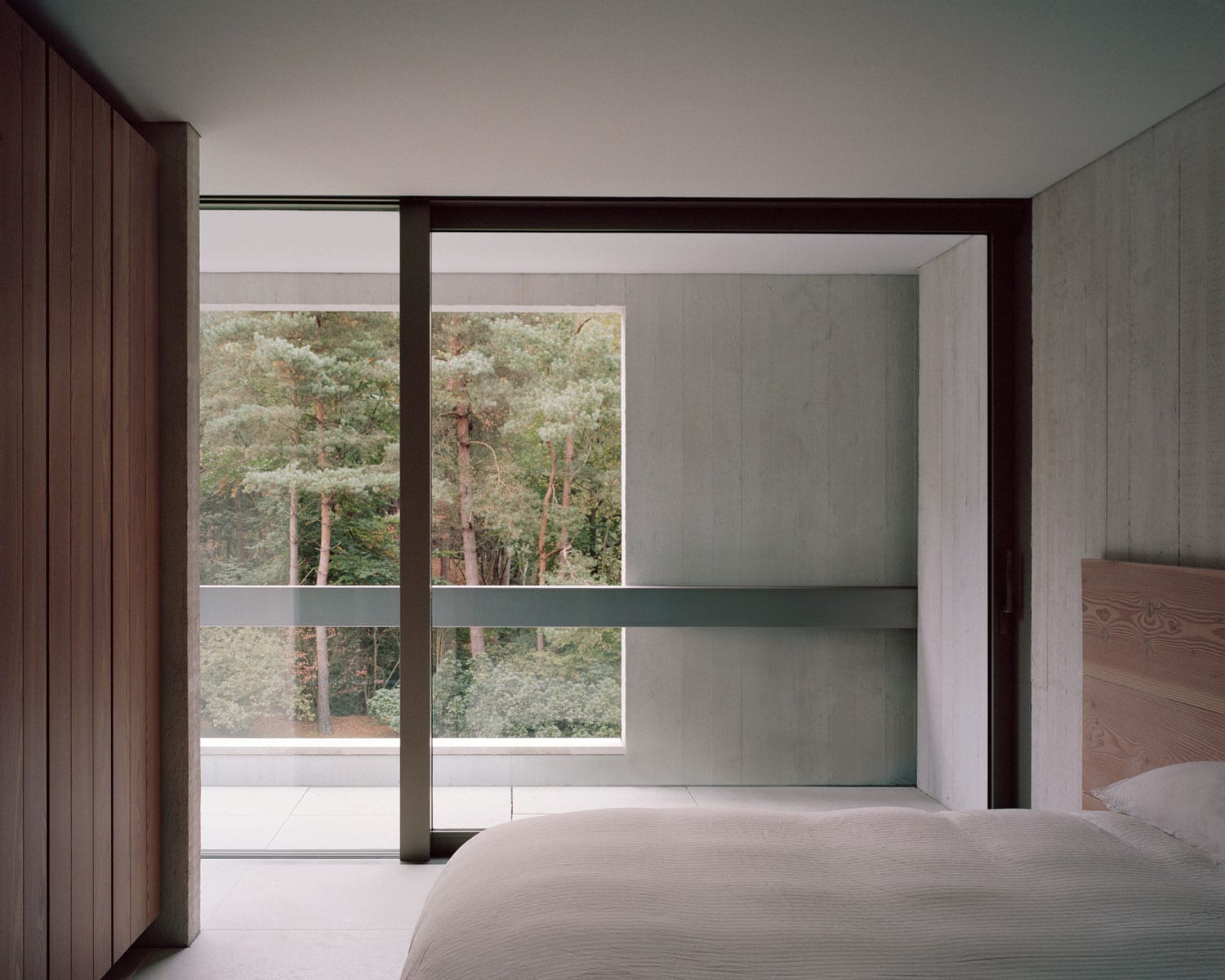
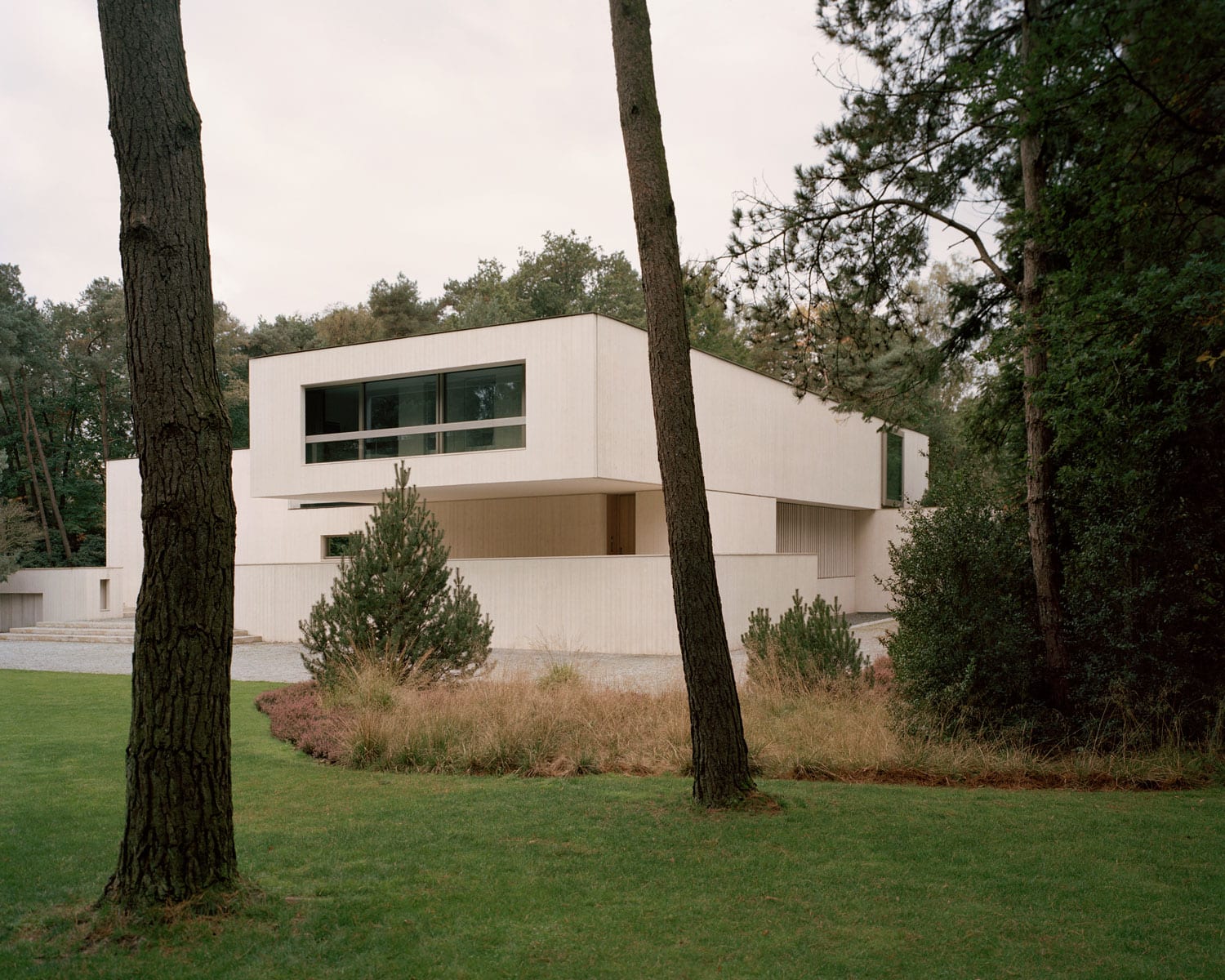
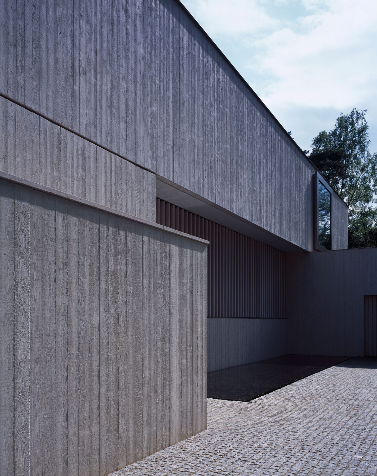
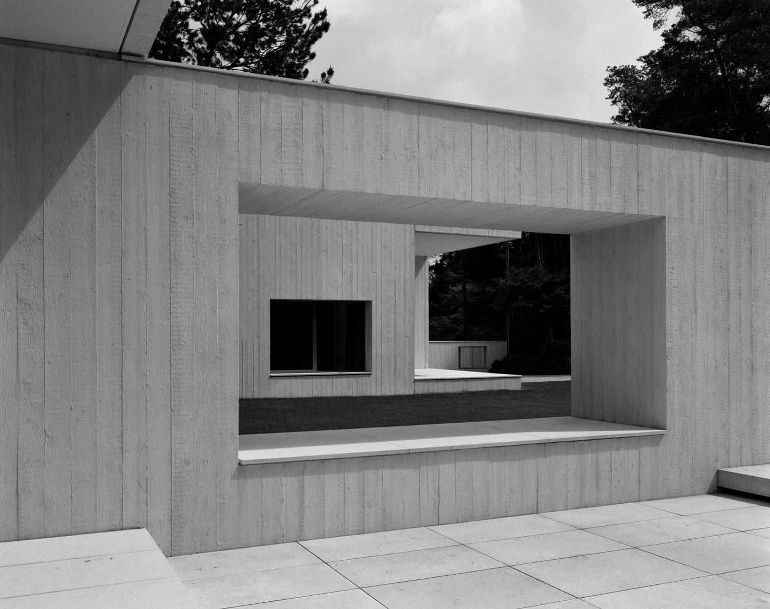
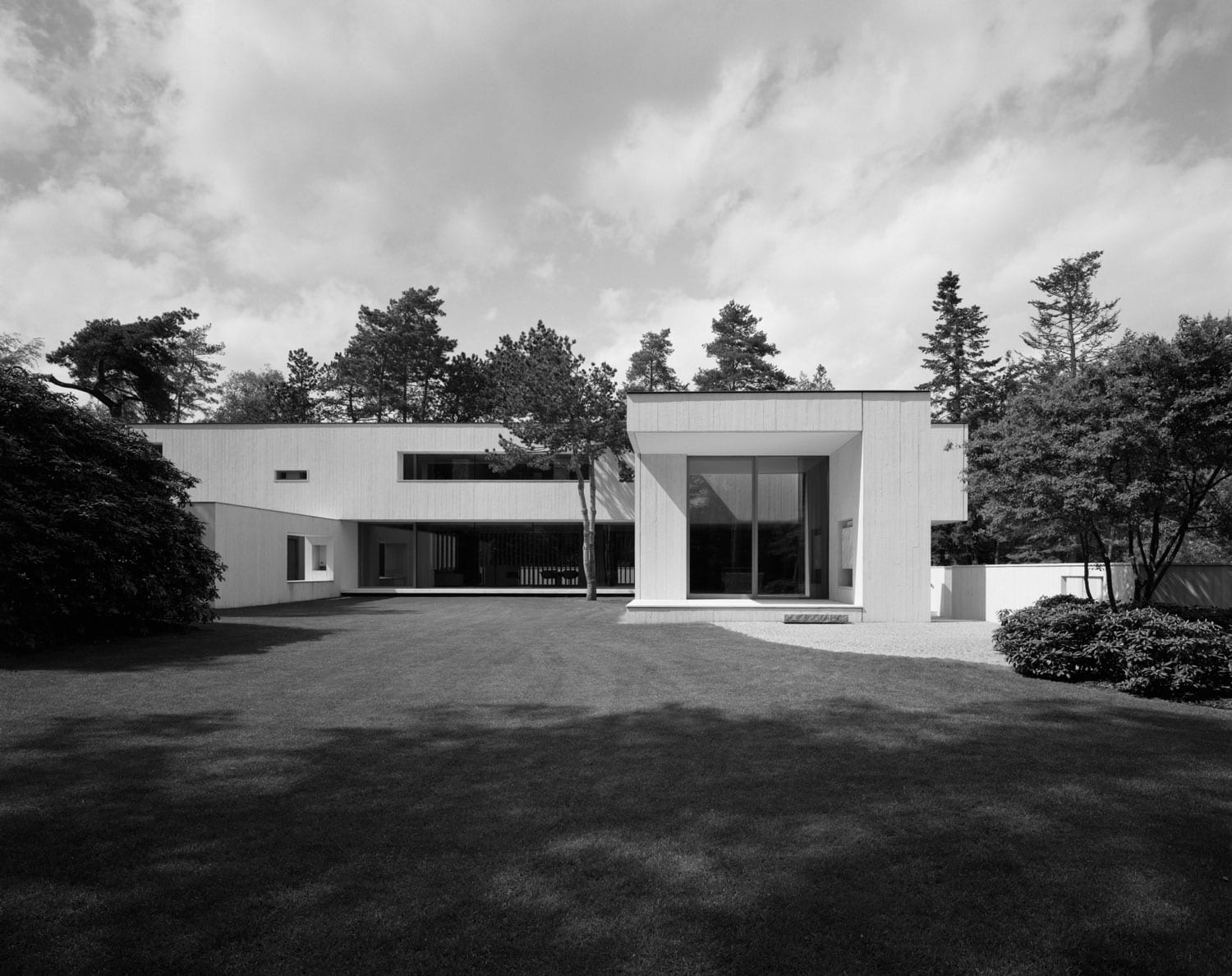
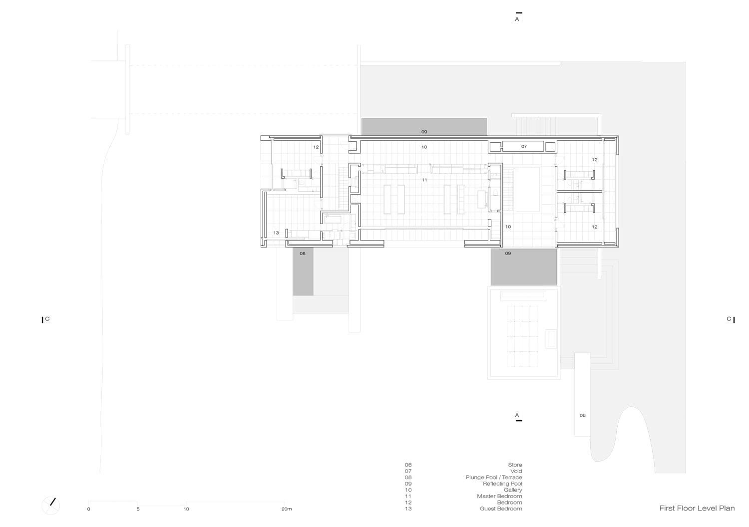
Set within a forested Dune landscape, in Waalre outside of Eindhoven, in the Netherlands this white concrete family home covers an enclosed area of 1200 square meters over four levels and resides on a 7000 square meter plot of land. Completed in 2015, the dwelling replaces a home once owned by Frans Otten, the son in law of Anton Philips, founder of the Dutch technology company Phillips. The new home is designed by renowned architect Russell Jones. Born in Melbourne, Jones studied architecture in Australia and worked in the office of Harry Seidler. After extensive travel in the United States and Europe as well as in selected offices in London, Jones established his own studio in London in 1993.
Photography by Hélène Binet and Rory Gardiner.
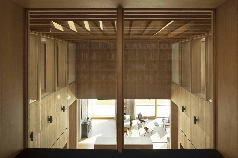
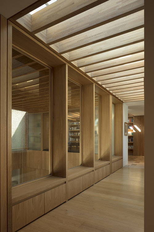
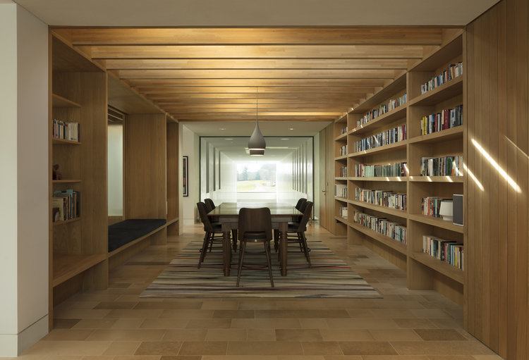
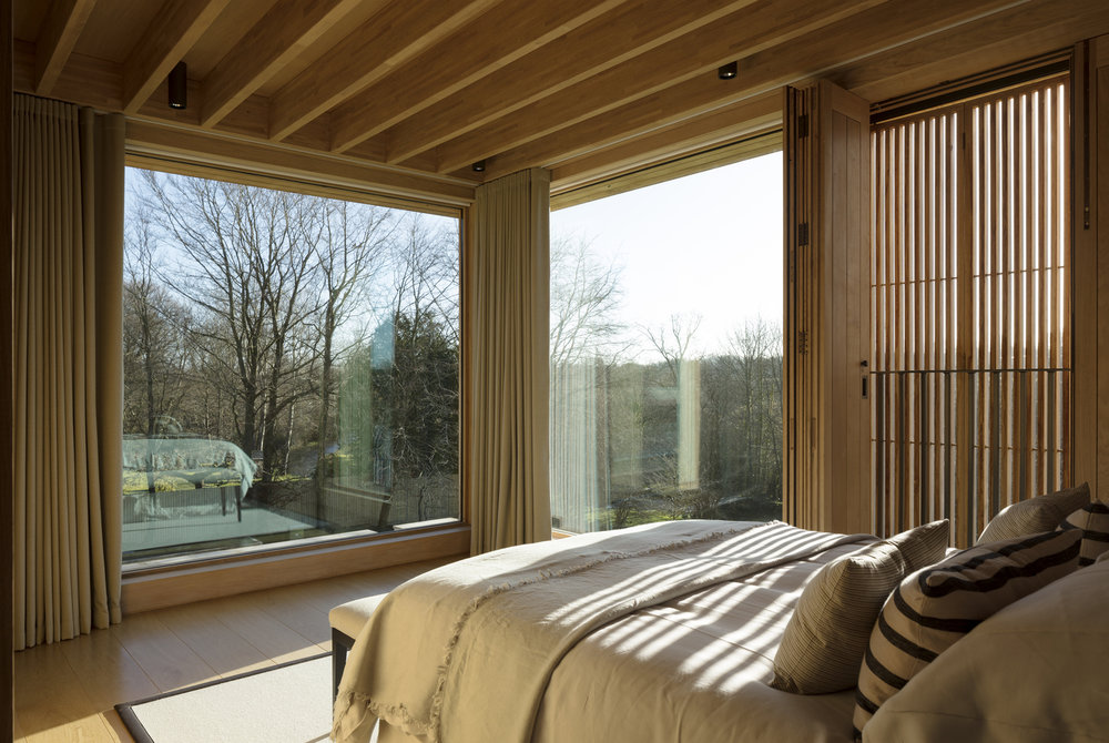
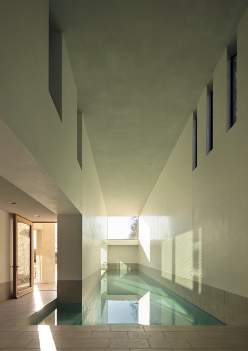
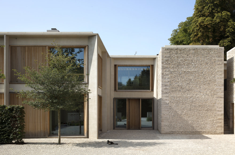
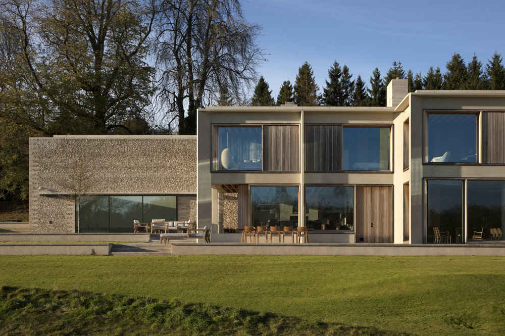
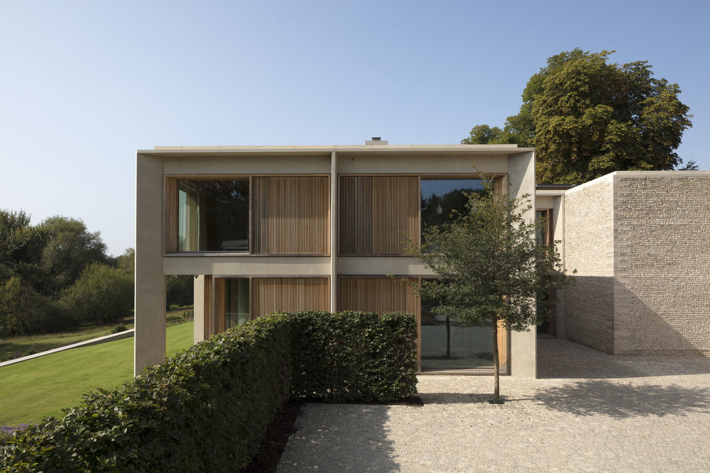
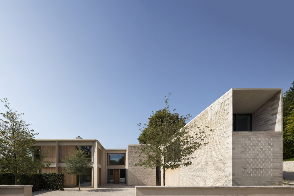
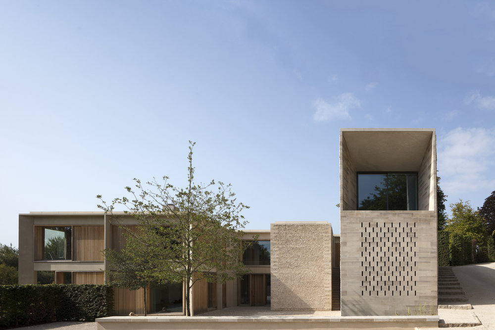
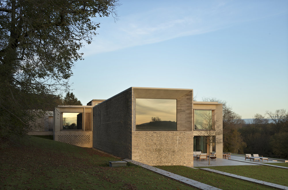
Hampshire House by Niall McLaughlin Architects
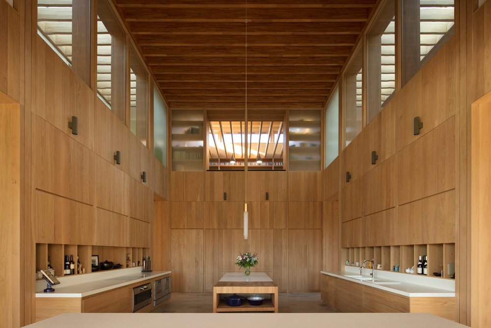
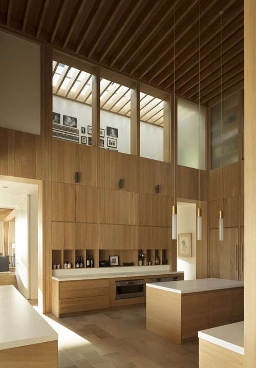
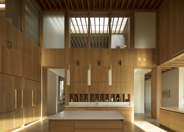
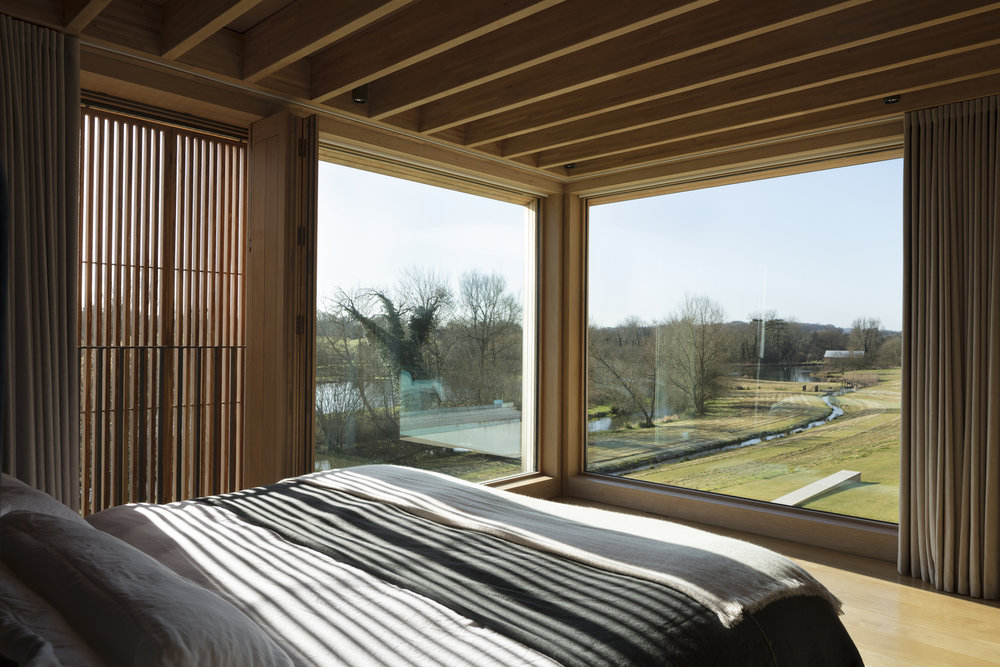
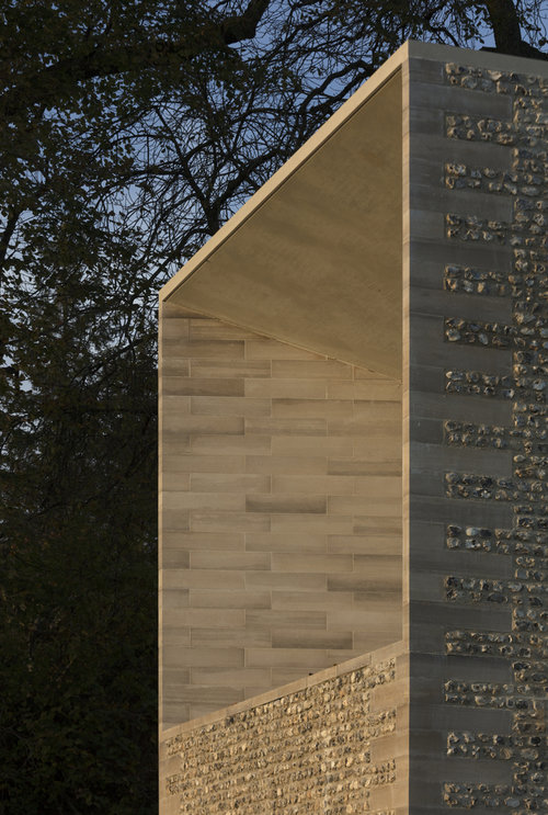
From the architects: "The property is approached from the north, down a steep bank. The house is nestled into the hillside and appears as a single story flint building echoing the demesne walls common in the local area. Visitors are guided down a tree-lined road to a lower entrance courtyard where the building rises to two stories. The house is arranged in a series of staggered volumes, which are conceived of as an entrance to the landscape. The spaces frame the three key views; the meadows, the lakes, and the gardens. In the center is the top-lit, double height kitchen, around which the daily life of the family revolves.”
Photography by Nick Kane.


